Showing posts with label grid design. Show all posts

Thursday, June 07, 2007

@media - Five Steps To Better Typography

Next up was Mark Boulton, who wanted us to work with typography in a better way.

  • Be Appropriate & Adaptable
    Typefaces tell stories, and the web is still playing catchup with this power. Comic Sans is appropriate for the menu at a greasy spoon cafe; you wouldn't want an invitation to a Black Tie event done in it though. Similarly, the BBC's use of Gill Sans evokes order and authority. The BBC logo has a twist - by reversing the type and blocking out the shapes of Gill Sans.
    Don't let type and design get in the way of words.
    Be adaptable to requirements, and appropriate for the story.

  • Use Rhythm
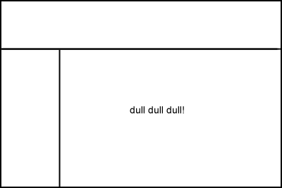
    Richard Rutter's Compose To A Vertical Rhythm explains about using the line height and leading of your blocks of text to best advantage. The basic theory goes: 12px font height with 18px between lines, give a line height of 1.5. You can use incremental leading to make 4 lines of text in the main body of a page line up with 5 lines of text in a sidebar.
    [Text in the sidebar bears no relation to the main body copy. It looks messy.]
    The maths gets a bit hairy: 18px x 4 lines = 72px for the main body. 72px ÷ 5 lines = 14.4px for the sidebar
    If you're using 10px height for your sidebar text, 14.4 ÷ 10px = 1.44 line height. You may find the sidebar top-margin property needs a bit of tweaking to get it to line up properly.
    [This looks much better now everything is aligned vertically]

  • Optical Grey
    If you squint at a block of text, you'll see the page has different tonal ranges depending on font, leading, letter spacing etc.
    Verdana has a more open shape, so is paler at smaller sizes.
    Combining serif and sans-serif fonts can be effective, giving different "colours". Minimize dark grey and balance the line height.

  • Use The Right Tools For The Job
    Hyphens "-" are NOT em dashes!! "—". Use an em — or en – where appropriate.

  • Use a Grid System
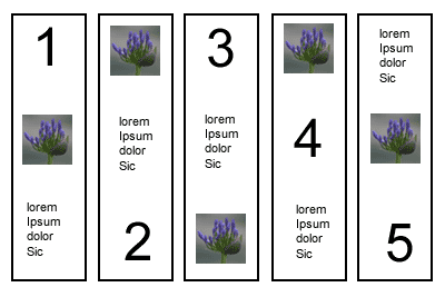
    Use grids as a tool to help you organise information. How to decide how big the grid unit should be? You can subdivide the units too - you might have a 3em high by 4.5em wide block, which divides nicely into 2x3 squares each of 1.5em width and height.
    Choose gutter sizes carefully, it can depend on the relationship between whitespace and font size.
    Using Alternate Row colours in tables must be done with care - don't use colours which are too strong.
    Set type to your grid, and align everything! The smallest error can really stick out.
In Summary
Typography is all about the details. Tiny increments can make a huge difference. The full slides are available at Mark's website.

@media - Diabolical Design: The Devil Is In The Details

The conference split into two tracks, and I chose to listen to Jason Santa Maria of Happy Cog Studios talking about Design. Design is intent, and that must be reflected in the finer details.

Colour
Colour means different things to different people and evokes emotional responses. Use colour for emphasis and to help deliver the message. Faith Inkubators uses purple sparingly for emphasis and it works nicely. A Film uses pink and a particular headline motif to great effect.

Sometimes unexpected colours can be equally effective, The Times' acid green isn't obvious for a serious newspaper, but it works. Some other sites may take a colour from a photo or logo and use this to add emphasis.

Hierarchy
Visual hierarchy should reflect the underlying semantics of headingd hierarchy. It will give users a sense of what's important and what's not in the page. Use a focal point to grab attention and drive home the message. Providing variety can also lead the viewer through a page.

[The visual hierarchy should reflect the underlying document's semantics]

Whitespace
Whitespace is often something designers are afraid of - but used effectively, the "nothing" can be just as important as the "something" it surrounds. Also, optimum line length is 66 characters (anything between 45-75 is OK) for easy reading. The longer the line length, the more leading is required for better legibility.

Organisation - Grids
Grids can be liberating rather than restrictive. But giving users a solid framework can mean they will find it easier to get around your site - less time investment is required to "learn" the grid. He showed us maps of Philadelphia and London and asked us which we would be happier in negotiating as a tourist:

[Philadelphia's regular street plan contrasts with London's maze of tiny streets]

Even when using a grid, there are many ways of breaking the rigid order and still getting interesting designs. These three screenshots are from Australian agency Trout:

[Trout's home page, a regular grid, but even this is broken up with the bright colour emphasis]

[Detail page when you click through from the home page. More of the grid is broken up into bigger chunks]

[The About Trout page, dominated by the main text panel]

Having said all that, make sure that alignment happens and doesn't fall down - subliminal effects can be powerful and if something doesn't quite line up, it will still look "wrong" without the user being able to put their finger on why.

Planning
It's easy to jump into the finished product right from the start. Step back and plan! Keep a sketchbook to jot down ideas - they may all come together at a much later date, but you have them to hand.

[Jason's sketch book showing early doodles for the A List Apart design]

Design should be an iterative process. Grey box comping can help you decide the best weight for various layouts. Jason doesn't show these grey box comps to clients, but just uses them for his own purposes. He would then expect a PSD comp to show to clients, and perhaps 1-2 iterations round the loop before they are happy. The whole process can take a couple of months.

Strive For Clarity
Storytelling gives people hooks and things to remember, they will come back!

Fonts
Use fonts in such a way to give some extra interest to the page. sIFR can be a useful method of delivering certain fonts if they are mandatory branding requirements.

Handover
The all-important step that is often overlooked. A style guide is best kept short, under 10 pages, and provide a dummy template for each type of page, so that other people can look after the site going forward.

Customer Interference!
We all know what he means. But if you find your client is trying to steamroller you, set up a meeting and let them know you are the expert. Try to convince them of you design, as long as it conveys their message and isn't just kudos for your portfolio.

Friday, June 16, 2006

@media, Fine Art of Web Design

Andy Clarke of Stuff & Nonsense / And All That Malarkey

Andy's an odd fish! But he thinks of things in different ways, and from different viewpoints. He sees inspiration for web design all over, not just online. "Art is design without compromise" - Jeffrey Veen.

Bound By Boxes
We are hampered every which way by boxes, stemming from:

  • The environment - ie a 2D screen, which is inflexible
  • The Materials - ie the limits of Markup+CSS
  • Medium - poor CSS support in older browsers
  • Ourselves! - unlearning what we have already learned.
  • Refs: Blue Robot's Reservior, Web Standards Awards
Grid Design
It is a fundamental skill of any designer - using the grid (see also the writeup on Good Design vs Great Design). BUT, what do we end up with?

becomes

Should we look at the web for inspiration, at places like cssreboot, or csszengarden?
Or should we look elsewhere? Maybe a right nav and vertical header could work for your site!

Keep a Scrapbook - could be magazine cuttings, etc, just to give inspiration from other areas. Showed example of page layout which was thus - just an ordered list, effectively - think how this below could be marked up with CSS?

Sometimes the juxtaposition of lines and curves can be quite interesting to think about.

Markup In The Real World
Markup needs to be technically valid but contain elements that have been chosen to convey meaning, semantically. If its tabular data - present it in a table!

Progressive Enhancement
Name given to technique were basic stuff is marked up for styling in IE, plus bells and whistles for other more capable browsers - eg Moz browsers can cope with the :hover class on any element, not just anchors; round corners on boxes are coming!

Transcendent CSS makes full use of all the most up to date CSS techniques. In CSS2.1 this could mean attribute selectors, parent/child/sibling selecctors, pseudo classes eg first/last child etc. Only use hacks to target browsers to turn things off.

Graded Browser Support
Doesn't mean everyone gets the same thing - but so what if it works and is usable in older browsers. IE7 will level the playing field a bit more (we hope!).

Refs: Yahoo DevNet - Browser Grades
stuffandnonsense.co.uk/downloads/transcendingcss.pdf


Thursday, June 15, 2006

@media, Good Design vs Great Design

A discussion panel chaired by John Hicks, Veerle Pieters & Cameron Moll.

Design is about communication, not just about making things look pretty. Subjective! How important is is to be original & creative? This can be intimidating for new designers. Look for inspiration from all things, not just the genre you're working on. Look at the brief to see what (if any) conventions have to be followed (eg existing branding).

Can great design be achieved on a budget? No! You may well get good design on a budget, but it's time that's required to make something into a truely great design - and time means money. Thinking time is required, not just the time taken to produce something. Great designers can produce something more quickly, perhaps, than other designers, within the timescale.

Grids

Grids can help you with placement and proportion. Assess the requirements of your likely content - eg long headlines, size of photographs etc, and plan your grid/layout around them accordingly. Violate the grid when neccessary. 5 Steps To Designing Grid Systems.

Methods:

  • Fixed width, uniform - www.newyorktimes.com
    11 columns: 1 wide, 2 wide, 4 wide, 2 x 2 wide
    Useful to use a b/g element tracing image (add to wrapper div) - switch it on and off as you develop.
  • Fixed width, hierarchical
    eg 2 cols either side ~160px; 1x400px, 1x200px - left and right cols can be used for ads.
  • Fluid width - vivabit.com
    Columns stretch as a percentage of browser width.
  • Fluid+fixed width
    eg first four coloumns resize in browser, last one fixed width for adverts

Typography

Every typeface has its own language, emotion, implied age etc. Type can be the design itself.
Imagine the Sex Pistols "Never Mind The Bollox" cover done in Comic Sans & Princetown - it looks ridiculous!
Use harmonising fonts. Meta/Trebuchet are a good pair. Americans tend to use Serif fonts, Europeans tend to favour sans serifs (why?!)
Great typography is not just choosing a cool font. It should be invisible - and relates to space, lines etc.

Case studies:

  • www.alistapart.com - Titles are centred, serifs, colours. Body text, left aligned, and given a decent leading ~1.8em. Author names are text-transform: uppercase, bold, larger kerning - makes it very easy to spot the authors in a list of articles.
  • www.subtraction.com - headings have bold use of whitespace to delineate hierarchy.

Sparks of creativity - tweak the H in the Shelter logo; often just one eleent can be reused to give accent.
Good designers use typefaces, great designers use typography => improve your typography! Ref: 5 Simple Steps To Better Typography

Colour
Why is colour so important? It sets mood, personality, emotion of a site. Can convey meaning. Adds balance and contrast. Great design doesn't solely rely on colour to convey message. Contrast is important - don't overdo colour. Colour guidance for different sections of a site can be useful.