Showing posts with label web design. Show all posts

Thursday, June 07, 2007

@media - Diabolical Design: The Devil Is In The Details

The conference split into two tracks, and I chose to listen to Jason Santa Maria of Happy Cog Studios talking about Design. Design is intent, and that must be reflected in the finer details.

Colour
Colour means different things to different people and evokes emotional responses. Use colour for emphasis and to help deliver the message. Faith Inkubators uses purple sparingly for emphasis and it works nicely. A Film uses pink and a particular headline motif to great effect.

Sometimes unexpected colours can be equally effective, The Times' acid green isn't obvious for a serious newspaper, but it works. Some other sites may take a colour from a photo or logo and use this to add emphasis.

Hierarchy
Visual hierarchy should reflect the underlying semantics of headingd hierarchy. It will give users a sense of what's important and what's not in the page. Use a focal point to grab attention and drive home the message. Providing variety can also lead the viewer through a page.

[The visual hierarchy should reflect the underlying document's semantics]

Whitespace
Whitespace is often something designers are afraid of - but used effectively, the "nothing" can be just as important as the "something" it surrounds. Also, optimum line length is 66 characters (anything between 45-75 is OK) for easy reading. The longer the line length, the more leading is required for better legibility.

Organisation - Grids
Grids can be liberating rather than restrictive. But giving users a solid framework can mean they will find it easier to get around your site - less time investment is required to "learn" the grid. He showed us maps of Philadelphia and London and asked us which we would be happier in negotiating as a tourist:

[Philadelphia's regular street plan contrasts with London's maze of tiny streets]

Even when using a grid, there are many ways of breaking the rigid order and still getting interesting designs. These three screenshots are from Australian agency Trout:

[Trout's home page, a regular grid, but even this is broken up with the bright colour emphasis]

[Detail page when you click through from the home page. More of the grid is broken up into bigger chunks]

[The About Trout page, dominated by the main text panel]

Having said all that, make sure that alignment happens and doesn't fall down - subliminal effects can be powerful and if something doesn't quite line up, it will still look "wrong" without the user being able to put their finger on why.

Planning
It's easy to jump into the finished product right from the start. Step back and plan! Keep a sketchbook to jot down ideas - they may all come together at a much later date, but you have them to hand.

[Jason's sketch book showing early doodles for the A List Apart design]

Design should be an iterative process. Grey box comping can help you decide the best weight for various layouts. Jason doesn't show these grey box comps to clients, but just uses them for his own purposes. He would then expect a PSD comp to show to clients, and perhaps 1-2 iterations round the loop before they are happy. The whole process can take a couple of months.

Strive For Clarity
Storytelling gives people hooks and things to remember, they will come back!

Fonts
Use fonts in such a way to give some extra interest to the page. sIFR can be a useful method of delivering certain fonts if they are mandatory branding requirements.

Handover
The all-important step that is often overlooked. A style guide is best kept short, under 10 pages, and provide a dummy template for each type of page, so that other people can look after the site going forward.

Customer Interference!
We all know what he means. But if you find your client is trying to steamroller you, set up a meeting and let them know you are the expert. Try to convince them of you design, as long as it conveys their message and isn't just kudos for your portfolio.

Wednesday, January 03, 2007

Property Is Theft

19th-Century French politician Pierre-Joseph Proudhon might have coined the phrase, but it's still pretty relevent today. As a soon-to-be-freelance web designer and photographer, I was particularly alarmed to read Sion Touhig's piece at The Register, about how the glut of freely- (or cheaply-) available images on the web has "devasted" the freelance photography and photojournalism sector. Not only is content on the web more easy to pinch, but also the rise in "user generated content" has made things increasingly difficult. He states:

"User Contributed Content should be more accurately termed 'Audience Stolen Content', because media groups rarely pay for Citizen Journalism images and more often than not, either claim the copyright or an all-encompassing license from contributors, when they send their pictures in. That's a copyright grab in all but name."
The article runs to three pages and make many other salient points, but this one stuck out too:
"The perception is "if it's on the web, it's either free, or I'm gonna nick it anyway because, hey, 'they' can afford it". The reality is that there are now more copyright-free or near-free images on the web than copyright images. Most of them will be on Flickr (owned by Yahoo!), MySpace (owned by Rupert Murdoch's News Corporation) or the major corporate image portals. Neither Flickr nor MySpace exist to commercially leverage images, but clients now go there trawling for free content, so they don't have to pay a photographer for it. It has caused a crash in the unit cost of any images which aren't given away and which are licensed for profit."
As a victim of copyright theft in the past, I can entirely sympathise with his point of view. In my case, I was minding my own business reading one of the broadsheets' weekend colour suppliments a few years ago, when I stumbled across a picture which I knew incontrovertibly to have been stolen from one of my websites and used without my permission. After writing an incensed letter to the paper's picture editor, they freely admitted that it was their fault (blaming a lazy researcher for not checking the copyright status of the image!) and agreed to pay me their standard repro fee.

It took another 4 letters and six months for them to finally honour their promise. And that was for a picture which wasn't particularly important or valuable, and would not have earned me anything anywhere else - it was just for the principle of it that I pursued them. What would have happened if I hadn't spotted it? I wonder how many more times newspapers get away with this sort of thing - not to mention the millions of folks online who can trawl the web for all of your pictures and do with them what they will.

And I'm afraid that's why you'll find I put a copyright watermark in all my images which I put online - they're usually only 600x400 resolution too. And my Flickr images aren't tagged with a Creative Commons licence. Once bitten, twice shy.

On a related note, recently a client gave me a brief, and I worked up a proposed site layout. But despite me following the brief, the client was not happy and has basically admitted they want me to rip off the design of another site! I flatly refuse to do so. Asking me to do this would basically be asking me to throw away my professional integrity and risk being sued for breach of copyright.

Fortunately, there was PR agency inbetween me and the client in question, who managed to mediate the situation. They were pretty much in agreement with me that it wasn't not a healthly thing to be suggesting. And from a prospective customer's point of view, I wouldn't be too impressed if I found a site which had obviously pinched a design from a competitor - that wouldn't say much for the company's buisness ethics!

Friday, June 16, 2006

@media, Fine Art of Web Design

Andy Clarke of Stuff & Nonsense / And All That Malarkey

Andy's an odd fish! But he thinks of things in different ways, and from different viewpoints. He sees inspiration for web design all over, not just online. "Art is design without compromise" - Jeffrey Veen.

Bound By Boxes
We are hampered every which way by boxes, stemming from:

  • The environment - ie a 2D screen, which is inflexible
  • The Materials - ie the limits of Markup+CSS
  • Medium - poor CSS support in older browsers
  • Ourselves! - unlearning what we have already learned.
  • Refs: Blue Robot's Reservior, Web Standards Awards
Grid Design
It is a fundamental skill of any designer - using the grid (see also the writeup on Good Design vs Great Design). BUT, what do we end up with?

becomes

Should we look at the web for inspiration, at places like cssreboot, or csszengarden?
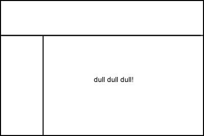
Or should we look elsewhere? Maybe a right nav and vertical header could work for your site!

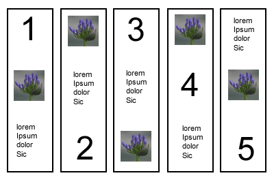
Keep a Scrapbook - could be magazine cuttings, etc, just to give inspiration from other areas. Showed example of page layout which was thus - just an ordered list, effectively - think how this below could be marked up with CSS?

Sometimes the juxtaposition of lines and curves can be quite interesting to think about.

Markup In The Real World
Markup needs to be technically valid but contain elements that have been chosen to convey meaning, semantically. If its tabular data - present it in a table!

Progressive Enhancement
Name given to technique were basic stuff is marked up for styling in IE, plus bells and whistles for other more capable browsers - eg Moz browsers can cope with the :hover class on any element, not just anchors; round corners on boxes are coming!

Transcendent CSS makes full use of all the most up to date CSS techniques. In CSS2.1 this could mean attribute selectors, parent/child/sibling selecctors, pseudo classes eg first/last child etc. Only use hacks to target browsers to turn things off.

Graded Browser Support
Doesn't mean everyone gets the same thing - but so what if it works and is usable in older browsers. IE7 will level the playing field a bit more (we hope!).

Refs: Yahoo DevNet - Browser Grades
stuffandnonsense.co.uk/downloads/transcendingcss.pdf