Wednesday, December 05, 2007

Lifestream, Yahoo! Pipes and jQuery

Jeremy Keith's lifestream was the first I saw online, where he'd aggregated together his many RSS feeds into one place. It shows the various sources ordered by time, and it can be quite interesting to follow along and see what sort of sources are most prevalent at any one time. I'd been meaning to have a play with something similar myself for some time, but wasn't sure how to go about it. Then a couple of weekends ago, I went to BarCampLondon3 and Cristiano Betta did a great session on how to author your lifestream using Yahoo! Pipes. There's bags more information about how to do it at his blog. Finally, I thought it was about time I had a play with it myself. The feeds I used were the following:

I decided against using my Last.fm feed for the moment, as it would probably swamp all the other inputs (I listen to a lot of music while working, it's one of the perks of working from home, no-one moans about your choice of songs!).

Having got the basic lifestream out of Pipes, I used Dreamweaver's XSLT transform functionality to generate a list which would sit in my ASP.NET page. I wanted to use specific icons to show which feed each item was from. Cristiano was using a JSON output for his pipe, but mine is coming out as RSS, so the custom ID's applied in the pipe weren't getting through, since they're not part of the RSS spec.

CSS3 attribute selectors are one option, but they don't work in clunky browsers like IE6. So having also been at Simon Willison's jQuery session at BarCampLondon3, I thought I'd have a play with with the library to see if I could do some neat DOM manipulation to add the correct class to each list item.

The Llifestream list is marked up thus: <ul id="lifestream">. I added some jQuery to insert the class for the list element, based on the attribute of the link it contains. That requires a parent element to be changed, based on it's child's attributes. Slightly tricky for a jQuery novice like myself. It took me a while but eventually I found the correct syntax:
$(document).ready(function() {
$("#lifestream > li > a[@href^=http://twitter]").parent("li").addClass("twitter");
});
The first line calls jQuery once the full DOM is loaded; line 2 (which looks rather horrible with text wrap, but bear with me) selects an anchor with the attribute which begins with "http://twitter", but I wanted the class added to the parent LI, so hence the chaining of jQuery functions.

Now all I needed to do was to add a case for each link type to my new lifestreamclasses.js file and add a linke to it in the header of my lifestream page, and the proper stylings can be applied. I decided to keep them in a separate JS file for ease of maintenance. Once the pipe has mashed it all together and I've written the relevant styles into the stylesheet, the resulting RSS aggregated feed looks like this.

Sunday, November 25, 2007

BarCampLondon3 - Day 2

Sunday morning saw various folks rise from the dead and gather for breakfast - another mighty catering WIN from Google's chefs - Full English if you so wished, fruit and cereals for those of a more delicate constitution.

It took a while for the brain cells to get going (copious amounts of coffee and fresh orange juice helped), so the first session I sat in on was the second of the day.

What To Teach The Next Gen Web Devs - Dan Dixon
Dan is a lecturer teaching today's university-age students about the web. His round-table discussion focussed on what sort of curriculum they should be getting, from a working designer/industry expert opinion. The whiteboard proved useful in splitting up the syllabus into 4 stages and brainstorming the essentials of what should be covered:

Universals:

  • Accessibility as best practice, not an afterthought
  • Make them aware of an international web (localisation issues)
  • Good communications skills - ability to present their projects and lead discussions
  • Need good writing skills for email, reports, blog posts
  • Give them business context for their skills
  • Point them towards the developer community
Foundation:
  • Not too much emphasis on specific tools - teach basics of HTML/CSS
  • Fundamentals of design
  • Typography
  • HCI and UX design
  • The ideas of the web - a bit of history about the technology?
  • Empowerment
  • What is the web for? - show them it's not just Facebook
  • Different ways of working
  • Tell them about realistic career paths
  • Basics of how to program
Middle:
  • Practice-based
  • CSS, JavaScript
  • PHP/Ruby
  • Wireframes/IA/Sitemaps
  • Do usability testing
  • Make sure something they have worked on is torn apart (might sound harsh, but it's going to happen sooner or later!)
  • Small groups/projects
  • Understand project management skills
Internship:
  • Need good HTML/CSS skills so they are immediately useful - don't want to end up just making the tea
  • Need to work as part of a team
  • Know about browser testing
  • How to interact with clients - people skills
  • Innovation
  • Time estimation
  • Should be able to choose a path - Front End or Design or Programming or UX/IA and be able to gain relevent experience in that
End:
  • More on localisation
  • Project Manage a 2nd-year team
  • Start a project from scratch
  • More about business and how it works
It was a very thought-provoking session, and a few of us continued in well into the break. Then coffee called, so I ended up missing another session! Oh well.

Self Publishing - Vicky Lamburn
Vicky has self-published several fiction books and gave us some tips on the tools she uses for writing and typesetting (Word on Window), Lyx (for Ubuntu). Then she gave us a quick tour round the Lulu self publishing site. It is possible to get a book with ISBN - or self-promote, distribute, sell via web etc. In general, covers need to be 300dpi TIFF while text is usually send as a PDF (fonts only embedded where licencing is not an issue).

Then it was time for lunch! Still more food...

BarCamp Rhine - Sebastian "CB" Grünwaldt
CB gave a great presentation on the proposals for BarCampRhine, which basically involves BarCamp on a ship sailing from Basel (Switzerland) to Rotterdam (Netherlands), with static BarCamps in cities along the way, such as Basel, Karlsrühe, Mannheim, Köln, Strasbourg, and Rotterdam. The idea was originally suggested by Frenchman Sacha Lemaire and has been presented at various BarCamps in Europe since then.

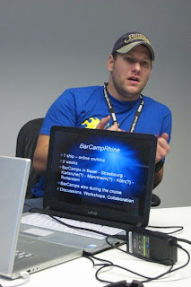
[CB explaining the BarCampRhine idea to those in the room and in the chatroom]

If it goes ahead, it sounds like it will be a brilliant fortnight - but it needs lots of work and enthusiasm to make it happen - so if you are interested, go and sign up at the Wiki and let the other folks know you want to help. CB's talk led on nicely to Ryan Alexander's which followed:

Future of BarCamps - Ryan Alexander
Ryan's session involved asking two recent BarCamp organisers up on stage and asking some important questions about how much work was involved with putting on a BarCamp. Ian Forrester (London) and Oliver Berger (German BarCamps) kindly shared their experiences with us:
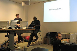
[Question Time]

Q. How long have you spent working on BarCamp?
A. Ian - Backstage are a sponsor, some time can be claimed from work time - at least a week's time.

Q. How much personal risk did you need to take?
A. Ian - does not put himself at risk, sponsors take the can. Oliver, some risk.

Q. How many others helped out?
A. Oliver 12-15. Ian 2 Googles.

Q. How many others would think about organising an event
A. Most people in room. Alistair organising one in Tyneside. Previous experience to give it a go.

Q. Norm - what would you do for a first step?
A. Get people to help - people who are passionate about it.

Q. How would you find those people?
A. Don't know (Norm). Ian - says its a lot easier to go it along to begin with. Oliver - don't need to look for passionate people - they will ask you if they can help.

Ryan's suggested BarCamp2 - a BarCamp about organising a BarCamp. This seemed to go down well, and hopefully something concrete will begin to take shape soon.
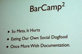
[So meta, it hurts]

Anatomy of a Business Card - Ross Bruniges
Ross's lighthearted look at the power of a business card can be summarised as follows:
  • Keep in touch with the people you meet up with.
  • Once you have a name you can see where people are going - Flickr, etc
  • Twitter - finding out what people are doing now.
  • Upcoming - what's going to happen
He ended with a favourite photo of himself:
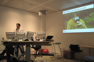
[Ross and his Pimp goblet]

Then we were all encouraged to exchange cards with folks in the room who didn't already have ours.

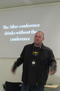
Rise & Inevitable Fall of Pub Standards - Dan Webb
In the beginning... Dan took us on a little historical tour on how PubStandards formed, why it's good and why you shoulnd't miss the next one:

[Who needs the conference?]

As the sessions came to a close, everyone reconvened in the main canteen for the farewell closing speeches. I think everyone agreed it was a spectacularly successful BarCamp, certainly the best I've been to.

The Highs? - brilliant wifi, food to die for, lots of geek toys to play with and plenty of friends old and new to hang out with, winning at Werewolf!

The lows? - not getting enough sleep, not wanting to leave! Roll on BarCampLondon4...

BarCampLondon3 - After Hours

If you're staying overnight (which is essential for the full BarCamp experience), then there isn't really an "after hours" - you just keep going for as long as there's a geek still standing.

After the first day's sessions came to a close, the socialising began in earnest. Here we see Mr Boozeniges living up to his name:

[First steps in drinking the mighty Google dry]

Inevitably, where geeks gather, there will be interminable rounds of Werewolf, for it is writ in Lore.

[Short break in a round of Werewolf. Cheer up! Anyone would think someone just died... oh wait!]

I think I must have played at least half a dozen games during the evening. But the most satisfying has to be the one that wrapped up around 5am - final round me [Werewolf] versus Tom Hughes-Croucher and Sebastian "CB" Grünwaldt [villagers] and Tom decides to nominate CB - mwahhaha! I win! Yum yum, tasty villagers.

Talking of tasty, as if the mountains of food served for dinner weren't enough, Google laid on a midnight feast for the geeks - freshly cooked waffles, pancakes and a chocolate fountain. Man, you could get soooo fat working here...

[The chocolate fountain - just had to be tried, didn't it?]

There were loads of games to play (Wii sports, tabletennis, fussball) and even a Segway to fool around with. However, Jan and CB, two of the crazy German LondonBubble guys decided they could go one better than the Segway with their two-seater "find":

[Ticket To Ride - CB drives with Jan on the back, looking justifyably worried]

But the weirdest trick of the evning must go to Oliver Uuberholz (another LondonBubble boy) who decided the empty beer fridges were going to waste and his Mac was getting too warm:
[Macs in the fridge]

Enough craziness, and being about dead on my feet by 5:30am, I went to find a quiet bit of floor to collapse on for 3 hours.

Saturday, November 24, 2007

BarCampLondon3 - Day 1

The time for another BarCampLondon3 has rolled around, and I was lucky enough to get a ticket. We all turned up at Google's swanky offices in Victoria knowing we would have a good time, but not quite realising what a great time we were in for.

The organisation went very smoothly, the wifi was rock solid, there was more food, beer and snacks than even a BarCamp-load of geeks could consume (well, apart from the beer - it's the first time Google's fridges have been emptied, oops!)

As usual with an unconference, it was all about the sessions folks decided to give, and we were treated to some really thought-provoking and fun discussions. It was a shame that out of the 100 attendees, about 30 chose not to present. So the schedule was a little light at times, but that's not always a bad thing - nice to catch your breath every now and then! Jeremy marked up the timetable for us all to refer to easily.

The first session I went to was Tom Morris - Scraping Sucks - where he was giving us more usable alternatives to scraping HTML, namely doing clever stuff with GRDDL. He says it's much easier that way. As usual, I nodded sagely at the time, and then a couple of hours later, wondered what it was all about. Tom is a great geek, but he's several steps ahead of me when it comes to brain-wracking abilities :-) He's put up a page of GRDDL Profiles here - which lets you look at (X)HTML and with an XSLT transform, spits out XML/RDF which can be used as you want.
[Tom gets stuck in to his presentation]

Norm's Law
This was an excellent presentation from Mark Norman Francis. He gave us some very good reasons for doing code his way - especially for fostering interoperability betweeen different members of the team, or yourself coming back to code at a later date. Some points included:

  • Use spaces not tabs
  • Code goes no further than col 77
  • No-one ever died from using too much whitespace
  • Separate operators and braces - more of a cognitive burden to parse squashed up code
  • Always indent by 4 spaces ONLY
  • Line up assignments of variables (equals sign in the same place etc)
  • Line up data tables too (arrays or whatever)
  • Space keys out from brackets $vote[ $value }++; etc
  • Space keywords out not functions
  • Vertical rhythm - break bits up with comments for each sub part - make a story out of it
  • Respect left-to-right comprehension
  • K&R bracketing - opening brace should be tied to RHS end of line, closing brace should be on a new line - aligned with the starting coment
  • Don't cuddle and else!
  • One statement per line - you can easily miss the ";" in the middle of the line separating the two commands
  • Break lines before operators - EXCEPT in JavaScript or it won't work
  • Ignore operator precidence - use brackets to make it more "English readable"
  • Use single quotes where possible - ' in PHP will just be stuffed in, " will make PHP parse the contents looking for variables
  • Factor out long expressions and use intermediate variables (with english-sensible names) to break up
  • Always use x on regexpressions
  • Don't use camelCase! unless you're in JavaScript
  • Systems Hungarian is harmful, Apps Hungarian is too
  • All short variable names are harmful
  • Use grammatical variable names and function calls
  • Optimise for humans first! Machines - throw more hardware at it - but you can't refactor comprehension
  • HTML indents use 2 spaces not 4
  • Write the whole document FIRST before you do any CSS etc
  • Insert Microformat classes
  • Always use single quotes in attributes
  • Inline CSS means you've done it wrong
  • If it only works in JS don't
  • VALIDATE
  • Start with base stylesheets - reset, fonts, layout
  • Use Uppercase tags in HTML
  • Keep z-index below 50
[Norm - I can haz 4 skreenz]

Next up was a session about new developments from the BBC's web team:

BBC APIs First Look
PIPs is the system to list all broadcasted stuff - telly and radio
  • bbc.co.uk/programmes
  • Gives a list of all current programmes - by genre or alphabetically
  • Nice URLs which can have .yaml or .json can be added for the feed in that format
  • bbc.co.uk/programmes/formats
  • Pid is the 8-character id for each episode - taken from user experience tests and will always be constant (never change)
  • JSON and YAML are the two formats currently supported - XML coming? - RDF ontology has been produced
  • RSS feed is coming so you could subscribe to know when "every episode of Doctor Who" is on
  • Data model - "programme" can be brand, series or episode - an episode can have multiple versions (signed, extended etc) which then have broadcast (tv) or ondemand (iPlayer) times
  • Historical data back to May 2006
  • Can filter out to network (tv or radio) eg Radio4
  • Next release (API stuff) in New Year
  • http://catalogue.bbc.co.uk/ - is historical data - grand plan is to have them merged
DIY User Research - Leisa Reichelt
Leisa gave us lots of good advice on how to carry out some DIY user research - her premise being that it doesn't have to take days and days and cost big bucks - and often talking to more than half a dozen victims volunteers gives you diminishing returns. Leisa's slides are already available at the Slideshare BarCampLondon3 group.

Building Lifestream with Yahoo! Pipes - Cristiano Betta
I didn't take many notes as I was listening as I was actually playing with a real Yahoo pipe of my own and trying to follow along with what Cristiano had to say. I've been meaning to use Pipes to create my own Lifestream for some time, but had a quick go before and things weren't coming out as I wanted. Cristiano has done a series of excellent blog posts to get you going, or you can watch Tom Morris' video of Cristiano's presentation. Or view Cristiano's own Lifestream.

10 Things You Should Do In Project Management But Probably Don't - Gareth Rushgrove
Gareth's top ten tips:
  1. Use Source Control software
  2. Validate markup - XML, RSS, Atom and JSON
  3. CSS validation
  4. Broken Links! check them thoroughly - W3C Link checker
  5. Performance - do you have metrics for measuring the performance - YSlow is a Firebug enhancement, httperf - use uptime checker too such as Pingdom
  6. Maintainable Javascript - JSLint gives you good tips
  7. Carry out Unit Testing
  8. Carry out Functional tests
  9. Asset Compilation
  10. Building Scripts
More at morethanseven.net

Learning jQuery - Simon Willison
Simon gave us a lightining half hour tour of the jQuery Javascript library with great examples and succinct slides - you can get them from Slideshare. I've been meaning to beef up my JavaScript skills, and getting to grips with jQuery sounds like a good place to start.

[Simon talks about jQuery's Ajax capabilities]

Ask Them Anything
For the final sessions of day one, Norm and friends held an Ask Us Anything panel - just a bit of silliness to round off the proceedings before dinner. The guys from the Londonbubble did a live stream of the session to their mogulus chatroom, and it all got a bit recursive when this was put up on the main screen behind the guys:

[Behind you!]

The chatroom folks even got to ask a question or two - and Ross got a marriage proposal from a lady named Picki which he had to graciously decline!

[Ross, Norm and Ryan answer the online questions]

And so to dinner... but that's for another post.

Thursday, October 04, 2007

Subquery Problems in mySQL

I'm having trouble selecting data for a web-based application. There are three tables, Articles, Keywords and KeywordsInArticle. There is a many-to-many relationship between the articles and keywords, which is handled by the piggy-in-the-middle KeywordsInArticle table. So, if we have the following scenario:

Articles
articleID  articleName
1             First Article
2             Second Article
3             Third Article
4             Fourth Article

Keywords
keywdID  keyWord
1             apples
2             oranges
3             bananas
4             grapes

KeywordsInArticle
articleID  keywdID
1             1
1             3
2             1
2             2 etc

We know that "First Article" is all about apples and bananas while "Second Article" is about apples and oranges etc. And for article #1, I can pull out a list of the relevent keywords by using the following SQL statement:

SELECT keywordsinarticle.articleID, keywordsinarticle.keywdID, keywords.keyWord
FROM keywords, keywordsinarticle
WHERE ((keywordsinarticle.keywdID=keywords.keywdID) AND (keywordsinarticle.articleID=1))
This would give the following result:
articleID   keywdID   keyWord
1             1              apples
1             3              bananas
So far, straighthforward. However, in the Content Management side of the application, there needs to be a way of managing the keywords associated with each article, to update the KeywordsInArticle table. However, this has a compound key value made up from the articleID and the keywdID. It cannot contain duplicate rows, so when adding a keyword entry to the list, I want to be able to select all keywords not already associated with that article. In the example, I need to select only "oranges" and "grapes" from the keywords table, to give them as options to add.

I want to be able to invert my selection, so I tried a using the above as a subquery and negating the result:
SELECT *
FROM keywords
WHERE keywdID NOT IN (SELECT keywordsinarticle.articleID, keywordsinarticle.keywdID, keywords.keyWord
FROM keywords, keywordsinarticle
WHERE ((keywordsinarticle.keywdID=keywords.keywdID) AND (keywordsinarticle.articleID=1)))
Sadly, mySQL throws a wobbler at this, telling me:
Message = "Operand should contain 1 column(s)"
Looking up this error at the mySQL website directed me towards the Row Subqueries page, but I'm not convinced this fits my problem either. So now I'm rather stuck. If anyone has any ideas, I'd love to hear them!

Wednesday, August 29, 2007

A Stitch In Time

I've got a probem with date sorting.

I have a PHP/mySQL application which requires sorting a dataset by year.

As mySQL won't let you store just the year, I originally used a varchar (text) field to store the year, YYYY, which sorts nicely.

However, I now have a client who wants to be more specific with some dates only, ie they want to be able to store YYYY, YYYY/MM or YYYY/MM/DD in the same field and still have it sort nicely.

OK, so I can force them to input the full date (when required) in the YYYY/MM/DD format, but that looks really ugly when output to the web page as a human-readable date.

So my problem is this:

  • If I want human-readable dates, like 1 January 2007, and go for a text field, they won't sort properly as 1 April 2007 comes before 1 January 2007 in that case.
  • If I opt for the date field, it would sort properly but I can't store dates which are just month/year or year only, as mySQL throws a wobbler and protests when you don't have the full date input.
Storing the "date" as a string: 2007/08/01 (the pubDate) sorts nicely, and I had hoped using the following PHP:
<?php echo date('j F Y', strtotime($row_rsByDate['pubDate'])); ?>
would solve the problem, since it gives a nice date 1 August 2007. But there are still issues with just storing part of the date - see screenshot below:

The entries are sorted correctly (most specific at the top, descending order). The first date (red) is the nice output of the PHP function - the second (puce green) is the actual stored text.

It falls over horribly when only the YYYY/MM is stored (returning 1st January 1970) or YYYY (returning today's date).

EUREKA!

After much discussion (via the comments on this post and my buddies on Twitter) , I was almost ready to explode with frustration at not being able to find a solution. Turns out, that's exactly what I needed to do!

James Aylett suggested I use the PHP explode() and implode() functions to write a custom parser. I didn't actually need the implode() half as it happens. Being a relative newbie to PHP, I'd never heard of the explode function, so thanks for the pointer, James!

So, to recap. The database column should be stored as TEXT or VARCHAR(10) not DATETIME. That way, all variations of YYYY, YYYY/MM or YYYY/MM/DD are acceptable, and will sort correctly. This will look horrible if put straight into the page, so use something like the following to present it nicely to the web page:

<?php $split = explode("/",$row_rsByDate['pubDate'],3);
print_r($split[2]);
echo " ";
if ($split[1]==1) print_r("Jan");
elseif ($split[1]==2) print_r("Feb");
elseif ($split[1]==3) print_r("Mar");
elseif ($split[1]==4) print_r("Apr");
elseif ($split[1]==5) print_r("May");
elseif ($split[1]==6) print_r("Jun");
elseif ($split[1]==7) print_r("Jul");
elseif ($split[1]==8) print_r("Aug");
elseif ($split[1]==9) print_r("Sep");
elseif ($split[1]==10) print_r("Oct");
elseif ($split[1]==11) print_r("Nov");
elseif ($split[1]==12) print_r("Dec");
echo " ";
print_r($split[0]);
?>

explode() - separates the string found in pubDate into its component parts (the separator is set by the first parameter, "/"), giving the $split array. This containts up to 3 elements, depending on how specific the stored "date" is.
$split[2] is the DD day element and is printed directly.
$split[0] is the YYYY year element and can be printed directly.
$split[1] is the MM month element, which requires the pretty formatting. So a match against each month number prints out a more human-readable month. Voilà!

Another screenshot - this time the green output is the unprocessed pubDate text field, and the preceding red date is the bespoke-parsed version - allowing for all cases of "date" format.

Some caveats:
I wouldn't normally recommend spoofing the date like this - if it's a real date (specified to day, month, year for every record) then use the DATETIME type in your database - this will sort and you can perform arithmetic on it quite readily (eg next month, last week etc).

I only went through this pain because of the special case I was finding - the publication "dates" of newspaper articles (day, month, year), journals (month, year) and books (year only) which my data required. Using this solution lets it all sort properly and look nice to viewers. Win!

Thursday, June 07, 2007

@media - Five Steps To Better Typography

Next up was Mark Boulton, who wanted us to work with typography in a better way.

  • Be Appropriate & Adaptable
    Typefaces tell stories, and the web is still playing catchup with this power. Comic Sans is appropriate for the menu at a greasy spoon cafe; you wouldn't want an invitation to a Black Tie event done in it though. Similarly, the BBC's use of Gill Sans evokes order and authority. The BBC logo has a twist - by reversing the type and blocking out the shapes of Gill Sans.
    Don't let type and design get in the way of words.
    Be adaptable to requirements, and appropriate for the story.

  • Use Rhythm
    Richard Rutter's Compose To A Vertical Rhythm explains about using the line height and leading of your blocks of text to best advantage. The basic theory goes: 12px font height with 18px between lines, give a line height of 1.5. You can use incremental leading to make 4 lines of text in the main body of a page line up with 5 lines of text in a sidebar.
    [Text in the sidebar bears no relation to the main body copy. It looks messy.]
    The maths gets a bit hairy: 18px x 4 lines = 72px for the main body. 72px ÷ 5 lines = 14.4px for the sidebar
    If you're using 10px height for your sidebar text, 14.4 ÷ 10px = 1.44 line height. You may find the sidebar top-margin property needs a bit of tweaking to get it to line up properly.
    [This looks much better now everything is aligned vertically]

  • Optical Grey
    If you squint at a block of text, you'll see the page has different tonal ranges depending on font, leading, letter spacing etc.
    Verdana has a more open shape, so is paler at smaller sizes.
    Combining serif and sans-serif fonts can be effective, giving different "colours". Minimize dark grey and balance the line height.

  • Use The Right Tools For The Job
    Hyphens "-" are NOT em dashes!! "—". Use an em — or en – where appropriate.

  • Use a Grid System
    Use grids as a tool to help you organise information. How to decide how big the grid unit should be? You can subdivide the units too - you might have a 3em high by 4.5em wide block, which divides nicely into 2x3 squares each of 1.5em width and height.
    Choose gutter sizes carefully, it can depend on the relationship between whitespace and font size.
    Using Alternate Row colours in tables must be done with care - don't use colours which are too strong.
    Set type to your grid, and align everything! The smallest error can really stick out.
In Summary
Typography is all about the details. Tiny increments can make a huge difference. The full slides are available at Mark's website.

@media - Design Interface Juggling

Dan Cederholm took us through the various elements of interface design that a good juggler should be able to "keep in the air".

[Dan and his interface-juggling octopus]

Colour
Colour evokes an emotional response in the viewer, and we need to be careful when choosing a palette. At Wellstyled.com, there's a handy widget for generating complimentary colour schemes. Try it out.

Dan had mocked up a site especially to demonstrate some of his points - go have a giggle over at ToupéePal!

One good way of choosing a palette is by taking shades from a photo - either sample direstly, or pixellate it and use some of the blocks. Dan often starts with colour as the inspiration for a site and works from there. He will re-use certain strategic colours throughout a site, eg Links, headings etc. The colour used for links will always carry weight in the design.

Typography
Great typography is actually invisible - we don't notice it. But do it badly and it sticks out like a sore thumb. He recommended the article, Web Design is 95% Typography to read.

There are a limited number of fonts we can realistically guarantee a user having on their system, but within these constraints, we can still get creative. Try using the text-transform uppercase or lowercase styles, change the letterspacing, text-align, leading etc to vary the typographical colour of a block of text. Good reading: "The Elements of Typographical Style" by Robert Bringhurst, if you can find it. Read more on applying it to the web here.

Favicons
Could be regarded as the most important design element on your site! They are the thing that represents it in the shortcut icon, browser address bar etc.

[Subtraction.com uses each site's favicon as shorthand branding for the link]

So when creating a favicon, it has to be something memorable. They must:

  • Scale well down to 16x16 pixels
  • If the whole logo doesn't work, choose a fragment to focus on
  • Use something unique about the site that still ties in with the branding
Icon files can be made with Iconographer or a plugin for Photoshop. As well as the standard 16x16 icon, 32x32 and 64x64 pixel icons can be inserted into the same .ico file. There's an interesting collection of Favicons at Delta Tango Bravo's blog.

Add Detail But Not Complexity
Understand the limitations of the browser, and suggest the box [model] but with minimal suggestions. Perhaps use just one rounded corner on an element. Re-use graphic elements where you can.

Microformats
If you site contains any sort of contact information, events lists, reviews or relationships, then you should be marking them up with Microformats. Using what works today can encourage others to do the same:

[The Microformats can be used by people, applications and as hooks for CSS]

Brian Suda did some parsing of Cork'd for Microformats, and used this information to add wine reviews (from Cork'd) to his Scrugy site, where you can learn all about wine. Corkd's Microformats had produced an accidental API. If you were to mash this up with a list of your XFN friends, you could use it as a filter for just returning reviews from your trusted sources.

@media - High-Noon Shoot Out: Design vs Implementation

This was a bit of light-hearted fun, with two heavyweights standing in opposing corners and trying to convince us their point of view was right.

[the protagonists on the podium]

In The Design Corner - Mr Simon Collison
The Design Manifesto went thus:

  • Visual design is not complex engineering
  • Design interfaces visually, don't be afraid to take risks
  • Reserve the right to veto decisions of technologists
  • Think, build & design organically
  • Don't pander to personal prefereneces
  • Deliver a rich, considered visual experience for all
  • Be expressive with web typography
  • Layout decisions are the preserve of the designer
  • Visual design makes the first impression - respect it!
  • Build everything in Flash (not really)

[Evil Drew - New Implementation, New Danger!]

In The Implementation Corner - Mr Drew McLellan
It all started with nxoc01.cern.ch, the very first web server. Drew said we were all implementers, and as such, we needed to know our enemies:
  • Fixed width layouts
  • Flash for non-media presentation
  • (Flash breaks the basic nature of the web when used for anything other than a player for graphics or audio, and each Flash player instance impacts on performance of the browser)
  • Text replacement, since text on a web page is a solved problem
  • Styled form elements
  • Potent GETs
  • Controlled heights
  • Controlled text size
  • Colour schemes and low contrast
  • The user agent
  • The FOLD - THERE IS NO FOLD since we never know where it's going to be from one browser/user to the next!!
[Drew gets all fervant and placard-wavey saying There Is No Fold]

Conclusion
Of course, we all know that life's not so black and white, and at different times, we may have to sit in different camps. So it was a nice way of stimulating some light-hearted debate, but there's definitely no "right" answer on this one!

@media - Diabolical Design: The Devil Is In The Details

The conference split into two tracks, and I chose to listen to Jason Santa Maria of Happy Cog Studios talking about Design. Design is intent, and that must be reflected in the finer details.

Colour
Colour means different things to different people and evokes emotional responses. Use colour for emphasis and to help deliver the message. Faith Inkubators uses purple sparingly for emphasis and it works nicely. A Film uses pink and a particular headline motif to great effect.

Sometimes unexpected colours can be equally effective, The Times' acid green isn't obvious for a serious newspaper, but it works. Some other sites may take a colour from a photo or logo and use this to add emphasis.

Hierarchy
Visual hierarchy should reflect the underlying semantics of headingd hierarchy. It will give users a sense of what's important and what's not in the page. Use a focal point to grab attention and drive home the message. Providing variety can also lead the viewer through a page.

[The visual hierarchy should reflect the underlying document's semantics]

Whitespace
Whitespace is often something designers are afraid of - but used effectively, the "nothing" can be just as important as the "something" it surrounds. Also, optimum line length is 66 characters (anything between 45-75 is OK) for easy reading. The longer the line length, the more leading is required for better legibility.

Organisation - Grids
Grids can be liberating rather than restrictive. But giving users a solid framework can mean they will find it easier to get around your site - less time investment is required to "learn" the grid. He showed us maps of Philadelphia and London and asked us which we would be happier in negotiating as a tourist:

[Philadelphia's regular street plan contrasts with London's maze of tiny streets]

Even when using a grid, there are many ways of breaking the rigid order and still getting interesting designs. These three screenshots are from Australian agency Trout:

[Trout's home page, a regular grid, but even this is broken up with the bright colour emphasis]

[Detail page when you click through from the home page. More of the grid is broken up into bigger chunks]

[The About Trout page, dominated by the main text panel]

Having said all that, make sure that alignment happens and doesn't fall down - subliminal effects can be powerful and if something doesn't quite line up, it will still look "wrong" without the user being able to put their finger on why.

Planning
It's easy to jump into the finished product right from the start. Step back and plan! Keep a sketchbook to jot down ideas - they may all come together at a much later date, but you have them to hand.

[Jason's sketch book showing early doodles for the A List Apart design]

Design should be an iterative process. Grey box comping can help you decide the best weight for various layouts. Jason doesn't show these grey box comps to clients, but just uses them for his own purposes. He would then expect a PSD comp to show to clients, and perhaps 1-2 iterations round the loop before they are happy. The whole process can take a couple of months.

Strive For Clarity
Storytelling gives people hooks and things to remember, they will come back!

Fonts
Use fonts in such a way to give some extra interest to the page. sIFR can be a useful method of delivering certain fonts if they are mandatory branding requirements.

Handover
The all-important step that is often overlooked. A style guide is best kept short, under 10 pages, and provide a dummy template for each type of page, so that other people can look after the site going forward.

Customer Interference!
We all know what he means. But if you find your client is trying to steamroller you, set up a meeting and let them know you are the expert. Try to convince them of you design, as long as it conveys their message and isn't just kudos for your portfolio.

@media - Beyond Ajax

@media has rolled around super-quick this year. It kicked off with Jesse James Garrett of Adaptive Path talking about the future of web beyond Ajax.

He started by asking us "what is the web good for (at)? It's still quite a young medium - as TV and Radio started out emulating theatre, before finding their own feet, a new medium needs about 10 years for us to find out what it's good for - so we should be getting some good clues very soon!

[Be careful not to get confused by the many faces of Ajax!]

Web apps such as Flickr are part of a much larger ecosystem, but benefit it by having an open API that other applications can hook into. The web is now moving away from static pages of documents towards applications and interaction. The kayak.co.uk interface (airline ticket price comparison) was cited as one where Ajax enables users to dynamically filter the search results almost instantaneously. And these products get better with use.

Value can come from the users themselves - YouTube's a good example. The OK GO Treadmill video was home made, posted on YouTube, has been watched more than 18.5million times, eventually got onto MTV and won a Grammy! Then Google buys YouTube for $1bn - it obviously recognises the value in the userbase.

Websites are now delivering a rich user experience via Ajax and other native browser technologies - ideal as no plugins are required. Bruce Sterling coined the phrase that Ajax is "roller skates for the web". It's like the way that gmail and google maps have revolutionised the way we think about interfaces, and now we want everything to be drag and drop.

What's the highest form of praise? Not "makes loads of money" or "never crashes" but "I can't live without it!". Making systems work is all about the balance between technology, features and the user experience. The Diamond Rio was the first ever mp3 player, but it pretty much bombed. Three years later, along comes the iPod - costs more, does less, but it's all about the way users buy into the experience.

Dealing with interactive products stimulates the same part of the brain as when we are dealing with other people. "People are products too". So, products who "know who they are" also seem to pique our attention and become successful. It's why we like things like the iGuy and TiVo logo:

[Anthropomorphic Personification aka "oh look, isn't that cuuuuuute!!!"]

[Developers look at technology but the users think it's all just magic underneath]

Successful web2.0 applications are designed from the "outside in" and focus on the user experience strategy. This was the way Google Calendar was built, and within 9 months it had overtaken the second most popular competitor on the market.

With photography, no-one owns the endo to end solution, but Flickr takes the same philosophy. The About Flickr page states the site's two main goals:

  • We want to help people make their photos available to the people who matter to them.
  • We want to enable new ways of organizing photos.
The longer explanation on the page sets out the goals, but puts no limits on the technology. "The experience is the product"

Wednesday, June 06, 2007

Interaction vs Passivity

It's that time of year again, and the Adobe Live roadshow has been to town. The two-day event was held at the Business Design Centre in Islington, and I went along to see demos of the latest versions of Photoshop, Dreamweaver and all the other goodies in the CS3 Suite.

As well as the product demos, there were also other seminars covering design topics. One by a guy from Avenue A/Razorfish was entitled Web Design With Emotion

This was quite thought provoking, saying users are starting to expect more and more from things like eCommerce applications, and there are more ways of presenting results that just boring old lists of stuff. Two examples he gave were:

Amaznode
Great way of querying Amazon - I ran a search for rugby books on the UK site, and got the following interconnectedness results back:

[Amaznode search results show a web of connectedness for the items]

It's fun watching the network to build up. You can pick up an item and drag it about (the blue knot). Double-clicking the centre book will bring up the item detail panel, which lets you Add to Cart or Go to Amazon. I liked the way it presents related stuff - could be good if you're looking for recommendations based on what you have already. Not sure how reliable they are though!

Etsy's Shop By Colour
Etsy is a site where folks who hand make craft items can sell to individuals. There's the usual way of browsing boring old categories, but the Shop By Colour feature is fun - especially if you are trying to co-ordinate stuff for an outfit or room.

[Etsy shop by colour display]

Swirl your mouse round to stir up the colour trail, and click one you like the look of. The database will bring back a cluster of stuff that matches. It's great fun - go and have a play!

So, just two bits of food for thought which show search results don't have to be boring. Users are getting smarter and prefer interaction to passivity, so whilst this kind of interface would have been unheard of even a couple of years ago, things are changing fast.

Thursday, May 31, 2007

Geek Dinner With Becky Hogge

This Geek Dinner saw us in a new venue, Ye Olde Cock Tavern on Fleet Street, since our old haunt, The Bottlescrue has called time for good. The new place is actually better, I think, because we can have one floor of the pub to ourselves and not encroach on anyone else too much. And the food was much better, too! Thanks to Ian for finding such a great place for us to meet.Becky Hogge was the guest. She heads the Open Rights Group, and explained the work of the ORG, who summarise their goals as:

  • To raise awareness in the media of digital rights abuses
  • To provide a media clearinghouse, connecting journalists with experts and activists
  • To preserve and extend traditional civil liberties in the digital world
  • To collaborate with other digital rights and related organisations
  • To nurture a community of campaigning volunteers, from grassroots activists to technical and legal experts
[Becky explains the work of the Open Rights Group]

[Attentive audience]

The ORG's website is well worth a read if you are interested in any issues regarding digital rights of various kinds.

Thursday, May 17, 2007

Playing Catchup

I seem to have got out of the blogging habit, so I'm hoping to catch up on a few posts now. I'll tweak the dates so they're relevent to the events roughly as they happened (chronology? what's that?!)

The first event I'd like to make a post about was the excellent -

Web Standards Group Meeting on Javascript

Some of us shy away from JavaScript (until recently, myself included) on the grounds that it's not accessible. But these days, if it's done right, it can be positively beneficial to accessibility.

Demystifying Screen Readers - Steve Faulkner
Steve is very knowledgable on screen readers and all their foibles, and is Director of the Web Accessibility Tools Consortium. This talk mainly centred around Jaws (65%) and Window Eyes (35%). The bracketed figures are from a US National Federation of the Blind market share survey - it's obvious these are the two big players.

The key issues revolve around:

  • Dynamic updates - user initiated and independent
    Can the user access the updated content?
    Is the user aware that the content has been updated?
  • Rich Internet Applications (RIA)
    Can the user understand the role of the control?
    Can the user successfully interact with the control?
    Is the user able to access information about the current state of the control?
He then explained the differences in screen reader modes:
  • Browse Mode (virtual buffer) - the user can navigate page content via paragraphs, headings, links, lists etc. They can also activate links and some form controls. But text characters can't be input into form fields, or interact with select elements in this mode.
  • Forms Mode (browse mode off) - the user may only navigate through a document to focusable elements via the TAB key. Text access is limited to "read all" functionality. Most of advanced content navigation is unavailable.
The crucial question we have to consider is, when and how does content become available to the user after it's been updated in the browser?

[Steve Faulkner and the Latency Issue]

Latency is a problem because the virtual buffer does not update and the user doesn't know anything has changed. However, JAWS v7.1 started "listening" for virtual buffer updates in response to things like:
  • window.setInverval()
  • object.innerText (for IE)
  • object.textContent and object.appendChild (in Firefox)
  • changes in form control values
  • And other stuff like ALT or TITLE attribute value changes.
Jez Lemon has an excellent article on Improving Ajax Applications For JAWS Users on his webiste. Steve summed up with some recommendations:
  • Do not code to accommodate the poor support shown by JAWS and Window Eyes.
  • Use unobtrusive methods where available and appropriate, to help screen readers along.
  • Don't use the excuse that JavaScript / Ajax is not accessible for screen readers to not bother to design for accessibility.
  • Start developing interface elements that use WAI-ARIA specs, which will provide some benefits now and many more in the future.
Steve's thought-provoking presentation was followed by a turn from Christian Heilmann entitled Seven Reasons For Code Bloat

[Christain's been on the beanz again]

His notes are available for download from his blog, so I won't repeat them verbatim. Needless to say, it was a fun presentation and contained the obligatory photo of a kitten ;-). Meanwhile, he's thinking of this as the title of his next book:

[Christian's Next Book?]

PubStandards XVIII
Of course, the next item on the social agenda was the PubStandards gathering. Lots of fun and revelry as usual, here's one photo, but you can see more on Flickr.

[Patrick & Ashe go head-to-head, while Ross butts in the middle]

Thursday, March 22, 2007

Disconnected

When I first started cutting my teeth on dynamic web site development, I was pleased that Dreamweaver has plenty of tools to help out. Because we used it at work for sites, I chose the ASP.NET/C# server model, and used Access as the database (perfectly adequate for the size and features of the sites I was building).

Now I'm beginning to get to grips with PHP/mySQL for development. That's going well too. And having used mySQL for a while, I can see the advantages over Access. But what I'd really like to do is upsize a few of my Access databases to mySQL and have them connect to my existing .NET applications, without having to re-write the damned things.

The data migration tools available to s smooth job, and the data is sitting there, ready to go. But now I've hit a brick wall. How to tell Dreamweaver I want to use a mySQL database instead of access! So I began looking for the correct connection string, this was some help. I also downloaded MySQL ODBC 3.51 and installed it.

Then I set the web.config file entry to this (bold being the connection string given in the link above):


Driver={MySQL ODBC 3.51 Driver};Server=localhost;Database=myDatabase;User=myUser;
Password=myPassword;Option=3;" />


I tried the TEST button and Dreamweaver connected successfully! But try running the site via the browser (or Dreamweaver Live Data View) and it falls over with an error:
System.ArgumentException: An OLE DB Provider was not specified in the ConnectionString. An example would be, 'Provider=SQLOLEDB;'.
at System.Data.OleDb.OleDbConnectionString.ValidateParse()

So tried a different connection method, using Connector/Net 1.0.9 with this syntax in the web.config file - but got very similar results. Then I found this following in an Adobe Tech Note (my emphasis):
Do I have to use ODBC?
No. For ASP sites you can also connect to a database using OLEDB. For ASP.NET sites you must use OLEDB or the native ASP.NET SQL Server connector.
So it looks like it has to be OLEDB, but how to put the correct provider in the connection string? Nothing I've tried seems to work! Any clues? Has anybody actually got this combination to work?
  • Dreamweaver 8
  • ASP.NET/C# server model
  • mySQL database

Tuesday, March 20, 2007

Mobile Web Best Practices

Sheila went to the 3GSM World Congress in Barcelona a few weeks ago, and picked up a handy set of cue cards on designing for the mobile web, which she was kind enough to give to me. It was great timing, since I'd been thinking for a while about the best way to go about designing for mobile devices. The cue cards promote the W3C's Mobile Web Initiative, and are great prompts on the best techniques to use.

[Mobile Web Best Practices cue cards]
So for those who don't have a copy, I thought I would share the wisdom that they detail. More info can be found at http://www.w3.org/TR/mobile-bp/ - but the below is a distilled and much more user-friendly summary.

10 Ways To Mobilise
The cards are broken into ten topics, with hints and advice on each:

1. Design for One Web
Content designed with diverse devices in mind reduces cost, increases flexibility, and reaches the needs of more people.

Thematic constistency - ensure that content provided by accessing a URI yields a thematically coherent experience when accessed from different devices.

Capabilities - exploit device capabilities to provide an enhanced user experience.

Deficiencies - take reasonable steps to work around deficient implementations.

Testing - carry out testing on actual devices as well as emulators.

2. Rely on Web Standards

In the highly fragmented market of devices and browsers, standards are the best guarantee for interoperability.
Validate Markup - create documents that validate to published formal grammars.

Content Format Support - send content in a format that is known to be supported by the device.

Content Format Preferred - where possible, send content in a preferred format.

Character Encoding Support - ensure that content is encoded using a character encoding that is known to be supported by the target device.

Character Encoding Use - indicate in the response the character encoding being used.

Style Sheet Use - use style sheets to control layout and presentation, unless the device is known not to support them.

Structure - use features of the markup language to indicate logical document structure.

Error Messages - provide informative error messages and a means of navigating away from an error message back to useful information.

3. Stay away from known hazards

Thoughtful design can help reduce usability problems due to small screens and keyboards, and other features of mobile devices.
Pop Ups - do not cause pop-ups or other windows to appear and do not change the current window without informing the user.

Tables Nested - do not use nested tables.

Tables Layout - do not use tables for layout.

Graphics For Spacing - do not use graphics for spacing.

No Frames - do not use frames.

Image Maps - do not use image maps unless you know the device supports them effectively.

4. Be cautious of device limitations

When choosing to use a particular web technology, consider that mobile devices vary greatly in capability.
Cookies - do not rely on cookies being available.

Objects or Script - do not rely on embedded objects or script.

Tables Support - do not use tables unless the device is known to support them.

Tables Alternatives - where possible, use an alternative to tabular presentation.

Style Sheets Support - Organise documents so that, if necessary, they may be read without style sheets.

Fonts - do not rely on support of font related styling.

Use of Colours - Ensure that information conveyed with colour is also available without colour.

5. Optimize navigation

Simple navigation and typing become critical when using a small screen and keyboard, and limited bandwidth.
Navbar - provide only minimal navigation at the top of the page.

Navigation - provide consistent navigation mechanisms.

Link Target ID - cleary identify the target of each link.

Link Target Format - Note the target file's format unless you know the device supports it.

Access Keys - assign access keys to links in navigational menus and frequently accessed functionality.

URIs - keep the URIs of site entry points short.

Balance - take into account the trade-off between having too many links on a page and asking the user to follow too many links to reach what they are looking for.

6. Check graphics & colours

Images, colours and style brighten content, but require care due to inconsistent support for some formats low-contrast screens.
Images Resizing - resize images at the server, if they have an intrinsic size.

Large Graphics - do not use images that cannot be rendered by the device. Avoid large or high resolution images except where critical information would otherwise be lost.

Images Specify Size - specify the size of images in markup, if they have an intrinsic size.

No Text Alternative - provide a text equivalent for every non-text element.

Colour Contrast - ensure that foreground and background colour combinations provide sufficient contrast.

Background Image Readability - when using background images, make sure that content remains readable on the device.

Measures - do not use pixel measures and do not use absolute units in markup language attribute values and style sheet property values.

7. Keep it small

Smaller sites make users happier by costing less in time and money.
Minimise - use terse, efficient markup.

Page Size Limit - ensure that the overall size of page is appropriate to the memory limitations of the device.

Style Sheet Size - keep style sheets small.

Scrolling - limit scrolling to one direction, unless secondary scrolling cannot be avoided.

8. Use the network sparingly

Web protocol features can help improve the user experience by reducing the impact of network bottlenecks and latencies.
Auto refresh - do not create periodically auto-refreshing pages, unless you have informed the user and provided a means of stopping it.

Redirection - do not use markup to redirect pages automatically. Instead, configure the server to perform redirects by means of HTTP 3xx codes.

External Resources - keep the number of externally linked resources to a minimum.

Caching - provide caching information in HTTP responses.

9. Help & guide user input

Keyboards and other input methods on mobile devices can be tedious to use, so effective designs minimize the need for them.
Minimise Keystrokes - keept the number of keystrokes to a minimum.

Avoid Free Text - avoid free text entry in forms, where possible.

Provide Defaults - provide pre-selected default values where possible.

Default Input Mode - Specify a default text entry mode, language and/or input format, if the target device is known to support it.

Tab Order - Create a logical order through links, form controls and objects.

Control Labelling - label all form controls appropriately and explicitly associate labels with form controls.

Control Position - position labels so they lay out properly in relation to the form control to which they refer.

10. Think of users on the go

Web users on the go want compact information when time is short and distractions many.
Page Title - provide a short but descriptive page title for every page.

Clarity - use clear and simple language.

Central Meaning - ensure that material that is central to the meaning of the page precedes material that is not.

Limited - limit content to what the user has requested.

Suitable - ensure that content is suitable for use in a mobile context.

Page Size Usable - devide pages into usable but limited size portions.

And reading through these, most of the list sounds equally applicable to overcome other accessibility issues. Wise advice, which isn't always easy to follow!