Showing posts with label accessibility. Show all posts

Thursday, May 17, 2007

Playing Catchup

I seem to have got out of the blogging habit, so I'm hoping to catch up on a few posts now. I'll tweak the dates so they're relevent to the events roughly as they happened (chronology? what's that?!)

The first event I'd like to make a post about was the excellent -

Web Standards Group Meeting on Javascript

Some of us shy away from JavaScript (until recently, myself included) on the grounds that it's not accessible. But these days, if it's done right, it can be positively beneficial to accessibility.

Demystifying Screen Readers - Steve Faulkner
Steve is very knowledgable on screen readers and all their foibles, and is Director of the Web Accessibility Tools Consortium. This talk mainly centred around Jaws (65%) and Window Eyes (35%). The bracketed figures are from a US National Federation of the Blind market share survey - it's obvious these are the two big players.

The key issues revolve around:

  • Dynamic updates - user initiated and independent
    Can the user access the updated content?
    Is the user aware that the content has been updated?
  • Rich Internet Applications (RIA)
    Can the user understand the role of the control?
    Can the user successfully interact with the control?
    Is the user able to access information about the current state of the control?
He then explained the differences in screen reader modes:
  • Browse Mode (virtual buffer) - the user can navigate page content via paragraphs, headings, links, lists etc. They can also activate links and some form controls. But text characters can't be input into form fields, or interact with select elements in this mode.
  • Forms Mode (browse mode off) - the user may only navigate through a document to focusable elements via the TAB key. Text access is limited to "read all" functionality. Most of advanced content navigation is unavailable.
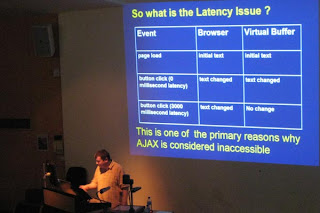
The crucial question we have to consider is, when and how does content become available to the user after it's been updated in the browser?

[Steve Faulkner and the Latency Issue]

Latency is a problem because the virtual buffer does not update and the user doesn't know anything has changed. However, JAWS v7.1 started "listening" for virtual buffer updates in response to things like:
  • window.setInverval()
  • object.innerText (for IE)
  • object.textContent and object.appendChild (in Firefox)
  • changes in form control values
  • And other stuff like ALT or TITLE attribute value changes.
Jez Lemon has an excellent article on Improving Ajax Applications For JAWS Users on his webiste. Steve summed up with some recommendations:
  • Do not code to accommodate the poor support shown by JAWS and Window Eyes.
  • Use unobtrusive methods where available and appropriate, to help screen readers along.
  • Don't use the excuse that JavaScript / Ajax is not accessible for screen readers to not bother to design for accessibility.
  • Start developing interface elements that use WAI-ARIA specs, which will provide some benefits now and many more in the future.
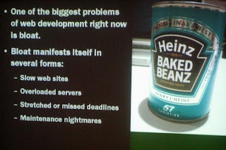
Steve's thought-provoking presentation was followed by a turn from Christian Heilmann entitled Seven Reasons For Code Bloat

[Christain's been on the beanz again]

His notes are available for download from his blog, so I won't repeat them verbatim. Needless to say, it was a fun presentation and contained the obligatory photo of a kitten ;-). Meanwhile, he's thinking of this as the title of his next book:
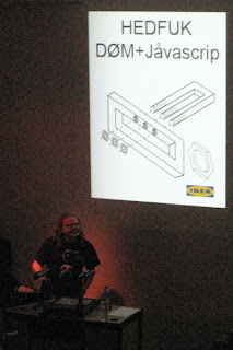
[Christian's Next Book?]

PubStandards XVIII
Of course, the next item on the social agenda was the PubStandards gathering. Lots of fun and revelry as usual, here's one photo, but you can see more on Flickr.

[Patrick & Ashe go head-to-head, while Ross butts in the middle]

Tuesday, March 20, 2007

Mobile Web Best Practices

Sheila went to the 3GSM World Congress in Barcelona a few weeks ago, and picked up a handy set of cue cards on designing for the mobile web, which she was kind enough to give to me. It was great timing, since I'd been thinking for a while about the best way to go about designing for mobile devices. The cue cards promote the W3C's Mobile Web Initiative, and are great prompts on the best techniques to use.

[Mobile Web Best Practices cue cards]
So for those who don't have a copy, I thought I would share the wisdom that they detail. More info can be found at http://www.w3.org/TR/mobile-bp/ - but the below is a distilled and much more user-friendly summary.

10 Ways To Mobilise
The cards are broken into ten topics, with hints and advice on each:

1. Design for One Web
Content designed with diverse devices in mind reduces cost, increases flexibility, and reaches the needs of more people.

Thematic constistency - ensure that content provided by accessing a URI yields a thematically coherent experience when accessed from different devices.

Capabilities - exploit device capabilities to provide an enhanced user experience.

Deficiencies - take reasonable steps to work around deficient implementations.

Testing - carry out testing on actual devices as well as emulators.

2. Rely on Web Standards

In the highly fragmented market of devices and browsers, standards are the best guarantee for interoperability.
Validate Markup - create documents that validate to published formal grammars.

Content Format Support - send content in a format that is known to be supported by the device.

Content Format Preferred - where possible, send content in a preferred format.

Character Encoding Support - ensure that content is encoded using a character encoding that is known to be supported by the target device.

Character Encoding Use - indicate in the response the character encoding being used.

Style Sheet Use - use style sheets to control layout and presentation, unless the device is known not to support them.

Structure - use features of the markup language to indicate logical document structure.

Error Messages - provide informative error messages and a means of navigating away from an error message back to useful information.

3. Stay away from known hazards

Thoughtful design can help reduce usability problems due to small screens and keyboards, and other features of mobile devices.
Pop Ups - do not cause pop-ups or other windows to appear and do not change the current window without informing the user.

Tables Nested - do not use nested tables.

Tables Layout - do not use tables for layout.

Graphics For Spacing - do not use graphics for spacing.

No Frames - do not use frames.

Image Maps - do not use image maps unless you know the device supports them effectively.

4. Be cautious of device limitations

When choosing to use a particular web technology, consider that mobile devices vary greatly in capability.
Cookies - do not rely on cookies being available.

Objects or Script - do not rely on embedded objects or script.

Tables Support - do not use tables unless the device is known to support them.

Tables Alternatives - where possible, use an alternative to tabular presentation.

Style Sheets Support - Organise documents so that, if necessary, they may be read without style sheets.

Fonts - do not rely on support of font related styling.

Use of Colours - Ensure that information conveyed with colour is also available without colour.

5. Optimize navigation

Simple navigation and typing become critical when using a small screen and keyboard, and limited bandwidth.
Navbar - provide only minimal navigation at the top of the page.

Navigation - provide consistent navigation mechanisms.

Link Target ID - cleary identify the target of each link.

Link Target Format - Note the target file's format unless you know the device supports it.

Access Keys - assign access keys to links in navigational menus and frequently accessed functionality.

URIs - keep the URIs of site entry points short.

Balance - take into account the trade-off between having too many links on a page and asking the user to follow too many links to reach what they are looking for.

6. Check graphics & colours

Images, colours and style brighten content, but require care due to inconsistent support for some formats low-contrast screens.
Images Resizing - resize images at the server, if they have an intrinsic size.

Large Graphics - do not use images that cannot be rendered by the device. Avoid large or high resolution images except where critical information would otherwise be lost.

Images Specify Size - specify the size of images in markup, if they have an intrinsic size.

No Text Alternative - provide a text equivalent for every non-text element.

Colour Contrast - ensure that foreground and background colour combinations provide sufficient contrast.

Background Image Readability - when using background images, make sure that content remains readable on the device.

Measures - do not use pixel measures and do not use absolute units in markup language attribute values and style sheet property values.

7. Keep it small

Smaller sites make users happier by costing less in time and money.
Minimise - use terse, efficient markup.

Page Size Limit - ensure that the overall size of page is appropriate to the memory limitations of the device.

Style Sheet Size - keep style sheets small.

Scrolling - limit scrolling to one direction, unless secondary scrolling cannot be avoided.

8. Use the network sparingly

Web protocol features can help improve the user experience by reducing the impact of network bottlenecks and latencies.
Auto refresh - do not create periodically auto-refreshing pages, unless you have informed the user and provided a means of stopping it.

Redirection - do not use markup to redirect pages automatically. Instead, configure the server to perform redirects by means of HTTP 3xx codes.

External Resources - keep the number of externally linked resources to a minimum.

Caching - provide caching information in HTTP responses.

9. Help & guide user input

Keyboards and other input methods on mobile devices can be tedious to use, so effective designs minimize the need for them.
Minimise Keystrokes - keept the number of keystrokes to a minimum.

Avoid Free Text - avoid free text entry in forms, where possible.

Provide Defaults - provide pre-selected default values where possible.

Default Input Mode - Specify a default text entry mode, language and/or input format, if the target device is known to support it.

Tab Order - Create a logical order through links, form controls and objects.

Control Labelling - label all form controls appropriately and explicitly associate labels with form controls.

Control Position - position labels so they lay out properly in relation to the form control to which they refer.

10. Think of users on the go

Web users on the go want compact information when time is short and distractions many.
Page Title - provide a short but descriptive page title for every page.

Clarity - use clear and simple language.

Central Meaning - ensure that material that is central to the meaning of the page precedes material that is not.

Limited - limit content to what the user has requested.

Suitable - ensure that content is suitable for use in a mobile context.

Page Size Usable - devide pages into usable but limited size portions.

And reading through these, most of the list sounds equally applicable to overcome other accessibility issues. Wise advice, which isn't always easy to follow!

Saturday, March 03, 2007

WSG London #3 - Accessibility

I'm playing catch-up a bit with blogging. I was at the third London Web Standards meeting on 28th February, which had an Accessibility theme.

We had three very different talks, each highly informative and enjoyable.

Niqui Merret on Accessbile Flash
Niqui started out by saying that Flash and accessibility don't have to be mutually exclusive, as many people presume. However, in the real world:

No single technology can be 100% accessible to all users. Aim to achieve the most accessible solution possible.
It's up to developers, programmers and copywriters to make sure their contributions are as accessible as possible. It's also up to the software vendors (eg of screen readers) to try and implement the standards properly and as quickly as possible. She also mentioned FlashAid (talks to screen reader and turns off the Javascript/Ajax so browser sees alternative accessible content) and SWFFix (a tool for progressive enhancement) as useful resources for Flash developers.

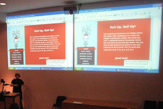
She talked a bit about the Accessibility panel in the Flash authoring environment, which allows developers to set things like Tab order and ALT text. And she demonstrated a fun little game in Flash, which was fully accessible without mouse and to screenreaders:

[Niqui demonstrates her accessible Flash game]

Ann McMeekin on Accessibility - What Not To Do
Ann is a Web Accessibility Consultant for the RNIB, and clearly knew her subject inside out.

She made many excellent points, but some of the most salient were:
  • Don't assume all users with disabilities are the same
  • Don't ignore users who come to you with a problem
  • Don't forget to set your page's default colours - background and foreground (if not, changing Windows default colour scheme could have a dramatic effect)
  • Don't waffle - be clear and concise, don't repeat yourself
  • Just because you can add a title attribute to almost anything, doesn't mean you should - it's largely redundant if your link text is descriptive enough
  • Don't be shy - show skiplinks, and use :focus and :active as well as :hover
  • Put instructions before forms - otherwise someone who has zoomed the page (magnified) doesn't have a hope in hell of seeing what the labels are
One of the most surprising things was to learn that most screen readers will read out the legend to an accompanying fieldset before every label in the fieldset - so it's important to keep legends short and concise, and so they will make sense when read with the form field label.

[right, Ann in full flow]

Two final thoughts from Ann:
  • Don't jump on the bandwagon and implement the latest cool widget without knowing what impact this might have on your users
  • Accessibility doesn't mean you can't be creative
Mike Davies on Web Accessibility - The Developer's Tale
Mike's talk was a case study of the re-design of Legal & General's website services and applications, which he had been heavily involved with before his move to Yahoo! in the summer of 2006.

Four years ago, before the project started, L&G's website was ranked 92nd in a FTSE100 survey of websites; it ranked badly with search engines, had at least 150 links on every page and was horribly inaccessible. Through the vision of the website manager, the site was completely redesigned with accessibility at the heart of the thinking.

They reaped the benefits very quickly:
  • 40% increase in website traffic
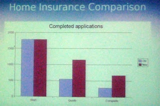
  • doubled conversion rates (that is, number of people completing an online application for insurance etc, versus those who start the process)
  • doubled online revenue
  • cut maintenance costs by two thirds
  • increased natural search-engine traffic by 50%
  • paid for itself in five months
[conversion rates for Home Insurance - lilac = old site, burgundy = new site. The first two bars are the numbers starting the process, middle represents those finishing a quote and last pair are numbers of completed applications]

And the website is now held up as a highly-regarded example of how to do things properly - it is a PAS 78 and AccessibilityNet case study, has accreditation from the Shaw Trust, and is cited in books on accessibility.

Thanks again to Stuart for organising an excellent event. I look forward to the next one.

Monday, February 12, 2007

Previews

BarCamp Presentation
I'm happy to have finished writing my presentation for BarCampLondon2. I've decided to do a spot on Better Picture Taking as there seem to be plenty of folks with digital cameras who want to know more about getting the most out of their gear. It won't be technical, and it won't be biased towards any particular type or brand of camera. Instead, I'll be covering the basics of good composition and lighting, plus editing your pictures for showing to friends. After BarCamp, I hope to blog most of the content for those who couldn't attend.

I've gone for a non web-related topic as I figure I'll be teaching many of the attendees how to suck eggs if I talk about web standards or css. Others have said that some of the most interesting topics last time round were those which were a bit off the beaten track. So here's hoping it will go down well.

Geek/Girlgeek Dinners
I notice there are a couple of geeky dinners coming up soon. They seem to have shot themselves in the foot slightly in that they're both on the same day! So, clone yourself or toss a coin to decided which of the following you'd rather attend on 21st February:

Unfortunately, I'm unable to attend either event as I'm already busy, but I will be keen to read any blogs about them afterwards. Please let me know if you write a review.

WSG London #3 - Accessibility
Stuart has put together another great programme for the forthcoming WSG meeting on 28th February. Now that's one I will be able to attend, and am looking forward to what Anne McMeekin, Niqui Merret and Mike Davies have to say on the subject.

Thursday, December 14, 2006

A Quick Roundup

Screen Reader Demo
I've been very poor at keeping up with my blogging of late. I meant to post a few days ago after attending an excellent Screen Reader demo at Test Partners. Steve Green led the session, and John Welsman (Freelance Assistive Technology Consultant) amazed us all with his speed and dexterity at negotiating the web with JAWS. John also brought along his lovely dog, Dalton, who sat very quietly in the corner all afternoon.

It's only when you witness a blind user having to negotiate the tag soup and badly muddled code that still makes up a huge proportion of the web, that you really appreciate why semantic markup is so important.

  • A website may look great, but take off those stylesheets, and if there are no headings in a document, the user has no way of knowing which sections are which, without wading through loads of text.
  • Jaws will announce how many items are in a list, so it can be very easy to get a mental picture of the navigation items, if they are marked up this way, rather than dumped in a table.
  • A visually impared user builds up a mental model of the page in a completely different way to a sighted user - they have no sense of left or right, everything is top-down - so source order of your code is vital in aiding their understanding.
  • Consistency is the byword - not just in the way things look, but in source order, for instance. Markup pages the same way, and you will give a blind user a head start in visualising the next page they visit on your site - because some of the mental model will still apply from previous pages they may have visited.
Frances also did a writeup of the event, and so I won't repeat too much stuff here. Steve Green also makes some excellent comments on Frances' post.

BBC Backstage Xmas Bash
The geek Christmas event of 2006 was great fun, at The Cuban bar in Citipoint. Ably organised by Ian Forrester, nearly 400 folks attended. It was really nice to catch up with The Usual Suspects, and I was also able to chat with a few people I hadn't had the pleasure of talking to before, including Eric Meyer, who was in London running a 2-day Carson Workshop. I'm kicking myself that I wasn't able to go along to share Eric's knowledge, but work wouldn't pay! Maybe next time?

Glutton For Punishment
Talking of parties, I'm just about to head off to the Pub Standards Christmas party this evening, so I better get my skates on...

Friday, November 10, 2006

Patronage And Other Musings

You may have noticed the "i'm patronising" badge on the side of this blog. What's it all about? Well, Joe Clark has a big plan and he needs small donations towards keeping him fed, while he spends four months trying to raise $7 million (canadian) to undertake the research he wants to carry out. He's targeting four major strands of accessibility, and has set up the Open & Closed Project in order to do so. By donating a modest sum, folks like you and me can make a small contribution, which in turn will allow Joe to make a big one. Good luck Joe!

Two more recent posts concerning accessibility have caught my eye:

Tuesday, October 17, 2006

Gone Into Hiding?

You may have wondered if I've gone into hiding as the blog has been very quiet lately. Well, the answer's no, but I have had a week off doing stuff at home and not going near the computer very much. Makes a nice change, every now and then!

Emerging from my exile, I'm blinking in the bright light of day and trying to catch up with a bit of blog reading, writing and other pc-related stuff.

Olly Hodgson has some excellent links, which I've been following up, and then generally getting lost in the blogsphere. I'm also waiting with baited breath to see how The CSS Div almost got himself killed...

Here's a few good posts about accessibility issues:

As an antidote to my recent exile, I'm also being very sociable this week, with the upcoming events in London to attend - WSG London #2 - Microformats and the London Geek Dinner with Molly H. Will report back on them later in the week.

Wednesday, September 13, 2006

Podcasts - Usability & Accessibility

Roger Kondrat over at TechWinter has two excellent Podcasts about usability and accessibility - two areas of particular interest to me.

To listen to the podcasts, go directly to Roger's blog:

#1: What is Usability and what does it mean to me? - a discussion with Lisa Halabi, Head of Usability at WebCredible.

#2: What is Accessibility and what does it mean to me? - a discussion with Trenton Moss, Head of Accessibility at WebCredible

They both make excellent points, and give sensible advice for those wishing to convince clients or superiours of the value of good usability and accessible sites.

It amazes me that, with so many positive benefits to using semantic XHTML and CSS, (not least the "freebie" benefit of much better SEO for your site), some company'sdesign mindsets are still rooted in tables and inline code soup.

Friday, September 08, 2006

d.construct, Accessible Web Applications In A Post Web 1.0 World

A presentation by Derek Featherstone

[Derek waves his arms and steadfastly refeses to use the phrase "web 2.0"!]

Derek is an accessibility expert who is trying to get the message across that, even in a web2.0 world, accessibility should still be a goal, and and achievable one.

The web now is moving towards functionality and applications, and away from the document-centric approach. To make apps accessible, it is vital to separate the app into three distinct areas:

  • Content (eg semantic, standards-compliant XHTML)
  • Presentation (CSS does all the hard work)
  • Behaviour (javascript, AJAX or other behavioural language)
All too often, 1 and 2 are adhered to, but 3 still remains buried in the page, and therefore accessibility issues begin to kick in. What happens when someone doesn't have JavaScript enabled? Can they still see the content, etc.

One common example Derek mentioned was the default text you often find in a search box, which some JavaScript removes when the element gets focus. What happens if you're a blind user who fills in the box, tabs to the next form element, decides to tab back to the first, and can't understand why the text they thought they'd typed had disappeared!

Fix senarios - either make the JavaScript check, and ONLY removed the default text, but retain the user-input text. Or, perhaps don't use default text at all, but instead use a Tool Tip on the form element to give some more information.

Similarly, validation error messages should always appear near the form control they validate. If you put it at the top of a page, and a user has the screen hugely magnified, they will never see the error text as it's well out of their portion of the viewport. Perhaps changing the background colour of an element which fails validation could also be useful.

So if it's easy to get such simple things wrong, what about applications using AJAX which can be very complex? The answer is, wherever possible, to try and make the content linearised within the page by setting tab orders etc to "lead" users through their application journey in a sensible way.

Tabindex="-1" might sound like an invalid value, but it is supported by IE and Firefox. It can be programmatically, as it does not show up in a tab set, but you can use it to force focus onto an element.

Drag and Drop interactions are great for the mouse-enabled community, but pretty hopeless for those only using a keyboard. So don't make it the ONLY way of doing something. Also, make the "hit area" of links or things to drag as large as possible, so that users with impaired mobility don't have to be so accurate with their mouse movements.

Saturday, June 17, 2006

@media, Hot Topics Panel

Closing panel for the conference. Just a mixture of random thoughts and questions.

  • CSS is still an undiscovered country - progressive CSS should come. IE7 is playing catchup with a lot of the other browsers.
  • Evangelising on the use of CSS is done - it should be a given (ha ha ha in some places)
  • We're now waiting for the next leap forward in what we can depend on as far as browser support for the standards.
  • Tantek demonstrated cutting edge css in Safari - a honeycomb pattern (yes, hexagons!) with rollover change of state - done entirely with CSS and not a graphic in sight. Blimey! That man has an enormous brain...
  • Wireframing applications with XHTML/CSS is the only way to test fluid and changable size of text etc.
  • What's missing from WebUI - Tantek would like an "undo" analagous function - plus CTL-S to save text in a form as you're going along (how many times have forms bombed on send, much to our cussing?) Or even better, persist it in the browser so its still there when you come back next time.
  • Yahoo Libraries - no idea why I wrote this down, will have to Google for enlightenment ;-)
  • Can Ajax be made accessible? Questioner wondered whether inaccessibility was a fundamental problem of Ajax, or just how it is implemented on any given site. User Agents are not really fully Ajax capable. Refs, Derek Featherstone/Joe Clarke basecamphq.com
  • According to technorati.com 's user stats, 15% of users have Javascript turned OFF!
  • It's best to specialise, but be aware of the designer/developer "trench" :-)
What's Coming Up?
  • We need real, practical solutions for web designers
  • Best practices
  • Microformats, iCal
  • OpenData - µ-formats, mashing, GoogleMaps release API, giving us frappr.com
  • hCards hCalendars and RSS
There should be podcasts of the seminars out in due course, available from the @media website.

Friday, June 16, 2006

@media, Beyond A Code Audit

Accessibility is about more than just making sure you have passed the code audit points in WCAG, said Robin Christopherson of abilitynet.org.uk

Useful Test Tools/Tips:
Home Page Reader (text only) - cheaper than JAWS.
Natural Language - if you switch language mid-paragraph, use the Inline Language Tag to flag it so that screenreaders know how to correctly interpret the change for pronunciation.
Always define background and foreground colours by default, you can never assume they will be black and white (say).
textaloud.com is a text-to-speach engine.

Problems with FLASH
Dynamic content is difficult to make accessible in Flash. For instance, ALT text should exactly match the words shown in an image or Voice Recognition Software doesn't work properly. Flash breaks the Say What You See rule.
The Flash Accessibility presentation at macromedia.com is totally aural with no text transcript => breaks one rule of accessibility straight away! No tool tips on any of the Flash buttons. Dynamic content requires a screen refresh otherwise screen readers are not aware that content has changed (one of the big problems with some emerging Web2.0 apps). Presentation is low contrast - which would probably fail the Vischeck criteria.
Flash content is never as accessible as HTML (and by inference to search engines also). Robin (blind) did not find it easy to use Flash presentations as he was never sure if he was missing something. Also for partially sighted people, you can't change the font style or colours in a Flash movie.

Problems with Javascript
JS can be a nightmare when its used to provide main functionality for a site - it's sometimes not enough just to produce a no-JS version of a page if you're relying on it to accomplish something fundamental. Non-JS versions of a page need to be flagged as available as Home Page Reader is a plugin to the IE engine, and therefore the user agent could well have JS enabled.
Using a Javascript routine to update the time displayed on a page every second can cause havoc - the screen reader has barely had time to read out the nav links before the page is declared to have been refreshed and it all starts again from the top - you get stuck in an infinite loop and can never get out!

Problems with Colour / Whitespace / Text Alignment
Never use colour solely to convey meaning - The Tube Map fails the colourblind tests!
People with congnitive disabilitities can have big problems if enough white space is not provided - don't crowd things together. Use the tags to define abbreviations, plus a decent-sized sans-serif font.
Folks with Dyslexia have trouble reading fully justified text due to the uneven word spacing - left justified text is much better for them.

Assistive Technologies and their special requirements:
Headset mouse emulator - fine control of movement can be limited - don't make links too close together like lastminute.com. Google's Next page links have good spacing.
On-screen keybord - takes up valuable screen real estate
Suck/Blow tube for left/right mouse click - again, can make movements clumsier than with a mouse alone
Screen Magnifiers - disney.com was a nightmare to view with a magnified screen because of the lack of proper TAB order - the cursor went all over the place, often out of the immediate viewport of the magnified screen. Users get lost.
Screen readers - IE7 is not good with these at present.
No Mouse - tab order is vital - take a look at the Vatican's site to see what a screwed up tab order can do :-(
Also, Tab Focus can be tricky to distinguish - some sort of obvious highlights work best..
Skip Nav Links - when they get focus they can have unhide set on them with CSS which is quite neat.

@media, Bulletproof Web Design

Accessible ways to bulletproof your website, by Dan Cederholm.

If you are using an image background for any element - apply colours as a fallback too.
Bulletproofing applies to:

  • Content - text size, content amount (overflows don't cause your design to blow up)
  • Editing - content changes and maintenance
  • Environment - what happens in various device/browser senarios (turn off CSS, JAvaScript etc
Ref: John Allsop - "The Dao Of Web Design"

How to make an icon with text and arrowhead the easiest way?
You could use an image (not editable easily), or CSS styled text and b/g colour and a "sliding door" type arrowhead as a b/g image element applied to the div.

Site headers used to be easy with tables - how do we have a logo aligned left and tabs/links aligned right?
Use one div for the header b/g (and perhaps use img as b/g to that) then float:left the div surrounding the logo, and float:right the div surrounding the nav/tabs/links. Reference: Positioning Is Everything - Easy Clearing

Also, use Modules (divs) which can be placed on the page. Fixed height modules will break with larger text sizes - you need to employ a Vertical Sliding Doors type technique.

Accepting The Box
The box model obviously leads us towards a mor rectangular layout, but you can break out of this visually by applying subtle b/g images to corners (one per element so if you want two, you might have to apply one to div b/g and one to h2 or p background) - to give the impression that things are rounded off or turned over at the corners. Refs: Hicksdesign.co.uk, Odeo, Vivabit (two rounded corners), cameronmoll.com (fancy top and bottom gifs for headings).

Reusable Ornamentation
Effective additional styling elements can be useful for breaking up the boxiness of a site. Eg for h4, give it a top border, text+b/g colour, then img b/g aligned to below and centred 50% - which iif its larger than needed will also suffice for long headlines. See some of the stuff on csszengarden for more ideas.

Pimp Up My Navigation!
Use a gradient b/g image to underlay text, then give the list item a two-sides + top border. Use CSS to style with different colour on mouseover. The only drawback - the :hover pseudoclass only works on anchor links in IE - but you can set li:hover for browsers like FireFox which know what to do with it - it'll just look heaps better in a standards compliant browser without breaking in IE6. You can attach icons to links easily by using a href="blah.htm"
class="edit" and then in the css, a.edit {background-image: url(edit.gif) } or whatever. Refs: haveamint.com, joyent.com, uncorked.com

Layouts - Fixed vs Fluid?
Fluid is better for increasing text sizes and accessibility, but can have major knock-ons for designs. Ref: rollyo.com - used mix and match: Home page is fixed width, but fluid on search results centre column. This is great, but the max-width CSS declaration is not supported in IEWin (dammit), eg #wrap {max-width:1200px;}
Refs: vertua.com uses %-tage width cols on either side to resize the central column.
simplebits.com

Variable Fixed-Width Layout
Wide layout for most browsers (four columns) - but then some clever DOM scrupting with JavaScript switches a stylesheet or class when the browser window is narrow, such that you now get four rows instead! Neat. Ref: cameronadams.com

Bulletproof Tools - Take the 10-second Usability Test:
  • Take away the design (css) - is the site still understandable (a lot to do with semantically correct HTML and source order)
  • Validation - keeping valid code 100% of the time can be difficult to maintain, but key while designing a site is constant validation of Markup and CSS - avoids lots of aggro when stylesheets don't work for silly reasons.
  • Turn off images and see what happens
  • Text size - pump it up a few sizes and see what ballooning text does to your design
Concepts - embrace flexibility - you will never get a site looking identical in in all browsers, but if it's still functional and usable, across a wide range, that's OK: Let go of pixel-accurate design constraints.

Issues
Print CSS - still a problem to be able to print out images used as backgrounds to any element. Refs: collylogic.com, muffinresearch.co.uk (drop coloumn site with pure css)
Hacks - Keep IE-specific hacks in a separate stylesheet; keep your main stylesheet clean. Refs, Molly H's article, "Strategic CSS Hack Management".


@media, WCAG2.0

A quick run-through of some of the new features in the Accessibility Guidelines v2.0.

References: juicystudio.com and accessifiey.com

Why change the existing regs? They are nearly 9 years old and should be:

  • Technology agnostic, using general terminology
  • Perceivable (ie catering for sensory deficiencies)
  • Operable
  • Understandable
  • Robust
New features inlcude terminologies such as web unit; more conformance. There are also several supporting documents, besides the actual standard, namely:

  • Understanding WCAG2.0
    For each guideline, it explains the intent, why the need to address a problem; how to meet the success criteria; benefits of meeting criteria; advisory techniques and examples.
  • Techniques for WCAG2.0
    This is a big, unwealdy document! Starts with listing the common failures (not very positive). Covers client-side scripting techniques, CSS, general techniques, HTML et.
  • About Baselines for WCAG
    What are they? Annotated examples.
    Who sets the baseline; how can developers choose their baseline
  • Application Notes
    To follow
New features - baselines are better (?)
Scoping:- conformance claims are not mandatory but you can say certain parts of a site aren't specifically in scope.
Does it hinder design? - you have to think of philosophy vs practicality.

Reference: Go to http://www.w3.org/WAI/WCAG20/quickref/ and select your baseline technologies. It will then generate a reasonable checklist of what you need to cover for HTML/CSS/JavaScript etc.