Showing posts with label my barcamp2 presentation. Show all posts

Tuesday, February 27, 2007

Photographic Tutorials

Sheila had a good idea, to collect the titles/links of my tutorials on photography, initially written for BarCampLondon2. I'll also be updating the list regularly when I post a new photography tutorial, so you can easily keep tabs on them.

Taking Better Pictures
These were the posts which formed my presentation at BarCampLondon2. They are aimed at anyone who would like to improve their photography, whether they use a fully-automatic compact camera or SLR. The principles apply equally to film and digital photography.

Getting Technical
These are aimed at people with a bit of photographic knowledge, but would like to learn more about the technicalities. They will explain the affects of ISO speed, shutter speed, apertures and more.
Please get in touch by leaving a comment if you would like any other aspect of photography explained.

Monday, February 19, 2007

Vibrant Colour

Theory
Subjects with vivid colours have immediate impact.

Again, this can be one single colour or perhaps two complimentary colours from opposite ends of the specrum - eg. blue and yellow.

For the most vibrant colours, you need good strong lighting - plenty of sun or perhaps flash, depending on the subject.

Examples

[The Mini Crevass - anything red has an immediate impact, and this macro shot of frost patterns on my car is no exception]

[The Green Lens - still striking, but grabs the attention a little bit less than it's red brother. The lighthouse lens is lit from behind by a shaft of sun]

[The Stamping Ground - stage lighting gives this shot a dramatic feel. I liked the contrast between red and yellow gels]

[Blue Luzzu - strong Mediterranean sun (and a polarising filter) brought out the depth of the colours in this Maltese fishing boat. I liked the complimentary blues and yellows]

Subdued Or Single-Colour Images

Theory
Selecting subjects with subdued colours, or all from one end of the spectrum, can evoke a particular mood.

It can be particularly effective in showing shapes and textures

Examples

[Smokey Shed - this is actually a colour image, showing the merest hint of grey/green in the shafts of light and pale pink and blue in the skylights]

[The Rusty Cog - a combination of browns and oranges show this scene in a very limited colour palette. The differentiation between foreground and background is largely through focus]

[Autumn Vines - the vines show leaves of green and pale yellow, with a bit of brown at their feet. Notice also the strong lead-in lines and "stop" (the darker green fir tree) at the back]

[Question Mark - just a few shades of cream and brown give a calm atmosphere and clean lines]

Texture & Tone in Monochrome

Theory
The right lighting is vital for conveying the texture and defining the tone in monochrome pictures.

Strong side lighting on the subject will create the best emphasis of light and shadow.

Soft lighting will lead to a more subdued image with smaller tonal range:

  • Images with lots of dark tones are said to be "low-key"
  • Images with lots of light tones are said to be "high-key"
Examples

[Cycle Lane - with a predominance of dark tones in the picture, this is definitely a low-key image]

[Mist Over The Farm - even though this has a very bright sky, the images is more low-key than high-key, with the dark silhouettes in the foreground dominating the image]

[Grey Horizons - this is probably more high-key than low-key - there is a predominance of paler tones, with only a few darker shapes]

[And Let Thy Feet… with only one small area of black in the frame, this is a high-key image]

Composition #8 - Using Triangles

Theory
The humble triangle can be a useful compositional device to improve your pictures.

Upright or inverted, they act as extra lead-in lines or can encapsulate the subject being photographed.

The triangle can be formed by tangible straight lines, or objects at each virtual corner.

Placing three objects in triangular formation is much stronger than the eye "bouncing" between two subjects - odd number repetition is best if possible.

Examples

[Bringing In The Catch - three boats in the harbour form the corners of a flattish triangle, also main interest in the picture is restricted to the middle third strip]

[Fungi and Treestump - here, the main content of the picture forms a natural inverted triangle, albeit made from circular objects (repetition with different sizes). I was careful to line up the top "side" with the edge of the frame]

[Overthrow - the players make up most of this upright triangle with their lineout jump - but it is capped off by the all-important ball. Neither of them caught it!]

[Louvre Geometry - this one is a special case, with two triangles (outlined). The lower, inverted one is very obvious, but the upper part is just as important]

Composition #7 - Fill The Frame, Or Not?

Theory
Nobody wants to play "hunt the interesting bit" with your photos! So get in close, and fill the frame. Remember:

"If it's not good enough, you're not close enough"
[Good advice for all except war photographers and wild animal specialists]

Or, make a point of not filling the frame, but giving the picture some "positive space" - a tricky thing to define, but examples should make things clearer. The skill is knowing which to go for under what circumstances!

Examples

[It Takes Allsorts - get in close, fill the frame]

[Lovely Bubbly Aero - get in close, then fill your tum after the photo shoot!]

[The Racing Line - most of the frame is empty track, but having the car so far off to the right does give an impression it's struggling to stay on the tarmac]

[The Red Roof - most of the picture is sky, but the gull and hut balance each other well]

Composition #6 - Using Repetition

Theory
Repetition can be appealing, but too much of the same thing can be boring.

Instead, take subjects which show repetition but with a slight difference:

  • Similar objects, of different sizes or focus
  • Similar objects, of different colours
  • Similar objects, in different positions
Examples

[Pencils I - the variation here is colour, size and position - the ends of the pencils were all lined up, and the difference in their lengths was entirely down to how much they had been used in the past]

[Windows Within Windows - foreground windows repeat uniformly, their reflected counterparts all suffer from different distortions in the glass]

[The Table Setting - a simple found still-life shot - the wine glasses, condiment set and red gerbera, each of different sizes and gradually getting less sharp as they get further back]

[Floral Details II - the blooms repeat in different positions and gradually less focussed further back in the picture]

Composition #5 - Creating Depth

Theory
Depth can be emphasised with good lead-in lines.

Also, make sure there is something of interest in the three areas of your picture:

  • Foreground [rocks]
  • Middle distance [sheep]
  • Background [hills]
It's those thirds again…

Examples

[Beached Lobster Pot - getting up close to the lobster pot (with a wide-angle lens) made it appear bigger in the frame; the rocks lead through the middle ground to the background hills]

[Heavy Traffic - the huskies in the foreground lead to skiers (middle ground) and hills beyond]

[Twilight Expedition - foreground interest is provided by the figures and dinghy, mid-ground is the tethered boat and more hills in the background]

[My Imaginary Friend - foreground girl is reflected to give some middle-distance interest; the background is not so significant in this shot]

Composition #4 - Framing Elements

Theory
There are two aspects to framing your pictures:

  • Make sure unwanted things don't cut into the side of your photos - always look around the viewfinder (or LCD screen) to check
  • Pictures can be enhanced by carefully framing the view - eg. with tree brances
Examples

[Le Chat Qui Pêche - the foreground path and overhanging trees frame the scene top and bottom, and the leaves cover up some boring sky]

[Ingatestone Hall - the horizon is placed high up, while the tree and its shadow appear to wrap around the building]

[The Castle Keep - I moved into a position where the archway framed the buildings beyond and the sunlight reflected from a window appeared behind the lamp fitting]

[Scrum Between The Posts - a scrum at the other end of the field, framed through the posts, provided a shot which showed more context to the situation]

Composition #3 - Using Symmetry

Theory
The rule of thirds is useful for many subjects, but not all.

If you see a symmetrical subject, it's often better to compoase so that the line of symmetry is right in the middle of the picture.

Take care to make sure the symmetrical subject really is in the middle - slightly off-centre and it will look odd.

Examples

[Transporter Bridge - I stood right in the middle of the roadway (waiting for the bridge to com back to our side) and got everything balanced]

[Southwark Roof - taken from the middle of the aisle, also showing lead-in lines pointing to the stained glass window at the end]

[Victorian Hangar - carefully composed, with all lines leading towards the window at the end of the room]

[Picture Window - sometimes you get lucky with two planes of symmetry - here the horizontal and vertical framing was very carefully controlled to be equal on opposite sides, even though the main content (the reflections) are not perfectly symmetrical]

Composition #2 - Lead-In Lines

Theory
Try to encourage the viewer's eye to go deeper into a picture. Lead the eye around the frame by using:
[straight lines, gentle curves]


[imaginary lines formed by picture elements]

Always make sure there is an object at the "stop" point where the line finishes, which reinforces the lead into something tangible.

Examples

[The Time Tunnel - lines converge towards the figure in the bottom left hand third]

[Sunlit Cloisters - imaginary lines formed by arches and shadows converge towards the two windows at the end of the corridor]

[The Long Trek For Water - curved line formed by the footprints lead to the figures at the water hole]

[Lights On London Hill - the snaking s-curve leads off into the distance, but the presence of the car heading towards us stops the eye wandering off too]

Composition #1 - The Rule Of Thirds

Theory
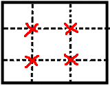
Try to put the main point of interest in your picture at one of the intersections of the thirds:

Or devide the sky/land line on a 1/3rd 2/3rd ratio. Try to avoid putting the horizon half way down the picture.

Examples

[Over The Rainbow - horizon on the lower third, protruding flower is on the horizontal and vertical third intersection]

[Sunrise, Calanais - horizon on the lower third, sun is on the intersection of the horizontal and vertical third]

[Pienza Hillside - high horizon on the upper third]

[Pencils IV - point of focus on the left hand third, but half way up this time]