Showing posts with label dan cederholm. Show all posts

Thursday, June 07, 2007

@media - Design Interface Juggling

Dan Cederholm took us through the various elements of interface design that a good juggler should be able to "keep in the air".

[Dan and his interface-juggling octopus]

Colour
Colour evokes an emotional response in the viewer, and we need to be careful when choosing a palette. At Wellstyled.com, there's a handy widget for generating complimentary colour schemes. Try it out.

Dan had mocked up a site especially to demonstrate some of his points - go have a giggle over at ToupéePal!

One good way of choosing a palette is by taking shades from a photo - either sample direstly, or pixellate it and use some of the blocks. Dan often starts with colour as the inspiration for a site and works from there. He will re-use certain strategic colours throughout a site, eg Links, headings etc. The colour used for links will always carry weight in the design.

Typography
Great typography is actually invisible - we don't notice it. But do it badly and it sticks out like a sore thumb. He recommended the article, Web Design is 95% Typography to read.

There are a limited number of fonts we can realistically guarantee a user having on their system, but within these constraints, we can still get creative. Try using the text-transform uppercase or lowercase styles, change the letterspacing, text-align, leading etc to vary the typographical colour of a block of text. Good reading: "The Elements of Typographical Style" by Robert Bringhurst, if you can find it. Read more on applying it to the web here.

Favicons
Could be regarded as the most important design element on your site! They are the thing that represents it in the shortcut icon, browser address bar etc.

[Subtraction.com uses each site's favicon as shorthand branding for the link]

So when creating a favicon, it has to be something memorable. They must:

  • Scale well down to 16x16 pixels
  • If the whole logo doesn't work, choose a fragment to focus on
  • Use something unique about the site that still ties in with the branding
Icon files can be made with Iconographer or a plugin for Photoshop. As well as the standard 16x16 icon, 32x32 and 64x64 pixel icons can be inserted into the same .ico file. There's an interesting collection of Favicons at Delta Tango Bravo's blog.

Add Detail But Not Complexity
Understand the limitations of the browser, and suggest the box [model] but with minimal suggestions. Perhaps use just one rounded corner on an element. Re-use graphic elements where you can.

Microformats
If you site contains any sort of contact information, events lists, reviews or relationships, then you should be marking them up with Microformats. Using what works today can encourage others to do the same:
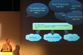
[The Microformats can be used by people, applications and as hooks for CSS]

Brian Suda did some parsing of Cork'd for Microformats, and used this information to add wine reviews (from Cork'd) to his Scrugy site, where you can learn all about wine. Corkd's Microformats had produced an accidental API. If you were to mash this up with a list of your XFN friends, you could use it as a filter for just returning reviews from your trusted sources.

Tuesday, September 19, 2006

Further Reading

There was a dangerously-tempting bookstall at d.Construct the other week, and I found myself buying two books which have been on my To Be Read list for a while:

Beginning JavaScript with DOM Scripting and AJAX - Christian Heilmann, Apress
I think it will be an excellent companion for the DOM Scripting book I've already read by Jeremy Keith. Will do a proper review when I've read this in more depth.

Blog Design Solutions - Andy Budd et al, Friends of ED
Great advice for customising your blog. Not just in terms of look and feel, but also advice on hosting your own blog, setting up testing environments, databases etc. I hope to give this blog a "lick of paint" in the near future!

I've also recently finished Dan Cederholm's excellent book:
Bulletproof Web Design - Dan Cederholm, New Riders
This one is a must-read for anybody seriously contemplating standards-based web design. Dan takes common table-based solutions (which can still be seen in the wild), explains why they are not bulletproof, and then reworks the solution in a standards-based way. I was very impressed with the session he did for @media in June, and this takes things even further. A great reference for bulletproof techniques.

Friday, June 16, 2006

@media, Bulletproof Web Design

Accessible ways to bulletproof your website, by Dan Cederholm.

If you are using an image background for any element - apply colours as a fallback too.
Bulletproofing applies to:

  • Content - text size, content amount (overflows don't cause your design to blow up)
  • Editing - content changes and maintenance
  • Environment - what happens in various device/browser senarios (turn off CSS, JAvaScript etc
Ref: John Allsop - "The Dao Of Web Design"

How to make an icon with text and arrowhead the easiest way?
You could use an image (not editable easily), or CSS styled text and b/g colour and a "sliding door" type arrowhead as a b/g image element applied to the div.

Site headers used to be easy with tables - how do we have a logo aligned left and tabs/links aligned right?
Use one div for the header b/g (and perhaps use img as b/g to that) then float:left the div surrounding the logo, and float:right the div surrounding the nav/tabs/links. Reference: Positioning Is Everything - Easy Clearing

Also, use Modules (divs) which can be placed on the page. Fixed height modules will break with larger text sizes - you need to employ a Vertical Sliding Doors type technique.

Accepting The Box
The box model obviously leads us towards a mor rectangular layout, but you can break out of this visually by applying subtle b/g images to corners (one per element so if you want two, you might have to apply one to div b/g and one to h2 or p background) - to give the impression that things are rounded off or turned over at the corners. Refs: Hicksdesign.co.uk, Odeo, Vivabit (two rounded corners), cameronmoll.com (fancy top and bottom gifs for headings).

Reusable Ornamentation
Effective additional styling elements can be useful for breaking up the boxiness of a site. Eg for h4, give it a top border, text+b/g colour, then img b/g aligned to below and centred 50% - which iif its larger than needed will also suffice for long headlines. See some of the stuff on csszengarden for more ideas.

Pimp Up My Navigation!
Use a gradient b/g image to underlay text, then give the list item a two-sides + top border. Use CSS to style with different colour on mouseover. The only drawback - the :hover pseudoclass only works on anchor links in IE - but you can set li:hover for browsers like FireFox which know what to do with it - it'll just look heaps better in a standards compliant browser without breaking in IE6. You can attach icons to links easily by using a href="blah.htm"
class="edit" and then in the css, a.edit {background-image: url(edit.gif) } or whatever. Refs: haveamint.com, joyent.com, uncorked.com

Layouts - Fixed vs Fluid?
Fluid is better for increasing text sizes and accessibility, but can have major knock-ons for designs. Ref: rollyo.com - used mix and match: Home page is fixed width, but fluid on search results centre column. This is great, but the max-width CSS declaration is not supported in IEWin (dammit), eg #wrap {max-width:1200px;}
Refs: vertua.com uses %-tage width cols on either side to resize the central column.
simplebits.com

Variable Fixed-Width Layout
Wide layout for most browsers (four columns) - but then some clever DOM scrupting with JavaScript switches a stylesheet or class when the browser window is narrow, such that you now get four rows instead! Neat. Ref: cameronadams.com

Bulletproof Tools - Take the 10-second Usability Test:
  • Take away the design (css) - is the site still understandable (a lot to do with semantically correct HTML and source order)
  • Validation - keeping valid code 100% of the time can be difficult to maintain, but key while designing a site is constant validation of Markup and CSS - avoids lots of aggro when stylesheets don't work for silly reasons.
  • Turn off images and see what happens
  • Text size - pump it up a few sizes and see what ballooning text does to your design
Concepts - embrace flexibility - you will never get a site looking identical in in all browsers, but if it's still functional and usable, across a wide range, that's OK: Let go of pixel-accurate design constraints.

Issues
Print CSS - still a problem to be able to print out images used as backgrounds to any element. Refs: collylogic.com, muffinresearch.co.uk (drop coloumn site with pure css)
Hacks - Keep IE-specific hacks in a separate stylesheet; keep your main stylesheet clean. Refs, Molly H's article, "Strategic CSS Hack Management".