Non-Designers' Tips
The lastest issue of .Net magazine (#154) has an article by Andy Rutledge, in which complains that not enough is done to inspire good design in people who do not come from a design background. And I agree with him.
Ever since the advent of HTML, anyone with a bit of a techie background has been able to put together a home page of their own and let it loose on the web.
In my time, I've stumbled across some truely shocking examples of bad design. I'm sure you know the sort of thing - fonts all sizes and clashing colours, forty different typfaces in use; nothing lines up; everything screams at you, and basically you can't be bothered to see the wood (good content) for the trees (hideous design). Recently, I found the XOXO blog, and I'm afraid it's assault on my eyeballs prevented me from actually reading the blog to see if there was any useful information there. I just felt ill. [Sorry guys if you read this via trackback, but I'm afraid it's not just a matter of personal taste, there are also usability/accessibility issues which have been resolutely ignored :-( ]
My background is geeky rather than arty (my degree was Electronic Engineering; the only thing we ever "designed" was the odd circuit board layout!). So aside from my latent arty tendencies with my photography, how did I pick up the basics of good design?
When I first started web design (with lovely Notepad) back in 1996, I made all the mistakes a novice can. There are some nasty memories lurking out there in the WayBack Machine! But I later found two books by Robin Williams very useful (no, not that Robin Williams, this one is a woman!). They are: The Non-Designers' Design Book - Robin Williams, Peachpit Press
Giving the basic principles of good design, layout, use of space, etc. Robin remembers the four major elements of design by a handy little acronym, I'm sure you'll be able to work out what it is:
- Contrast
- Repetition
- Alignment
- Proximity
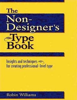
 The Non-Designers' Type Book - Robin Williams, Peachpit Press
Which shows you the right and wrong ways to go about using typography in your designs.
Both books are primarily aimed at design for print, and although print and web are quite different in some ways, the principles still hold true for the design of a web page.
If you're just starting out (or would like to learn about some of the formal grammar of design), you might well find these helpful.


