Saturday, June 17, 2006

@media, Hot Topics Panel

Closing panel for the conference. Just a mixture of random thoughts and questions.

  • CSS is still an undiscovered country - progressive CSS should come. IE7 is playing catchup with a lot of the other browsers.
  • Evangelising on the use of CSS is done - it should be a given (ha ha ha in some places)
  • We're now waiting for the next leap forward in what we can depend on as far as browser support for the standards.
  • Tantek demonstrated cutting edge css in Safari - a honeycomb pattern (yes, hexagons!) with rollover change of state - done entirely with CSS and not a graphic in sight. Blimey! That man has an enormous brain...
  • Wireframing applications with XHTML/CSS is the only way to test fluid and changable size of text etc.
  • What's missing from WebUI - Tantek would like an "undo" analagous function - plus CTL-S to save text in a form as you're going along (how many times have forms bombed on send, much to our cussing?) Or even better, persist it in the browser so its still there when you come back next time.
  • Yahoo Libraries - no idea why I wrote this down, will have to Google for enlightenment ;-)
  • Can Ajax be made accessible? Questioner wondered whether inaccessibility was a fundamental problem of Ajax, or just how it is implemented on any given site. User Agents are not really fully Ajax capable. Refs, Derek Featherstone/Joe Clarke basecamphq.com
  • According to technorati.com 's user stats, 15% of users have Javascript turned OFF!
  • It's best to specialise, but be aware of the designer/developer "trench" :-)
What's Coming Up?
  • We need real, practical solutions for web designers
  • Best practices
  • Microformats, iCal
  • OpenData - µ-formats, mashing, GoogleMaps release API, giving us frappr.com
  • hCards hCalendars and RSS
There should be podcasts of the seminars out in due course, available from the @media website.

Friday, June 16, 2006

@media, Fine Art of Web Design

Andy Clarke of Stuff & Nonsense / And All That Malarkey

Andy's an odd fish! But he thinks of things in different ways, and from different viewpoints. He sees inspiration for web design all over, not just online. "Art is design without compromise" - Jeffrey Veen.

Bound By Boxes
We are hampered every which way by boxes, stemming from:

  • The environment - ie a 2D screen, which is inflexible
  • The Materials - ie the limits of Markup+CSS
  • Medium - poor CSS support in older browsers
  • Ourselves! - unlearning what we have already learned.
  • Refs: Blue Robot's Reservior, Web Standards Awards
Grid Design
It is a fundamental skill of any designer - using the grid (see also the writeup on Good Design vs Great Design). BUT, what do we end up with?

becomes

Should we look at the web for inspiration, at places like cssreboot, or csszengarden?
Or should we look elsewhere? Maybe a right nav and vertical header could work for your site!

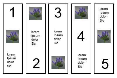
Keep a Scrapbook - could be magazine cuttings, etc, just to give inspiration from other areas. Showed example of page layout which was thus - just an ordered list, effectively - think how this below could be marked up with CSS?

Sometimes the juxtaposition of lines and curves can be quite interesting to think about.

Markup In The Real World
Markup needs to be technically valid but contain elements that have been chosen to convey meaning, semantically. If its tabular data - present it in a table!

Progressive Enhancement
Name given to technique were basic stuff is marked up for styling in IE, plus bells and whistles for other more capable browsers - eg Moz browsers can cope with the :hover class on any element, not just anchors; round corners on boxes are coming!

Transcendent CSS makes full use of all the most up to date CSS techniques. In CSS2.1 this could mean attribute selectors, parent/child/sibling selecctors, pseudo classes eg first/last child etc. Only use hacks to target browsers to turn things off.

Graded Browser Support
Doesn't mean everyone gets the same thing - but so what if it works and is usable in older browsers. IE7 will level the playing field a bit more (we hope!).

Refs: Yahoo DevNet - Browser Grades
stuffandnonsense.co.uk/downloads/transcendingcss.pdf


@media, Strategic CSS Management

Panel with Roger Johansson, Rachel Andrew and Dave Shea.

Always use basic vanilla CSS and HTML files as your starting point for any project. Then work on repurposing this to suit your bespoke application. This gives you a basic framework on which to build each time. Ref: undohtml.css (google for it or go to the end of this page) zaps all of the default browser formatting. Tantek developed it. Use to copy and paste into all new projects.

Next, stuff in the markup and some greeked content and validate

How to break up multiple CSS files
Several ways to do it, including:

  • by typography, colours, layout (clear:left does this I think)
  • Rachel puts most of her css in one file and pulls out the hacks into a separate one.
  • Divide the sheet up with comments when its more complex.
  • If its a very big sheet - put a Table of Contents at the top with these sort of comments /* page:=Header */ - as CTL-F will find "=name" very easily (equals not otherwise used in the CSS markup so you won't end up with spurious finds).
  • Dave breaks it up into sections: global nav; sidebar nav; basic html; then will use a separate file for a specific section such as the shopping cart function - he finds it easier to find things again afterwards.
  • List colours @ top of stylesheet in a comment - that way its much easier to do a global search and replace if needed.
One problem arises when you edit a stylesheet - you might rid the markup of a div, but rarely do you then weed out the associated css in the stylsheet - so it can end up rather bloated with old stuff you're no longer using. Try and use some sort of methodology to see if you can rid yourself of the extras.

Using Dreamweaver & Contribute in a collaborative environment
Some partcipants have DW and Contribute, and break the CSS up so that the typography is in one sheet which the dumb users can see - Contribute users will be able to apply these styles when choosing from their CMS, and so won't apply a page structure style to something that would blow up. The human factor has to come into play - there's no right or wrong way - you may choose to have one stylesheet for a small site, but split it up for a CMS-driven one.

COMMENT the CSS so you know what's what - its boring but very necessary when you come back (or someone else does) six months later and you can't remember what you did! Dave also finds it useful to comment the markup with div ends such as as you're not always sure which is the closing </div> tag (felt smug as I've already started to do that!).
  • ALWAYS ALWAYS comment Hacks so you remember why they're there. Useful to include the download/explanation URL in there too, for your future reference.
  • IF you use comments to break up the CSS, use lots of TABs to shift them over to the RHS - they are much easier to scan for quickly that way.
  • If you are a large team, comment the CSS with your name and the date when you make changes
Class/id Naming Conventions
Stick to a scheme, be consistent across projects so you are not left looking for something months later (also stems from using one vanilla template to seed each project). Use names such as .sidebar, #navigation, .menu ie keep the name structural rather than related to how it looks. If there were rigid or ideal naming conventions, it would be great for accessibility as users could then more easily override a given style on a page - but that's Utopia, it ain't gonna happen.

You can (if you're clever) use Server-side scripting to change styles on the fly, but none of the panel had much experience of that.

Code Order
Within your CSS, try and be structural about your layout order - start with wrapper, header, then the rest.
Pick an order that makes sense for global sheets, or global, generic then section-specific.
Within a rule, try and stick to a set order for properties (its just good organisation, doesn't make any difference); position, float, colour, text align etc.
Specifity- when using rules which override previous ones directly, try and put them near each other, if possible, so you're not hunting all over the stylesheet. - you can still see the styles which will override the properties.
Or group by elements - H1, H2,... Li...<a href> etc.

Tools
Text editors are OK! Or Topstyle, Firefox Web Developer toolbar (switch sheets on and off stupidly easily) .
Testing
Browsercam - its just like having multiple boxes running different browsers (VM ware?)

@media, Internationalisation

Presented by Molly E. Holzschlag

Benefits of Internationalisation/Local language version

  • Sales - Users are three times more likely to buy something from a site in their own language.
  • Customer Service - costs drop with translation of manuals etc, as people don't contact Customer Services so much.
  • Increased Revenue - from both of the above factors. Look at your site's stats and see if any one country is hitting the site, then set up a local language version for them (eg one site's revenue rose 8% from a Korean-version of the site
  • Better User Experience - leads to a happier user - always a good thing.
Design & Development Considerations
Try to design and develop the product, application oro document content such that it enables easy localisation for audiences from different cultures, religions or language.
Encourage design & development which removes barriers to local and international access - this process is sometimes referred to as globalisation.

i18n = internationalisation (in the jargon); l10n = localisation (number refers to number of letters left out).

Accessibility with i18n can mean providing the technology for features relating to local standards - such as change of date/time formats, numeral systems, personal names and forms of address.
Separate Content - if you separate out local from global info, it makes it much easier to repurpose for different versions Localisation can also mean the adaption of a product (site) to meet local requirements, or a specific target market. It can also mean specifying prices (for instance) in the local currency, or making allowances for different keyboard usage.

Localisation does NOT just mean Translation!
Semantics can differ hugely from one language to the next, and a straight translation might not convey the right meaning.

Symbols, Icons & Colour
Sensitivity to cultural perceptions, language and visual imagery is a must. What do upright and inverted triangles imply in various cultures?

Web Standards and i18n
Best practices are of course:
Structure
International sites rely on document structure, which requires proper encoding. Use the lang or xml:lang attributes to declare. This give te ability to handle monolingual as well as multilingual documents.
<html lang="en">
<meta equiv="content-language" contents="en"> [check this syntax]
<p>The French word for cat is <em lang="fr">chat</em>
Semantic Elements
Presentational html can wreak havoc for local content - using <i> for italic instead of <em> means Japanese would not understand the context of <i> (no italics) but they would comprehend that <em> meant emphasis. So always use <em> and then use CSS to style it in italics.

Semantic Naming
Advisable to use meaningful naming convention for class and ID selectors.
Choose a name which reflects the element's function not its presentation style as this is unlikely to change in different locales.

The Cross-Cultural Challenge
It can be difficult to understand another culture. For good i18n implementation, you will need a qualified representative (preferably a native) of that culture, who can adequately represent the cultural values of the target market.

Language
Use official and local language for the target market (not neccessarily overlapping with the geographical locale - how many folks in the USA speak Spanish?). Use jargon or slang only where the target market can understand it.

Screen Usage Concerns
Different languages behave differently on screen - the equivalent text for a form label might be twice as long in German as English, for instance => be careful of expansion/collapse of text, and the direction of reading.
Colours and imagery - ideally overlay local text over and image, rather than embedding into the graphic. Some colours/symbols mean different things to different cultures. If in doubt, use Blue (like the BBC!).

Why bother at all?
i18n and l10n can improve exposure and revenue. There are complex issues, but begin it early in the design process, right from the start of development. Inform the W3C if there are problems and issues.

Refs: w3.org/international/ and WaSP (Web Standards Project)
@media, Beyond A Code Audit

Accessibility is about more than just making sure you have passed the code audit points in WCAG, said Robin Christopherson of abilitynet.org.uk

Useful Test Tools/Tips:
Home Page Reader (text only) - cheaper than JAWS.
Natural Language - if you switch language mid-paragraph, use the Inline Language Tag to flag it so that screenreaders know how to correctly interpret the change for pronunciation.
Always define background and foreground colours by default, you can never assume they will be black and white (say).
textaloud.com is a text-to-speach engine.

Problems with FLASH
Dynamic content is difficult to make accessible in Flash. For instance, ALT text should exactly match the words shown in an image or Voice Recognition Software doesn't work properly. Flash breaks the Say What You See rule.
The Flash Accessibility presentation at macromedia.com is totally aural with no text transcript => breaks one rule of accessibility straight away! No tool tips on any of the Flash buttons. Dynamic content requires a screen refresh otherwise screen readers are not aware that content has changed (one of the big problems with some emerging Web2.0 apps). Presentation is low contrast - which would probably fail the Vischeck criteria.
Flash content is never as accessible as HTML (and by inference to search engines also). Robin (blind) did not find it easy to use Flash presentations as he was never sure if he was missing something. Also for partially sighted people, you can't change the font style or colours in a Flash movie.

Problems with Javascript
JS can be a nightmare when its used to provide main functionality for a site - it's sometimes not enough just to produce a no-JS version of a page if you're relying on it to accomplish something fundamental. Non-JS versions of a page need to be flagged as available as Home Page Reader is a plugin to the IE engine, and therefore the user agent could well have JS enabled.
Using a Javascript routine to update the time displayed on a page every second can cause havoc - the screen reader has barely had time to read out the nav links before the page is declared to have been refreshed and it all starts again from the top - you get stuck in an infinite loop and can never get out!

Problems with Colour / Whitespace / Text Alignment
Never use colour solely to convey meaning - The Tube Map fails the colourblind tests!
People with congnitive disabilitities can have big problems if enough white space is not provided - don't crowd things together. Use the tags to define abbreviations, plus a decent-sized sans-serif font.
Folks with Dyslexia have trouble reading fully justified text due to the uneven word spacing - left justified text is much better for them.

Assistive Technologies and their special requirements:
Headset mouse emulator - fine control of movement can be limited - don't make links too close together like lastminute.com. Google's Next page links have good spacing.
On-screen keybord - takes up valuable screen real estate
Suck/Blow tube for left/right mouse click - again, can make movements clumsier than with a mouse alone
Screen Magnifiers - disney.com was a nightmare to view with a magnified screen because of the lack of proper TAB order - the cursor went all over the place, often out of the immediate viewport of the magnified screen. Users get lost.
Screen readers - IE7 is not good with these at present.
No Mouse - tab order is vital - take a look at the Vatican's site to see what a screwed up tab order can do :-(
Also, Tab Focus can be tricky to distinguish - some sort of obvious highlights work best..
Skip Nav Links - when they get focus they can have unhide set on them with CSS which is quite neat.

@media, Bulletproof Web Design

Accessible ways to bulletproof your website, by Dan Cederholm.

If you are using an image background for any element - apply colours as a fallback too.
Bulletproofing applies to:

  • Content - text size, content amount (overflows don't cause your design to blow up)
  • Editing - content changes and maintenance
  • Environment - what happens in various device/browser senarios (turn off CSS, JAvaScript etc
Ref: John Allsop - "The Dao Of Web Design"

How to make an icon with text and arrowhead the easiest way?
You could use an image (not editable easily), or CSS styled text and b/g colour and a "sliding door" type arrowhead as a b/g image element applied to the div.

Site headers used to be easy with tables - how do we have a logo aligned left and tabs/links aligned right?
Use one div for the header b/g (and perhaps use img as b/g to that) then float:left the div surrounding the logo, and float:right the div surrounding the nav/tabs/links. Reference: Positioning Is Everything - Easy Clearing

Also, use Modules (divs) which can be placed on the page. Fixed height modules will break with larger text sizes - you need to employ a Vertical Sliding Doors type technique.

Accepting The Box
The box model obviously leads us towards a mor rectangular layout, but you can break out of this visually by applying subtle b/g images to corners (one per element so if you want two, you might have to apply one to div b/g and one to h2 or p background) - to give the impression that things are rounded off or turned over at the corners. Refs: Hicksdesign.co.uk, Odeo, Vivabit (two rounded corners), cameronmoll.com (fancy top and bottom gifs for headings).

Reusable Ornamentation
Effective additional styling elements can be useful for breaking up the boxiness of a site. Eg for h4, give it a top border, text+b/g colour, then img b/g aligned to below and centred 50% - which iif its larger than needed will also suffice for long headlines. See some of the stuff on csszengarden for more ideas.

Pimp Up My Navigation!
Use a gradient b/g image to underlay text, then give the list item a two-sides + top border. Use CSS to style with different colour on mouseover. The only drawback - the :hover pseudoclass only works on anchor links in IE - but you can set li:hover for browsers like FireFox which know what to do with it - it'll just look heaps better in a standards compliant browser without breaking in IE6. You can attach icons to links easily by using a href="blah.htm"
class="edit" and then in the css, a.edit {background-image: url(edit.gif) } or whatever. Refs: haveamint.com, joyent.com, uncorked.com

Layouts - Fixed vs Fluid?
Fluid is better for increasing text sizes and accessibility, but can have major knock-ons for designs. Ref: rollyo.com - used mix and match: Home page is fixed width, but fluid on search results centre column. This is great, but the max-width CSS declaration is not supported in IEWin (dammit), eg #wrap {max-width:1200px;}
Refs: vertua.com uses %-tage width cols on either side to resize the central column.
simplebits.com

Variable Fixed-Width Layout
Wide layout for most browsers (four columns) - but then some clever DOM scrupting with JavaScript switches a stylesheet or class when the browser window is narrow, such that you now get four rows instead! Neat. Ref: cameronadams.com

Bulletproof Tools - Take the 10-second Usability Test:
  • Take away the design (css) - is the site still understandable (a lot to do with semantically correct HTML and source order)
  • Validation - keeping valid code 100% of the time can be difficult to maintain, but key while designing a site is constant validation of Markup and CSS - avoids lots of aggro when stylesheets don't work for silly reasons.
  • Turn off images and see what happens
  • Text size - pump it up a few sizes and see what ballooning text does to your design
Concepts - embrace flexibility - you will never get a site looking identical in in all browsers, but if it's still functional and usable, across a wide range, that's OK: Let go of pixel-accurate design constraints.

Issues
Print CSS - still a problem to be able to print out images used as backgrounds to any element. Refs: collylogic.com, muffinresearch.co.uk (drop coloumn site with pure css)
Hacks - Keep IE-specific hacks in a separate stylesheet; keep your main stylesheet clean. Refs, Molly H's article, "Strategic CSS Hack Management".


@media, Designing Next Generation Web Apps

Jeffery Veen's discussion, mainly covering what's called Web2.0 applications. The elements are:

Surface (typography, layout, colour, grid - skin), Skeleton (web application interactions, page elements - "what can I poke?"), Structure (information architecture and hierarchy), Scope ("what can I do now?") & Strategy (what do we actually do).

  • Surface
    Try to make users feel in control - example was the rainfall map with a month slider, which then interactively showed rainfall as a progressively bigger raindrop - much easier to comprehend than a table full of dry [sic] figures for rainfall per month! Trust users as peers. Trust of the surface presentation can help to foster trust of underlying data: it can influence visual appeal, cognition and emotion and increas the halo effect (credibility -> users trust data and content if they trust the visual design).
    References: Don Norman, Emotional Design; BJ Fogg, Persuasive Technology
  • Skeleton
    The design process: Whiteboard/fag packet! -> wireframes -> AJAX layout
    Ref: www.kayak.com - search results page.
    Ajax interaction & design:
    • Discoverability - how easy is it to find stuff? - give gentle hints like auto-complete search box
    • Recoverability - catch errors before they occur (form validation etc)
    • Context - real-time feedback to compensate for poor browser interface (eg proper progress bar for file uploads etc)
    • Feedback - how the system behaves, and the states of pages.
  • Structure
    For a site like del.icio.us, tagging forms the "experience" as the system architecture. Similarly Flickr - tag your images and then use these to pivot on your metadata, to find others with similar tags. Builds communities of people with common interests. This breaks down the old style rigid hierarchical structure - no one can actually draw a sitemap for Flickr!
  • Scope
    Scope is more focussed than before; we still have some of the old problems on a new platform, but now with added participation.
    Apparently, 60-70% of CMS's fail!
    For some functions, a blog such as Type Pad with a bit of custom design would be more than sufficient for eg Press Releases - whereas a CMS would perhaps be overkill.
    Ref: The Hype Machine - go look
    Also allowing stuff like the GoogleMaps API into the hands of the right dedicated people can lead to much more effective and localised sites such as chicagocrime.org
    Similarly Measuremap - a stats engine - is open source. Your site is just one piece of a larger whole.
  • Strategy
    How is the audience changing?
    Dedicated amateurs can now provide rich content - amateurisation is the "architecture
    of participation".
    Travel booking sites - travel agents have virtually gone away. A huge majority of people now book travel online.
    Wikipedia - how to deal with user interactions etc.
    Furl - your personal web file.

@media, WCAG2.0

A quick run-through of some of the new features in the Accessibility Guidelines v2.0.

References: juicystudio.com and accessifiey.com

Why change the existing regs? They are nearly 9 years old and should be:

  • Technology agnostic, using general terminology
  • Perceivable (ie catering for sensory deficiencies)
  • Operable
  • Understandable
  • Robust
New features inlcude terminologies such as web unit; more conformance. There are also several supporting documents, besides the actual standard, namely:

  • Understanding WCAG2.0
    For each guideline, it explains the intent, why the need to address a problem; how to meet the success criteria; benefits of meeting criteria; advisory techniques and examples.
  • Techniques for WCAG2.0
    This is a big, unwealdy document! Starts with listing the common failures (not very positive). Covers client-side scripting techniques, CSS, general techniques, HTML et.
  • About Baselines for WCAG
    What are they? Annotated examples.
    Who sets the baseline; how can developers choose their baseline
  • Application Notes
    To follow
New features - baselines are better (?)
Scoping:- conformance claims are not mandatory but you can say certain parts of a site aren't specifically in scope.
Does it hinder design? - you have to think of philosophy vs practicality.

Reference: Go to http://www.w3.org/WAI/WCAG20/quickref/ and select your baseline technologies. It will then generate a reasonable checklist of what you need to cover for HTML/CSS/JavaScript etc.

Thursday, June 15, 2006

@media, Fine Typography On The Web

by Dave Shea. Downloadable from Dave's website archive.

Typography affects tone. Leading affects readability. Across all platforms and OS's, the designer only has about 10 fonts to rely on being installed - not very good.

  • Times New Roman - if you use this, it looks like you've made a mistake, or your style sheet hasn't loaded!
  • Arial - really a ripoff of Helvetica, a safe choice, but boring. Read: The Scourge Of Arial
  • Verdana / Georgia are a good pair for sans + serif fonts. But they could become non-safe backups in due course as MacOS X will not neccessarily carry them.
  • Trebuchet MS / Comic Sans alternatives, but Comic only really any good for doing kiddies stuff.
  • Lucida Sans / Palatino (serif) might like to think about them.
Font Survey websites are all very well, but they don't tend to be very representative of the general populace as the only people that fill in the surveys are the sort of folks who care about typography!

Fonts to look out for in future release of Windows (Vista):
  • Calibri (sans) - good for body copy
  • Cambria - a bit more subtle than Georgia
  • Candara - probably best reserved for headlines
  • Consolas - a monospaced font which will be great for code examples
  • Constantina - better for larger sized text, eg headlines and pullquotes
  • Corbel - excellent all-rounder
NEVER USE THE FONT TAG AGAIN!!!

So how do we get sexy fonts on web pages?
  • You could embed a font in a page with this:
    @font-face { family:myfont; src=url(myfont, eot);
    } in the css, then,
    h3 {font-family: myfont, serif;}
    in the markup
    This has its problems, mainly that Font Foundaries are very ansty about you distributing copyrighted fonts.
  • Scalable Vector Graphics would be fantastic but most browsers aren't currently supporting SVG.
  • sIFR - scalable Inline Flash Replacement. Uses Flash
    to transform text in <h2> tag, say, to a flash object representing the h2. Need to embed some javascript to do it:
    <script
    src="sifr/sifr.js"
    type="text/javascript">
    </script>
    Fallbacks - if you don't have JS or flash, you can write a fallback to style the original h2 with CSS as now.
  • Image Replacement - two methods: Phark (negative text indent) which can be a bit dodgy for accessibility
  • Gilder/Levin - need to look up
  • CSS3 - but can't remember what he said about this :-(
So what to use for various circumstances?
  • CMS - Use CSS or sIFR
  • Ensured Control - Use an Image, Image Replacement or sIFR
  • Kerning Control - Use Image or IR
  • Well-styled - Use Img, IR or possibly sIFR (in due course) but not CSS
  • Font Scalability - Use CSS, possibly sIFR later
  • Search Engines - Use CSS for best results
References: Typographic Design: Form & Communication
A List Apart - Dynamic Text Replacement
Font Explorer X - windows version due soon.
Googled for a "Flash of unstyled content" - there is a fix for IE.

@media, Good Design vs Great Design

A discussion panel chaired by John Hicks, Veerle Pieters & Cameron Moll.

Design is about communication, not just about making things look pretty. Subjective! How important is is to be original & creative? This can be intimidating for new designers. Look for inspiration from all things, not just the genre you're working on. Look at the brief to see what (if any) conventions have to be followed (eg existing branding).

Can great design be achieved on a budget? No! You may well get good design on a budget, but it's time that's required to make something into a truely great design - and time means money. Thinking time is required, not just the time taken to produce something. Great designers can produce something more quickly, perhaps, than other designers, within the timescale.

Grids

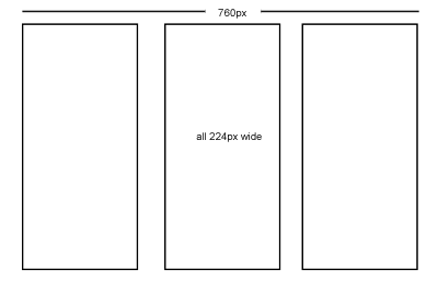
Grids can help you with placement and proportion. Assess the requirements of your likely content - eg long headlines, size of photographs etc, and plan your grid/layout around them accordingly. Violate the grid when neccessary. 5 Steps To Designing Grid Systems.

Methods:

  • Fixed width, uniform - www.newyorktimes.com
    11 columns: 1 wide, 2 wide, 4 wide, 2 x 2 wide
    Useful to use a b/g element tracing image (add to wrapper div) - switch it on and off as you develop.
  • Fixed width, hierarchical
    eg 2 cols either side ~160px; 1x400px, 1x200px - left and right cols can be used for ads.
  • Fluid width - vivabit.com
    Columns stretch as a percentage of browser width.
  • Fluid+fixed width
    eg first four coloumns resize in browser, last one fixed width for adverts

Typography

Every typeface has its own language, emotion, implied age etc. Type can be the design itself.
Imagine the Sex Pistols "Never Mind The Bollox" cover done in Comic Sans & Princetown - it looks ridiculous!
Use harmonising fonts. Meta/Trebuchet are a good pair. Americans tend to use Serif fonts, Europeans tend to favour sans serifs (why?!)
Great typography is not just choosing a cool font. It should be invisible - and relates to space, lines etc.

Case studies:

  • www.alistapart.com - Titles are centred, serifs, colours. Body text, left aligned, and given a decent leading ~1.8em. Author names are text-transform: uppercase, bold, larger kerning - makes it very easy to spot the authors in a list of articles.
  • www.subtraction.com - headings have bold use of whitespace to delineate hierarchy.

Sparks of creativity - tweak the H in the Shelter logo; often just one eleent can be reused to give accent.
Good designers use typefaces, great designers use typography => improve your typography! Ref: 5 Simple Steps To Better Typography

Colour
Why is colour so important? It sets mood, personality, emotion of a site. Can convey meaning. Adds balance and contrast. Great design doesn't solely rely on colour to convey message. Contrast is important - don't overdo colour. Colour guidance for different sections of a site can be useful.

@media, Eric Meyer's Keynote Speech

A write-up of some rough notes I made during the 2-day @media2006 conference. I hope they make sense after the event!

Eric went through a brief history of web development in relation to CSS etc. I missed the fiirst few minutes (due to transport problems) but came in at Todd Fahrner suggesting the use of the Doctype declaration for switching rendering engines to Tantek Çelik, who was at Microsoft building IE5 for the Mac. This was launched in 2000. Tantek invented the Box Model Hack (which is valid CSS, even if it doesn't look obvious!) in 2001/02, when using CSS for layout began to catch on. People sat up an took notice when wired.com went table-less CSS for layout in October 2002 (design by Douglas Bowman). Then Dave Shea waded in with the CSS Zen Garden and layed down the gauntlet to challenge perceptions of what can be done with pure CSS. Today, the real world still has source-order dependencies; some things are still hard to do, eg easy alternation of row colours which was fairly trivial with tables. Printing with CSS has been improved with CSS3.

Other links/references:

Introduction

I thought it would be useful for me to start a professionally-based blog rather than polluting my Rugybmadgirl blog with stuff about XHTML, CSS and web technologies, which is for entirely different audiences. So here goes...

I'm a web designer and developer with 10 years experience of coding sites - I started with Notepad back in '96 and have progressed quite a lot since then! My current weapons of choice are:

  • Dreamweaver8 - Macrodobe's latest offering (I've been using DW since version 4) which has much better support for CSS layout, XHTML and .Net than its predecessors
  • PhotoshopCS - essential for graphics preparation and photographic retouching
  • Firefox 1.5 with various plugins, notably:
  1. Web Developer Toolbar - turn off css or javascript at the flick of your mouse, outline block level elements, debug scripts, and heaps more.
  2. Tidy HTML validator - great as it runs on your localhost and immediately validates any page directly in the browser. Especially useful if you are developing offline or for intranet apps when you can't get the W3C validator to play ball - its the same validation engine
  3. IE Tab - allows you to open tab in Firefox which uses the IE rendering engine - dead handy if you have a pathalogical fear of using Internet Explorer :-)
  4. Foxytunes - for keeping you supplied with music, this plugin gives you all the basic controls over your media player of choice in the status bar of the browser, and takes up much less task-bar real estate than the minimized Media Player
  • XHTML - usually 1.0 transitional, but sometimes 1.0 strict. Essential if you want to improve your standards-compliance and accessibility for your content
  • ASP.NET - I have developed a few sites driven by .net, and have found it to be resonably easy to get to grips with. Examples are:
  1. www.cazphoto.co.uk - an online portfolio site for my general photography
  2. www.rugbypix.com - specialising in my rugby photography
  3. www.johnflood.co.uk - electronic publishing for John Flood, professor of Law & Sociology
  • Access2000 - so far, the sites I have developed have not needed the extra scalability required by mySQL or SQL Server, but I do intend to build sites with mySQL in the future.
I'm also looking to develop my PHP skills in the near future.