Thursday, June 07, 2007

@media - Five Steps To Better Typography

Next up was Mark Boulton, who wanted us to work with typography in a better way.

  • Be Appropriate & Adaptable
    Typefaces tell stories, and the web is still playing catchup with this power. Comic Sans is appropriate for the menu at a greasy spoon cafe; you wouldn't want an invitation to a Black Tie event done in it though. Similarly, the BBC's use of Gill Sans evokes order and authority. The BBC logo has a twist - by reversing the type and blocking out the shapes of Gill Sans.
    Don't let type and design get in the way of words.
    Be adaptable to requirements, and appropriate for the story.

  • Use Rhythm
    Richard Rutter's Compose To A Vertical Rhythm explains about using the line height and leading of your blocks of text to best advantage. The basic theory goes: 12px font height with 18px between lines, give a line height of 1.5. You can use incremental leading to make 4 lines of text in the main body of a page line up with 5 lines of text in a sidebar.
    [Text in the sidebar bears no relation to the main body copy. It looks messy.]
    The maths gets a bit hairy: 18px x 4 lines = 72px for the main body. 72px ÷ 5 lines = 14.4px for the sidebar
    If you're using 10px height for your sidebar text, 14.4 ÷ 10px = 1.44 line height. You may find the sidebar top-margin property needs a bit of tweaking to get it to line up properly.
    [This looks much better now everything is aligned vertically]

  • Optical Grey
    If you squint at a block of text, you'll see the page has different tonal ranges depending on font, leading, letter spacing etc.
    Verdana has a more open shape, so is paler at smaller sizes.
    Combining serif and sans-serif fonts can be effective, giving different "colours". Minimize dark grey and balance the line height.

  • Use The Right Tools For The Job
    Hyphens "-" are NOT em dashes!! "—". Use an em — or en – where appropriate.

  • Use a Grid System
    Use grids as a tool to help you organise information. How to decide how big the grid unit should be? You can subdivide the units too - you might have a 3em high by 4.5em wide block, which divides nicely into 2x3 squares each of 1.5em width and height.
    Choose gutter sizes carefully, it can depend on the relationship between whitespace and font size.
    Using Alternate Row colours in tables must be done with care - don't use colours which are too strong.
    Set type to your grid, and align everything! The smallest error can really stick out.
In Summary
Typography is all about the details. Tiny increments can make a huge difference. The full slides are available at Mark's website.

@media - Design Interface Juggling

Dan Cederholm took us through the various elements of interface design that a good juggler should be able to "keep in the air".

[Dan and his interface-juggling octopus]

Colour
Colour evokes an emotional response in the viewer, and we need to be careful when choosing a palette. At Wellstyled.com, there's a handy widget for generating complimentary colour schemes. Try it out.

Dan had mocked up a site especially to demonstrate some of his points - go have a giggle over at ToupéePal!

One good way of choosing a palette is by taking shades from a photo - either sample direstly, or pixellate it and use some of the blocks. Dan often starts with colour as the inspiration for a site and works from there. He will re-use certain strategic colours throughout a site, eg Links, headings etc. The colour used for links will always carry weight in the design.

Typography
Great typography is actually invisible - we don't notice it. But do it badly and it sticks out like a sore thumb. He recommended the article, Web Design is 95% Typography to read.

There are a limited number of fonts we can realistically guarantee a user having on their system, but within these constraints, we can still get creative. Try using the text-transform uppercase or lowercase styles, change the letterspacing, text-align, leading etc to vary the typographical colour of a block of text. Good reading: "The Elements of Typographical Style" by Robert Bringhurst, if you can find it. Read more on applying it to the web here.

Favicons
Could be regarded as the most important design element on your site! They are the thing that represents it in the shortcut icon, browser address bar etc.

[Subtraction.com uses each site's favicon as shorthand branding for the link]

So when creating a favicon, it has to be something memorable. They must:

  • Scale well down to 16x16 pixels
  • If the whole logo doesn't work, choose a fragment to focus on
  • Use something unique about the site that still ties in with the branding
Icon files can be made with Iconographer or a plugin for Photoshop. As well as the standard 16x16 icon, 32x32 and 64x64 pixel icons can be inserted into the same .ico file. There's an interesting collection of Favicons at Delta Tango Bravo's blog.

Add Detail But Not Complexity
Understand the limitations of the browser, and suggest the box [model] but with minimal suggestions. Perhaps use just one rounded corner on an element. Re-use graphic elements where you can.

Microformats
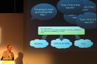
If you site contains any sort of contact information, events lists, reviews or relationships, then you should be marking them up with Microformats. Using what works today can encourage others to do the same:

[The Microformats can be used by people, applications and as hooks for CSS]

Brian Suda did some parsing of Cork'd for Microformats, and used this information to add wine reviews (from Cork'd) to his Scrugy site, where you can learn all about wine. Corkd's Microformats had produced an accidental API. If you were to mash this up with a list of your XFN friends, you could use it as a filter for just returning reviews from your trusted sources.

@media - High-Noon Shoot Out: Design vs Implementation

This was a bit of light-hearted fun, with two heavyweights standing in opposing corners and trying to convince us their point of view was right.

[the protagonists on the podium]

In The Design Corner - Mr Simon Collison
The Design Manifesto went thus:

  • Visual design is not complex engineering
  • Design interfaces visually, don't be afraid to take risks
  • Reserve the right to veto decisions of technologists
  • Think, build & design organically
  • Don't pander to personal prefereneces
  • Deliver a rich, considered visual experience for all
  • Be expressive with web typography
  • Layout decisions are the preserve of the designer
  • Visual design makes the first impression - respect it!
  • Build everything in Flash (not really)

[Evil Drew - New Implementation, New Danger!]

In The Implementation Corner - Mr Drew McLellan
It all started with nxoc01.cern.ch, the very first web server. Drew said we were all implementers, and as such, we needed to know our enemies:
  • Fixed width layouts
  • Flash for non-media presentation
  • (Flash breaks the basic nature of the web when used for anything other than a player for graphics or audio, and each Flash player instance impacts on performance of the browser)
  • Text replacement, since text on a web page is a solved problem
  • Styled form elements
  • Potent GETs
  • Controlled heights
  • Controlled text size
  • Colour schemes and low contrast
  • The user agent
  • The FOLD - THERE IS NO FOLD since we never know where it's going to be from one browser/user to the next!!
[Drew gets all fervant and placard-wavey saying There Is No Fold]

Conclusion
Of course, we all know that life's not so black and white, and at different times, we may have to sit in different camps. So it was a nice way of stimulating some light-hearted debate, but there's definitely no "right" answer on this one!

@media - Diabolical Design: The Devil Is In The Details

The conference split into two tracks, and I chose to listen to Jason Santa Maria of Happy Cog Studios talking about Design. Design is intent, and that must be reflected in the finer details.

Colour
Colour means different things to different people and evokes emotional responses. Use colour for emphasis and to help deliver the message. Faith Inkubators uses purple sparingly for emphasis and it works nicely. A Film uses pink and a particular headline motif to great effect.

Sometimes unexpected colours can be equally effective, The Times' acid green isn't obvious for a serious newspaper, but it works. Some other sites may take a colour from a photo or logo and use this to add emphasis.

Hierarchy
Visual hierarchy should reflect the underlying semantics of headingd hierarchy. It will give users a sense of what's important and what's not in the page. Use a focal point to grab attention and drive home the message. Providing variety can also lead the viewer through a page.

[The visual hierarchy should reflect the underlying document's semantics]

Whitespace
Whitespace is often something designers are afraid of - but used effectively, the "nothing" can be just as important as the "something" it surrounds. Also, optimum line length is 66 characters (anything between 45-75 is OK) for easy reading. The longer the line length, the more leading is required for better legibility.

Organisation - Grids
Grids can be liberating rather than restrictive. But giving users a solid framework can mean they will find it easier to get around your site - less time investment is required to "learn" the grid. He showed us maps of Philadelphia and London and asked us which we would be happier in negotiating as a tourist:

[Philadelphia's regular street plan contrasts with London's maze of tiny streets]

Even when using a grid, there are many ways of breaking the rigid order and still getting interesting designs. These three screenshots are from Australian agency Trout:

[Trout's home page, a regular grid, but even this is broken up with the bright colour emphasis]

[Detail page when you click through from the home page. More of the grid is broken up into bigger chunks]

[The About Trout page, dominated by the main text panel]

Having said all that, make sure that alignment happens and doesn't fall down - subliminal effects can be powerful and if something doesn't quite line up, it will still look "wrong" without the user being able to put their finger on why.

Planning
It's easy to jump into the finished product right from the start. Step back and plan! Keep a sketchbook to jot down ideas - they may all come together at a much later date, but you have them to hand.

[Jason's sketch book showing early doodles for the A List Apart design]

Design should be an iterative process. Grey box comping can help you decide the best weight for various layouts. Jason doesn't show these grey box comps to clients, but just uses them for his own purposes. He would then expect a PSD comp to show to clients, and perhaps 1-2 iterations round the loop before they are happy. The whole process can take a couple of months.

Strive For Clarity
Storytelling gives people hooks and things to remember, they will come back!

Fonts
Use fonts in such a way to give some extra interest to the page. sIFR can be a useful method of delivering certain fonts if they are mandatory branding requirements.

Handover
The all-important step that is often overlooked. A style guide is best kept short, under 10 pages, and provide a dummy template for each type of page, so that other people can look after the site going forward.

Customer Interference!
We all know what he means. But if you find your client is trying to steamroller you, set up a meeting and let them know you are the expert. Try to convince them of you design, as long as it conveys their message and isn't just kudos for your portfolio.

@media - Beyond Ajax

@media has rolled around super-quick this year. It kicked off with Jesse James Garrett of Adaptive Path talking about the future of web beyond Ajax.

He started by asking us "what is the web good for (at)? It's still quite a young medium - as TV and Radio started out emulating theatre, before finding their own feet, a new medium needs about 10 years for us to find out what it's good for - so we should be getting some good clues very soon!

[Be careful not to get confused by the many faces of Ajax!]

Web apps such as Flickr are part of a much larger ecosystem, but benefit it by having an open API that other applications can hook into. The web is now moving away from static pages of documents towards applications and interaction. The kayak.co.uk interface (airline ticket price comparison) was cited as one where Ajax enables users to dynamically filter the search results almost instantaneously. And these products get better with use.

Value can come from the users themselves - YouTube's a good example. The OK GO Treadmill video was home made, posted on YouTube, has been watched more than 18.5million times, eventually got onto MTV and won a Grammy! Then Google buys YouTube for $1bn - it obviously recognises the value in the userbase.

Websites are now delivering a rich user experience via Ajax and other native browser technologies - ideal as no plugins are required. Bruce Sterling coined the phrase that Ajax is "roller skates for the web". It's like the way that gmail and google maps have revolutionised the way we think about interfaces, and now we want everything to be drag and drop.

What's the highest form of praise? Not "makes loads of money" or "never crashes" but "I can't live without it!". Making systems work is all about the balance between technology, features and the user experience. The Diamond Rio was the first ever mp3 player, but it pretty much bombed. Three years later, along comes the iPod - costs more, does less, but it's all about the way users buy into the experience.

Dealing with interactive products stimulates the same part of the brain as when we are dealing with other people. "People are products too". So, products who "know who they are" also seem to pique our attention and become successful. It's why we like things like the iGuy and TiVo logo:

[Anthropomorphic Personification aka "oh look, isn't that cuuuuuute!!!"]

[Developers look at technology but the users think it's all just magic underneath]

Successful web2.0 applications are designed from the "outside in" and focus on the user experience strategy. This was the way Google Calendar was built, and within 9 months it had overtaken the second most popular competitor on the market.

With photography, no-one owns the endo to end solution, but Flickr takes the same philosophy. The About Flickr page states the site's two main goals:

  • We want to help people make their photos available to the people who matter to them.
  • We want to enable new ways of organizing photos.
The longer explanation on the page sets out the goals, but puts no limits on the technology. "The experience is the product"

Wednesday, June 06, 2007

Interaction vs Passivity

It's that time of year again, and the Adobe Live roadshow has been to town. The two-day event was held at the Business Design Centre in Islington, and I went along to see demos of the latest versions of Photoshop, Dreamweaver and all the other goodies in the CS3 Suite.

As well as the product demos, there were also other seminars covering design topics. One by a guy from Avenue A/Razorfish was entitled Web Design With Emotion

This was quite thought provoking, saying users are starting to expect more and more from things like eCommerce applications, and there are more ways of presenting results that just boring old lists of stuff. Two examples he gave were:

Amaznode
Great way of querying Amazon - I ran a search for rugby books on the UK site, and got the following interconnectedness results back:

[Amaznode search results show a web of connectedness for the items]

It's fun watching the network to build up. You can pick up an item and drag it about (the blue knot). Double-clicking the centre book will bring up the item detail panel, which lets you Add to Cart or Go to Amazon. I liked the way it presents related stuff - could be good if you're looking for recommendations based on what you have already. Not sure how reliable they are though!

Etsy's Shop By Colour
Etsy is a site where folks who hand make craft items can sell to individuals. There's the usual way of browsing boring old categories, but the Shop By Colour feature is fun - especially if you are trying to co-ordinate stuff for an outfit or room.

[Etsy shop by colour display]

Swirl your mouse round to stir up the colour trail, and click one you like the look of. The database will bring back a cluster of stuff that matches. It's great fun - go and have a play!

So, just two bits of food for thought which show search results don't have to be boring. Users are getting smarter and prefer interaction to passivity, so whilst this kind of interface would have been unheard of even a couple of years ago, things are changing fast.