Thursday, March 22, 2007

Disconnected

When I first started cutting my teeth on dynamic web site development, I was pleased that Dreamweaver has plenty of tools to help out. Because we used it at work for sites, I chose the ASP.NET/C# server model, and used Access as the database (perfectly adequate for the size and features of the sites I was building).

Now I'm beginning to get to grips with PHP/mySQL for development. That's going well too. And having used mySQL for a while, I can see the advantages over Access. But what I'd really like to do is upsize a few of my Access databases to mySQL and have them connect to my existing .NET applications, without having to re-write the damned things.

The data migration tools available to s smooth job, and the data is sitting there, ready to go. But now I've hit a brick wall. How to tell Dreamweaver I want to use a mySQL database instead of access! So I began looking for the correct connection string, this was some help. I also downloaded MySQL ODBC 3.51 and installed it.

Then I set the web.config file entry to this (bold being the connection string given in the link above):


Driver={MySQL ODBC 3.51 Driver};Server=localhost;Database=myDatabase;User=myUser;
Password=myPassword;Option=3;" />


I tried the TEST button and Dreamweaver connected successfully! But try running the site via the browser (or Dreamweaver Live Data View) and it falls over with an error:
System.ArgumentException: An OLE DB Provider was not specified in the ConnectionString. An example would be, 'Provider=SQLOLEDB;'.
at System.Data.OleDb.OleDbConnectionString.ValidateParse()

So tried a different connection method, using Connector/Net 1.0.9 with this syntax in the web.config file - but got very similar results. Then I found this following in an Adobe Tech Note (my emphasis):
Do I have to use ODBC?
No. For ASP sites you can also connect to a database using OLEDB. For ASP.NET sites you must use OLEDB or the native ASP.NET SQL Server connector.
So it looks like it has to be OLEDB, but how to put the correct provider in the connection string? Nothing I've tried seems to work! Any clues? Has anybody actually got this combination to work?
  • Dreamweaver 8
  • ASP.NET/C# server model
  • mySQL database

Tuesday, March 20, 2007

Mobile Web Best Practices

Sheila went to the 3GSM World Congress in Barcelona a few weeks ago, and picked up a handy set of cue cards on designing for the mobile web, which she was kind enough to give to me. It was great timing, since I'd been thinking for a while about the best way to go about designing for mobile devices. The cue cards promote the W3C's Mobile Web Initiative, and are great prompts on the best techniques to use.

[Mobile Web Best Practices cue cards]
So for those who don't have a copy, I thought I would share the wisdom that they detail. More info can be found at http://www.w3.org/TR/mobile-bp/ - but the below is a distilled and much more user-friendly summary.

10 Ways To Mobilise
The cards are broken into ten topics, with hints and advice on each:

1. Design for One Web
Content designed with diverse devices in mind reduces cost, increases flexibility, and reaches the needs of more people.

Thematic constistency - ensure that content provided by accessing a URI yields a thematically coherent experience when accessed from different devices.

Capabilities - exploit device capabilities to provide an enhanced user experience.

Deficiencies - take reasonable steps to work around deficient implementations.

Testing - carry out testing on actual devices as well as emulators.

2. Rely on Web Standards

In the highly fragmented market of devices and browsers, standards are the best guarantee for interoperability.
Validate Markup - create documents that validate to published formal grammars.

Content Format Support - send content in a format that is known to be supported by the device.

Content Format Preferred - where possible, send content in a preferred format.

Character Encoding Support - ensure that content is encoded using a character encoding that is known to be supported by the target device.

Character Encoding Use - indicate in the response the character encoding being used.

Style Sheet Use - use style sheets to control layout and presentation, unless the device is known not to support them.

Structure - use features of the markup language to indicate logical document structure.

Error Messages - provide informative error messages and a means of navigating away from an error message back to useful information.

3. Stay away from known hazards

Thoughtful design can help reduce usability problems due to small screens and keyboards, and other features of mobile devices.
Pop Ups - do not cause pop-ups or other windows to appear and do not change the current window without informing the user.

Tables Nested - do not use nested tables.

Tables Layout - do not use tables for layout.

Graphics For Spacing - do not use graphics for spacing.

No Frames - do not use frames.

Image Maps - do not use image maps unless you know the device supports them effectively.

4. Be cautious of device limitations

When choosing to use a particular web technology, consider that mobile devices vary greatly in capability.
Cookies - do not rely on cookies being available.

Objects or Script - do not rely on embedded objects or script.

Tables Support - do not use tables unless the device is known to support them.

Tables Alternatives - where possible, use an alternative to tabular presentation.

Style Sheets Support - Organise documents so that, if necessary, they may be read without style sheets.

Fonts - do not rely on support of font related styling.

Use of Colours - Ensure that information conveyed with colour is also available without colour.

5. Optimize navigation

Simple navigation and typing become critical when using a small screen and keyboard, and limited bandwidth.
Navbar - provide only minimal navigation at the top of the page.

Navigation - provide consistent navigation mechanisms.

Link Target ID - cleary identify the target of each link.

Link Target Format - Note the target file's format unless you know the device supports it.

Access Keys - assign access keys to links in navigational menus and frequently accessed functionality.

URIs - keep the URIs of site entry points short.

Balance - take into account the trade-off between having too many links on a page and asking the user to follow too many links to reach what they are looking for.

6. Check graphics & colours

Images, colours and style brighten content, but require care due to inconsistent support for some formats low-contrast screens.
Images Resizing - resize images at the server, if they have an intrinsic size.

Large Graphics - do not use images that cannot be rendered by the device. Avoid large or high resolution images except where critical information would otherwise be lost.

Images Specify Size - specify the size of images in markup, if they have an intrinsic size.

No Text Alternative - provide a text equivalent for every non-text element.

Colour Contrast - ensure that foreground and background colour combinations provide sufficient contrast.

Background Image Readability - when using background images, make sure that content remains readable on the device.

Measures - do not use pixel measures and do not use absolute units in markup language attribute values and style sheet property values.

7. Keep it small

Smaller sites make users happier by costing less in time and money.
Minimise - use terse, efficient markup.

Page Size Limit - ensure that the overall size of page is appropriate to the memory limitations of the device.

Style Sheet Size - keep style sheets small.

Scrolling - limit scrolling to one direction, unless secondary scrolling cannot be avoided.

8. Use the network sparingly

Web protocol features can help improve the user experience by reducing the impact of network bottlenecks and latencies.
Auto refresh - do not create periodically auto-refreshing pages, unless you have informed the user and provided a means of stopping it.

Redirection - do not use markup to redirect pages automatically. Instead, configure the server to perform redirects by means of HTTP 3xx codes.

External Resources - keep the number of externally linked resources to a minimum.

Caching - provide caching information in HTTP responses.

9. Help & guide user input

Keyboards and other input methods on mobile devices can be tedious to use, so effective designs minimize the need for them.
Minimise Keystrokes - keept the number of keystrokes to a minimum.

Avoid Free Text - avoid free text entry in forms, where possible.

Provide Defaults - provide pre-selected default values where possible.

Default Input Mode - Specify a default text entry mode, language and/or input format, if the target device is known to support it.

Tab Order - Create a logical order through links, form controls and objects.

Control Labelling - label all form controls appropriately and explicitly associate labels with form controls.

Control Position - position labels so they lay out properly in relation to the form control to which they refer.

10. Think of users on the go

Web users on the go want compact information when time is short and distractions many.
Page Title - provide a short but descriptive page title for every page.

Clarity - use clear and simple language.

Central Meaning - ensure that material that is central to the meaning of the page precedes material that is not.

Limited - limit content to what the user has requested.

Suitable - ensure that content is suitable for use in a mobile context.

Page Size Usable - devide pages into usable but limited size portions.

And reading through these, most of the list sounds equally applicable to overcome other accessibility issues. Wise advice, which isn't always easy to follow!

Wednesday, March 14, 2007

Decisions, Decisions

I've been in a dilemma for the past few days. Ever since finding out that d.Construct2007 and BarCampBrighton are scheduled for 7th, 8th & 9th of September, it's posed me a problem. Which is that it's the exact same dates that the Rugby World Cup starts in France, and the opening games with France vs Argentina and then England vs USA are the ones I want to go to.

So, there's been some weighing up of pro's and con's, and I've just booked the rugby trip! I figured that, even though I had a great time at last year's d.Construct, since it's an annual event, there's always 2008 - whereas World Cups only come round once every four years - and the next one is in New Zealand - hardly a convenient hop across the channel!

The worse-case scenario would have been me prevaricating for so long that tickets to both events had sold out. So I thought it best to jump now and forever hold my peace :-)

Sunday, March 04, 2007

MiniBar4

Friday 2nd was the first time I had attended a MiniBar session, this time it was MiniBar4, held near Liverpool Street. I wasn't really sure of the format, but it was basically a chance for developers and investors to get together with a bit of free beer thrown in!

Each potential project was given a five minute slot to present their idea or website, and questions were taken at the end. The following sites were presented:

  • sellaband.com
    The basic premise is that "believers" invest in shares of new acts, so they can raise $50K to record an album. Each share is for $10 and will guarantee the believer one copy of the resulting CD. So buy $50 of shares and you get 5 CDs. Once the $50K has been raised, the website puts the band in touch with producers and the recording goes ahead. At any time before the full amount is raised, either band or believers may withdraw their offers. Two acts have already raised the neccessary capital and a third is well on the way.
  • spikesource.com
    Is a site for the Open Source community to collaborate and set standards for business-ready applications
  • flirtnik.com
    Billed as "Smart personals for smart people", it's apparently the first Web2.0 dating site, using folksonomy tagging. Users are able to add relevent tags for themselves and others, which can then be searched. Results can be filtered out on the basis of gender etc.
  • play.tm
    Site aimed at gamers and has loads of news about the latest gear, games, etc. Also has community section.
  • metaweather.com
    The site seems to default to Chinese (!), which was slightly disconcerting. It is an automated weather data aggregator that take the weather predictions from various forecasters and calculates the most likely outcome.
  • rouq.com
    An unusual search engine which brings up thumbnails of the results pages.
  • trustedplaces.com
    A site where users can rate restaurants, shops, or other places, and tag them with relevent meta data. You can play the tastefinder game, which will then match your tastes with other users on the site, in order that you get the recommendations which are most appropriate to you.
  • openrightsgroup.org
    The last presentation was from the Open Rights Group, telling us about the work they are doing spreading the word on copyright, DRM, and other tech stuff happening on the web today.
So, if you're an investor looking to put up some cash for good ideas, or a developer looking for financial input, MiniBar is the place for you. The next one is scheduled for 20th April.

There's also an event called the London OpenCoffee Meetup which does more or less the same thing. Only this time it's over coffee, every Thursday morning between 10:00 and 12:00 in Starbucks, Regent Street. I'll bear it in mind when I have my big idea and need funding!

Saturday, March 03, 2007

WSG London #3 - Accessibility

I'm playing catch-up a bit with blogging. I was at the third London Web Standards meeting on 28th February, which had an Accessibility theme.

We had three very different talks, each highly informative and enjoyable.

Niqui Merret on Accessbile Flash
Niqui started out by saying that Flash and accessibility don't have to be mutually exclusive, as many people presume. However, in the real world:

No single technology can be 100% accessible to all users. Aim to achieve the most accessible solution possible.
It's up to developers, programmers and copywriters to make sure their contributions are as accessible as possible. It's also up to the software vendors (eg of screen readers) to try and implement the standards properly and as quickly as possible. She also mentioned FlashAid (talks to screen reader and turns off the Javascript/Ajax so browser sees alternative accessible content) and SWFFix (a tool for progressive enhancement) as useful resources for Flash developers.

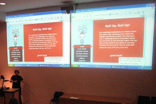
She talked a bit about the Accessibility panel in the Flash authoring environment, which allows developers to set things like Tab order and ALT text. And she demonstrated a fun little game in Flash, which was fully accessible without mouse and to screenreaders:

[Niqui demonstrates her accessible Flash game]

Ann McMeekin on Accessibility - What Not To Do
Ann is a Web Accessibility Consultant for the RNIB, and clearly knew her subject inside out.

She made many excellent points, but some of the most salient were:
  • Don't assume all users with disabilities are the same
  • Don't ignore users who come to you with a problem
  • Don't forget to set your page's default colours - background and foreground (if not, changing Windows default colour scheme could have a dramatic effect)
  • Don't waffle - be clear and concise, don't repeat yourself
  • Just because you can add a title attribute to almost anything, doesn't mean you should - it's largely redundant if your link text is descriptive enough
  • Don't be shy - show skiplinks, and use :focus and :active as well as :hover
  • Put instructions before forms - otherwise someone who has zoomed the page (magnified) doesn't have a hope in hell of seeing what the labels are
One of the most surprising things was to learn that most screen readers will read out the legend to an accompanying fieldset before every label in the fieldset - so it's important to keep legends short and concise, and so they will make sense when read with the form field label.

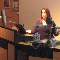
[right, Ann in full flow]

Two final thoughts from Ann:
  • Don't jump on the bandwagon and implement the latest cool widget without knowing what impact this might have on your users
  • Accessibility doesn't mean you can't be creative
Mike Davies on Web Accessibility - The Developer's Tale
Mike's talk was a case study of the re-design of Legal & General's website services and applications, which he had been heavily involved with before his move to Yahoo! in the summer of 2006.

Four years ago, before the project started, L&G's website was ranked 92nd in a FTSE100 survey of websites; it ranked badly with search engines, had at least 150 links on every page and was horribly inaccessible. Through the vision of the website manager, the site was completely redesigned with accessibility at the heart of the thinking.

They reaped the benefits very quickly:
  • 40% increase in website traffic
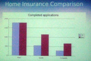
  • doubled conversion rates (that is, number of people completing an online application for insurance etc, versus those who start the process)
  • doubled online revenue
  • cut maintenance costs by two thirds
  • increased natural search-engine traffic by 50%
  • paid for itself in five months
[conversion rates for Home Insurance - lilac = old site, burgundy = new site. The first two bars are the numbers starting the process, middle represents those finishing a quote and last pair are numbers of completed applications]

And the website is now held up as a highly-regarded example of how to do things properly - it is a PAS 78 and AccessibilityNet case study, has accreditation from the Shaw Trust, and is cited in books on accessibility.

Thanks again to Stuart for organising an excellent event. I look forward to the next one.

Friday, March 02, 2007

My New Photographic Blog

I've decided to start a new blog, dedicated to purely photographic topics. Having thought about it for a while, the balance was finally tipped after BarCamp when I wrote up my tutorials from the presentation I did.

More and more of my photographic (non-geek) friends have been asking about them, and I thought it was easier to separate the content out into a new blog, rather than them having to wade through lots of web geekery here.

So please take a look at http://cazphoto.blogspot.com/ for the new publication!

Some posts from this blog's archives have moved to the new one; other posts are replicated (mainly my BarCamp2 stuff, or those with a few comments attached, which have stayed put here and been copied to the new address).

Henceforth, I shall be putting any photography-related topics on the new blog, so please put the address in your feedreaders if you'd like to keep up with my posts there.

Thursday, March 01, 2007

WebCards Extension For FireFox

Discovering Microformats
For viewing Microformats, and discovering them in a web page, I've blogged about Tails for Firefox in the past. But recently, I've been beta testing Andy Mitchell's excellent Webcards 0.3 extension for Firefox. So what does it do?

The first time you load a page containing Microformatted information, the green WebCards ribbon pops up at the bottom of the browser viewport to alert you. This also appears when you mouse over the bottom of the browser:

[WebCards ribbon tells you what sort of Microformats are in the page]

Playing Tag
Clicking the "Tags" link in the ribbon brings up the Tags panel:

[Default view of the "tags" panel is the Related option, allowing easy search of del.icio.us or Upcoming for the tags in question; "brian suda" in this example.]

Similarly, clicking the Feedback or Media icons gives alternative search options for that tag:


[Feedback offers to search Technorati, Media offers to search Flickr for the tag in question]

An alternate way to access the tags panel is to right click any tag on the page (which will be highlighted by the green TAG icon):

[Right-click (configurable) the TAG icon to get a floating version of the Tags panel]

Making Contact
When displaying contact information, the extension will display the blue Person icon whenever it encounters any hCard info. Right click to get the floating panel for the hCard information:

[Default view for hCard is the Information icon. Shows multiple links if they are in the hCard]

The Application icon will allow export of the hCard info to Outlook or other address book application. The Related icon shows other search options for that person:

[Related search options are LinkedIn, Google or Wikipedia]

Getting Friendly
My blogroll is marked up with XFN and when you mouse over the relevant link, WebCards will let you see the orange XFN icon. Right click and it shows relationship in the XFN panel:

[The XFN panel shows the page owner's relationship to the linked person]

Make A Date
The last major category of Microformat that I've been exploring with WebCards is of course, hCalendar. These are indicated by the little red CAL icon:

[Upcoming occasions displayed in the Calendar panel]

As with the other format panels, the Application icon lets you export the event to Outlook or Google Calendar applications; Related will search Upcoming or Google for the event:

[Add an event to my GoogleCalendar with the Applications icon]

Summing Up
So far, I've seen several iterations of this extension, and Andy has always welcomed feedback on the app. I like it a lot better than Tails for Firefox, it just seems to do more and looks much nicer - don't accuse me of being shallow, it just adds up to a nicer user experience! Anyway, I'd recommend it to anyone who is looking to get the most out of Microformats in the wild.