Wednesday, March 14, 2007

Decisions, Decisions

I've been in a dilemma for the past few days. Ever since finding out that d.Construct2007 and BarCampBrighton are scheduled for 7th, 8th & 9th of September, it's posed me a problem. Which is that it's the exact same dates that the Rugby World Cup starts in France, and the opening games with France vs Argentina and then England vs USA are the ones I want to go to.

So, there's been some weighing up of pro's and con's, and I've just booked the rugby trip! I figured that, even though I had a great time at last year's d.Construct, since it's an annual event, there's always 2008 - whereas World Cups only come round once every four years - and the next one is in New Zealand - hardly a convenient hop across the channel!

The worse-case scenario would have been me prevaricating for so long that tickets to both events had sold out. So I thought it best to jump now and forever hold my peace :-)

Sunday, March 04, 2007

MiniBar4

Friday 2nd was the first time I had attended a MiniBar session, this time it was MiniBar4, held near Liverpool Street. I wasn't really sure of the format, but it was basically a chance for developers and investors to get together with a bit of free beer thrown in!

Each potential project was given a five minute slot to present their idea or website, and questions were taken at the end. The following sites were presented:

  • sellaband.com
    The basic premise is that "believers" invest in shares of new acts, so they can raise $50K to record an album. Each share is for $10 and will guarantee the believer one copy of the resulting CD. So buy $50 of shares and you get 5 CDs. Once the $50K has been raised, the website puts the band in touch with producers and the recording goes ahead. At any time before the full amount is raised, either band or believers may withdraw their offers. Two acts have already raised the neccessary capital and a third is well on the way.
  • spikesource.com
    Is a site for the Open Source community to collaborate and set standards for business-ready applications
  • flirtnik.com
    Billed as "Smart personals for smart people", it's apparently the first Web2.0 dating site, using folksonomy tagging. Users are able to add relevent tags for themselves and others, which can then be searched. Results can be filtered out on the basis of gender etc.
  • play.tm
    Site aimed at gamers and has loads of news about the latest gear, games, etc. Also has community section.
  • metaweather.com
    The site seems to default to Chinese (!), which was slightly disconcerting. It is an automated weather data aggregator that take the weather predictions from various forecasters and calculates the most likely outcome.
  • rouq.com
    An unusual search engine which brings up thumbnails of the results pages.
  • trustedplaces.com
    A site where users can rate restaurants, shops, or other places, and tag them with relevent meta data. You can play the tastefinder game, which will then match your tastes with other users on the site, in order that you get the recommendations which are most appropriate to you.
  • openrightsgroup.org
    The last presentation was from the Open Rights Group, telling us about the work they are doing spreading the word on copyright, DRM, and other tech stuff happening on the web today.
So, if you're an investor looking to put up some cash for good ideas, or a developer looking for financial input, MiniBar is the place for you. The next one is scheduled for 20th April.

There's also an event called the London OpenCoffee Meetup which does more or less the same thing. Only this time it's over coffee, every Thursday morning between 10:00 and 12:00 in Starbucks, Regent Street. I'll bear it in mind when I have my big idea and need funding!

Saturday, March 03, 2007

WSG London #3 - Accessibility

I'm playing catch-up a bit with blogging. I was at the third London Web Standards meeting on 28th February, which had an Accessibility theme.

We had three very different talks, each highly informative and enjoyable.

Niqui Merret on Accessbile Flash
Niqui started out by saying that Flash and accessibility don't have to be mutually exclusive, as many people presume. However, in the real world:

No single technology can be 100% accessible to all users. Aim to achieve the most accessible solution possible.
It's up to developers, programmers and copywriters to make sure their contributions are as accessible as possible. It's also up to the software vendors (eg of screen readers) to try and implement the standards properly and as quickly as possible. She also mentioned FlashAid (talks to screen reader and turns off the Javascript/Ajax so browser sees alternative accessible content) and SWFFix (a tool for progressive enhancement) as useful resources for Flash developers.

She talked a bit about the Accessibility panel in the Flash authoring environment, which allows developers to set things like Tab order and ALT text. And she demonstrated a fun little game in Flash, which was fully accessible without mouse and to screenreaders:

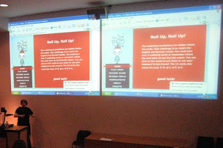
[Niqui demonstrates her accessible Flash game]

Ann McMeekin on Accessibility - What Not To Do
Ann is a Web Accessibility Consultant for the RNIB, and clearly knew her subject inside out.

She made many excellent points, but some of the most salient were:
  • Don't assume all users with disabilities are the same
  • Don't ignore users who come to you with a problem
  • Don't forget to set your page's default colours - background and foreground (if not, changing Windows default colour scheme could have a dramatic effect)
  • Don't waffle - be clear and concise, don't repeat yourself
  • Just because you can add a title attribute to almost anything, doesn't mean you should - it's largely redundant if your link text is descriptive enough
  • Don't be shy - show skiplinks, and use :focus and :active as well as :hover
  • Put instructions before forms - otherwise someone who has zoomed the page (magnified) doesn't have a hope in hell of seeing what the labels are
One of the most surprising things was to learn that most screen readers will read out the legend to an accompanying fieldset before every label in the fieldset - so it's important to keep legends short and concise, and so they will make sense when read with the form field label.

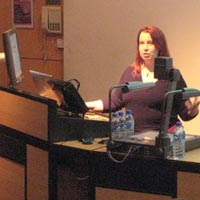
[right, Ann in full flow]

Two final thoughts from Ann:
  • Don't jump on the bandwagon and implement the latest cool widget without knowing what impact this might have on your users
  • Accessibility doesn't mean you can't be creative
Mike Davies on Web Accessibility - The Developer's Tale
Mike's talk was a case study of the re-design of Legal & General's website services and applications, which he had been heavily involved with before his move to Yahoo! in the summer of 2006.

Four years ago, before the project started, L&G's website was ranked 92nd in a FTSE100 survey of websites; it ranked badly with search engines, had at least 150 links on every page and was horribly inaccessible. Through the vision of the website manager, the site was completely redesigned with accessibility at the heart of the thinking.

They reaped the benefits very quickly:
  • 40% increase in website traffic
  • doubled conversion rates (that is, number of people completing an online application for insurance etc, versus those who start the process)
  • doubled online revenue
  • cut maintenance costs by two thirds
  • increased natural search-engine traffic by 50%
  • paid for itself in five months
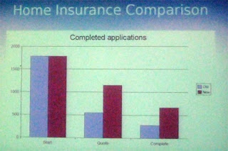
[conversion rates for Home Insurance - lilac = old site, burgundy = new site. The first two bars are the numbers starting the process, middle represents those finishing a quote and last pair are numbers of completed applications]

And the website is now held up as a highly-regarded example of how to do things properly - it is a PAS 78 and AccessibilityNet case study, has accreditation from the Shaw Trust, and is cited in books on accessibility.

Thanks again to Stuart for organising an excellent event. I look forward to the next one.

Friday, March 02, 2007

My New Photographic Blog

I've decided to start a new blog, dedicated to purely photographic topics. Having thought about it for a while, the balance was finally tipped after BarCamp when I wrote up my tutorials from the presentation I did.

More and more of my photographic (non-geek) friends have been asking about them, and I thought it was easier to separate the content out into a new blog, rather than them having to wade through lots of web geekery here.

So please take a look at http://cazphoto.blogspot.com/ for the new publication!

Some posts from this blog's archives have moved to the new one; other posts are replicated (mainly my BarCamp2 stuff, or those with a few comments attached, which have stayed put here and been copied to the new address).

Henceforth, I shall be putting any photography-related topics on the new blog, so please put the address in your feedreaders if you'd like to keep up with my posts there.

Thursday, March 01, 2007

WebCards Extension For FireFox

Discovering Microformats
For viewing Microformats, and discovering them in a web page, I've blogged about Tails for Firefox in the past. But recently, I've been beta testing Andy Mitchell's excellent Webcards 0.3 extension for Firefox. So what does it do?

The first time you load a page containing Microformatted information, the green WebCards ribbon pops up at the bottom of the browser viewport to alert you. This also appears when you mouse over the bottom of the browser:

[WebCards ribbon tells you what sort of Microformats are in the page]

Playing Tag
Clicking the "Tags" link in the ribbon brings up the Tags panel:

[Default view of the "tags" panel is the Related option, allowing easy search of del.icio.us or Upcoming for the tags in question; "brian suda" in this example.]

Similarly, clicking the Feedback or Media icons gives alternative search options for that tag:


[Feedback offers to search Technorati, Media offers to search Flickr for the tag in question]

An alternate way to access the tags panel is to right click any tag on the page (which will be highlighted by the green TAG icon):

[Right-click (configurable) the TAG icon to get a floating version of the Tags panel]

Making Contact
When displaying contact information, the extension will display the blue Person icon whenever it encounters any hCard info. Right click to get the floating panel for the hCard information:

[Default view for hCard is the Information icon. Shows multiple links if they are in the hCard]

The Application icon will allow export of the hCard info to Outlook or other address book application. The Related icon shows other search options for that person:

[Related search options are LinkedIn, Google or Wikipedia]

Getting Friendly
My blogroll is marked up with XFN and when you mouse over the relevant link, WebCards will let you see the orange XFN icon. Right click and it shows relationship in the XFN panel:

[The XFN panel shows the page owner's relationship to the linked person]

Make A Date
The last major category of Microformat that I've been exploring with WebCards is of course, hCalendar. These are indicated by the little red CAL icon:

[Upcoming occasions displayed in the Calendar panel]

As with the other format panels, the Application icon lets you export the event to Outlook or Google Calendar applications; Related will search Upcoming or Google for the event:

[Add an event to my GoogleCalendar with the Applications icon]

Summing Up
So far, I've seen several iterations of this extension, and Andy has always welcomed feedback on the app. I like it a lot better than Tails for Firefox, it just seems to do more and looks much nicer - don't accuse me of being shallow, it just adds up to a nicer user experience! Anyway, I'd recommend it to anyone who is looking to get the most out of Microformats in the wild.

Wednesday, February 28, 2007

RDF - What's It Good For?

One of the presentations that I missed at BarCampLondon2 (I was attending another session) was a light-hearted debate about the similarities and differences between Microformats and RDF. The main protagonists were:

Thankfully, for those who didn't see the debate, Ian has uploaded a video of the session. It makes interesting viewing! And shortly afterwards, I found Ben Ward's insightful post about the whole subject too. I think Ben's second paragraph hits the nail on the head:
The thing about RDF is that no-one has yet demonstrated any real-world reason to care about it. It fascinates academics who would love — just for the sake of it — to model the entire universe in triples but in the real world of web browsers the value has never really been promoted.
Spot on.

The Microformats advocates have been very quick to explain what they are for, what they do, and how to implement them. I use them regularly in this blog, and try to incorporate them wherever I can into new projects. It's so easy to build them in from scratch when marking up events (hCalendar), people (XFN) or contact details (hCard).

But as yet, I'm really stumped as to what RDF - or more importantly, eRDF can do for me. Tom Morris has started a website called GetSemantic which hopes to chart the progress of developments about eRDF and spread the word. I'll be keeping an eye on it from time to time, to see what's cooking, but until then, I'll be sticking to my diet of Microformats.

Tuesday, February 27, 2007

Photographic Tutorials

Sheila had a good idea, to collect the titles/links of my tutorials on photography, initially written for BarCampLondon2. I'll also be updating the list regularly when I post a new photography tutorial, so you can easily keep tabs on them.

Taking Better Pictures
These were the posts which formed my presentation at BarCampLondon2. They are aimed at anyone who would like to improve their photography, whether they use a fully-automatic compact camera or SLR. The principles apply equally to film and digital photography.

Getting Technical
These are aimed at people with a bit of photographic knowledge, but would like to learn more about the technicalities. They will explain the affects of ISO speed, shutter speed, apertures and more.
Please get in touch by leaving a comment if you would like any other aspect of photography explained.

Wednesday, February 21, 2007

Flickr And Self-Referential Folksonomy

I've been thinking a lot about Flickr and tagging recently, having just had to bash a load of tags onto my BarCamp pictures.

Lots of my mates are members, and when we've got together for socials, we share the pictures via Flickr afterwards. Many tag the images by subject, or use something like Upcoming's machine tags: upcoming:event=138806, which refer to the relevent event tag, and can be used by Upcoming's API to display photos from that event (held on Flickr), in the event page on Upcoming. "Old hat", some of you may say.

The other thing that regularly happens is that folks tag pictures with people's names or nicknames. Thus, you can see all the photos of me on Flickr (which have been appropriately tagged), whether they be in my photostream or someone else's. But here's where we get the problems.

Some people have particular tags by which they would like to be known, as well as their normal names. Ben (74 results currently) is a case in point, who also goes by the nickname of Kapowaz (56 results, some of them the same). Mark Norman Francis (390 pics) (aka Norm! - 2,324, not all of them him) thinks he's King Of The Britons (122). Adding all these tags by hand every time gets very tedious.

Now Flickr is very good at letting you organise your pictures, by set, date of upload, geographical position, etc. Their drag and drop interface is easy enough to get your head round with a bit of practice.

So I was thinking, why not let each Flickr user asign their own tags to describe themselves. Then give the Organiser Panel the facility to set which Flickr users appear in the photo, and that user's tags then get applied automatically. As long as you know that a person in one of your pictures is a Flickr member, you ought to be able to drag their icon onto a picture to set up the tagging, even if they are not in your friends, family or contact lists (these could easily load by default in the appropriate new "choose Flickr member" panel):

[mockup of the "choose member in photo" facility, via the Organiser panel]

Or when you come cross an individual picture in your Flickrstream, you can currently add it to a group via one of the fuction buttons at the top. Similarly, you could have:

[mockup of the "add member in photo" facility, in the Flickrstream view]

I'm sure that would save some donkey work on everyone's part, and would be quite interesting to follow the reference tag trails around Flickr until you get dizzy.

Comments anyone?

Monday, February 19, 2007

Vibrant Colour

Theory
Subjects with vivid colours have immediate impact.

Again, this can be one single colour or perhaps two complimentary colours from opposite ends of the specrum - eg. blue and yellow.

For the most vibrant colours, you need good strong lighting - plenty of sun or perhaps flash, depending on the subject.

Examples

[The Mini Crevass - anything red has an immediate impact, and this macro shot of frost patterns on my car is no exception]

[The Green Lens - still striking, but grabs the attention a little bit less than it's red brother. The lighthouse lens is lit from behind by a shaft of sun]

[The Stamping Ground - stage lighting gives this shot a dramatic feel. I liked the contrast between red and yellow gels]

[Blue Luzzu - strong Mediterranean sun (and a polarising filter) brought out the depth of the colours in this Maltese fishing boat. I liked the complimentary blues and yellows]

Subdued Or Single-Colour Images

Theory
Selecting subjects with subdued colours, or all from one end of the spectrum, can evoke a particular mood.

It can be particularly effective in showing shapes and textures

Examples

[Smokey Shed - this is actually a colour image, showing the merest hint of grey/green in the shafts of light and pale pink and blue in the skylights]

[The Rusty Cog - a combination of browns and oranges show this scene in a very limited colour palette. The differentiation between foreground and background is largely through focus]

[Autumn Vines - the vines show leaves of green and pale yellow, with a bit of brown at their feet. Notice also the strong lead-in lines and "stop" (the darker green fir tree) at the back]

[Question Mark - just a few shades of cream and brown give a calm atmosphere and clean lines]

Texture & Tone in Monochrome

Theory
The right lighting is vital for conveying the texture and defining the tone in monochrome pictures.

Strong side lighting on the subject will create the best emphasis of light and shadow.

Soft lighting will lead to a more subdued image with smaller tonal range:

  • Images with lots of dark tones are said to be "low-key"
  • Images with lots of light tones are said to be "high-key"
Examples

[Cycle Lane - with a predominance of dark tones in the picture, this is definitely a low-key image]

[Mist Over The Farm - even though this has a very bright sky, the images is more low-key than high-key, with the dark silhouettes in the foreground dominating the image]

[Grey Horizons - this is probably more high-key than low-key - there is a predominance of paler tones, with only a few darker shapes]

[And Let Thy Feet… with only one small area of black in the frame, this is a high-key image]

Composition #8 - Using Triangles

Theory
The humble triangle can be a useful compositional device to improve your pictures.

Upright or inverted, they act as extra lead-in lines or can encapsulate the subject being photographed.

The triangle can be formed by tangible straight lines, or objects at each virtual corner.

Placing three objects in triangular formation is much stronger than the eye "bouncing" between two subjects - odd number repetition is best if possible.

Examples

[Bringing In The Catch - three boats in the harbour form the corners of a flattish triangle, also main interest in the picture is restricted to the middle third strip]

[Fungi and Treestump - here, the main content of the picture forms a natural inverted triangle, albeit made from circular objects (repetition with different sizes). I was careful to line up the top "side" with the edge of the frame]

[Overthrow - the players make up most of this upright triangle with their lineout jump - but it is capped off by the all-important ball. Neither of them caught it!]

[Louvre Geometry - this one is a special case, with two triangles (outlined). The lower, inverted one is very obvious, but the upper part is just as important]

Composition #7 - Fill The Frame, Or Not?

Theory
Nobody wants to play "hunt the interesting bit" with your photos! So get in close, and fill the frame. Remember:

"If it's not good enough, you're not close enough"
[Good advice for all except war photographers and wild animal specialists]

Or, make a point of not filling the frame, but giving the picture some "positive space" - a tricky thing to define, but examples should make things clearer. The skill is knowing which to go for under what circumstances!

Examples

[It Takes Allsorts - get in close, fill the frame]

[Lovely Bubbly Aero - get in close, then fill your tum after the photo shoot!]

[The Racing Line - most of the frame is empty track, but having the car so far off to the right does give an impression it's struggling to stay on the tarmac]

[The Red Roof - most of the picture is sky, but the gull and hut balance each other well]

Composition #6 - Using Repetition

Theory
Repetition can be appealing, but too much of the same thing can be boring.

Instead, take subjects which show repetition but with a slight difference:

  • Similar objects, of different sizes or focus
  • Similar objects, of different colours
  • Similar objects, in different positions
Examples

[Pencils I - the variation here is colour, size and position - the ends of the pencils were all lined up, and the difference in their lengths was entirely down to how much they had been used in the past]

[Windows Within Windows - foreground windows repeat uniformly, their reflected counterparts all suffer from different distortions in the glass]

[The Table Setting - a simple found still-life shot - the wine glasses, condiment set and red gerbera, each of different sizes and gradually getting less sharp as they get further back]

[Floral Details II - the blooms repeat in different positions and gradually less focussed further back in the picture]

Composition #5 - Creating Depth

Theory
Depth can be emphasised with good lead-in lines.

Also, make sure there is something of interest in the three areas of your picture:

  • Foreground [rocks]
  • Middle distance [sheep]
  • Background [hills]
It's those thirds again…

Examples

[Beached Lobster Pot - getting up close to the lobster pot (with a wide-angle lens) made it appear bigger in the frame; the rocks lead through the middle ground to the background hills]

[Heavy Traffic - the huskies in the foreground lead to skiers (middle ground) and hills beyond]

[Twilight Expedition - foreground interest is provided by the figures and dinghy, mid-ground is the tethered boat and more hills in the background]

[My Imaginary Friend - foreground girl is reflected to give some middle-distance interest; the background is not so significant in this shot]