BarCamp Day 1 - Afternoon Sessions
Tom Scott on Open Source Incremental Backups For Windows
Tom's presentation was useful for those who want to manage incremental backups for Windows in a sensible way. His full presentation is available here: http://www.thomasscott.net/barcamp2/
I backup my system less often than I probably should (photographs aside, which get saved in at least 3 places regularly - I'm paranoid!). So perhaps I should take the time to have a go at this myself.
Meri Williams on Project Management For Busy Geeks
Meri's talk started with the Basic lifecycle of a project. Few projects go through the whole lifecycle properly. The Big Secret is that, for smaller projects, PM is all about Initiating, Planning & Closing (and not worrying too much about execution and control). Planning should NOT be about planning a step by step guide - but something that helps you understand what you're doing. And communicating this to stakeholders. She also mentioned that lots of projects are not closed properly - haven't we all been plagued by customers that just won't go away but pester by saying "can you just do this bit extra?". [Meri's running order]
Leisa Reichelt on Design Consequences
Leisa's was a hands-on session where she demonstrated her techniques for initial brainstorming of site layouts and designs. We all had to break out the pen and paper (and post-its!), and "mock up" a screen to show the BarCamp Schedule (the real thing was done the low-tech way as you can see): [Day 1 Schedule - done the low-tech way - but it works very well]
Then we talked about what we'd done and why. It was nice to get away from the computers for a bit, and everyone had fun explaining how they had implemented their solution to their neighbour. [Andy and Nat listen intently to one BarCamper's version of the schedule solution]
Robert Lee-Cann on Over-Engineering Is Fun! Leeky's presentation was a light-hearted and thoroughly enjoyable look at solutions to problems which have been hugely over-engineered, and he wondered if this was a typical trait of geeks in general?
[right, Leeky having a geeky- brained moment]
Problem: Is the coffee machine full?
Easy Solution: get off your butt and go and look
Geek Solution: we all know where a bit of over-thinking can get us: webcam trained on the coffee maker
[below: The man needs coffee!] Problem: Who's going to make the tea round?
Easy Solution: Press-gang someone into doing it
Geek Solution: Web-based ordering of drinks, LED display in the kitchen showing the round required, online voting afterwards to see how well it was made!
Confessions:
Having described the above solution which is in use at his work (!), he asked us all if we would like to confess our most ludicrous over-engineered solutions. Some of the best were as follows:
- Meri - private IRC channel to decide the flavour of your pizza before ordering it - used by people living in the same house
- John - set up a telly, Freeview box and video transmitter in one room and a reciever in the other room - when they could have run a cable through the wall!
- Brave Geek: had written 112K JavaScript file to write a whole web page on the fly, built in the days of Netscape 3 and IE3! He got a round of applause for that one!
The final part was for the audience to come up with a solution to the perennial problem of putting the loo seat up or down in the bathroom. Many outrageous examples were put forward, which ranged from having a finger-print recognition pad on the loo door, so the loo "knew" who was about to sit down, to weight/position sensitive pads just in front of the loo, so it knew if gents were standing or sitting down! All great fun.
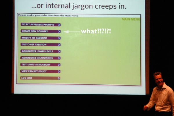
Andy Budd on The User Experience
 Andy started by talking about the early desktop interface, when abstracting the interface made it easier for "non-tech" users. At the time, it was revolutionary. Similarly, Joe Bloggs doesn't want to learn Unix to use their iPods. People DON'T read the manual. No wonder we say RTFM so often.
We learn by experience - programming DVD recorder is very similar to programming the video. So the building blocks are there and users learn the metaphores. It makes it important not to break common interaction habits.
Users learn new technology by exploring - you switch it on and start clicking buttons to see what happens! So make buttons look like buttons. And make sure it's not fragile so that inexperienced users can't break the system with one click.
Modern life constantly demands our attention. How easy is it to send a text while crossing the road? Rarely do people give your application 100% of their attention. Design it to make things easy, as people are adept at multitasking.
Make error reports blindingly obvious. It's a great place to make the user experience a good one - as soon as something breaks, you want immediate service or fix, or at very least, a human-readable error message. Don't make users feel stupid when they do something wrong.
 [I'm no dunce]
Usability is all about making technology easier to use. Plan user experiences carefully. Create wireframe storyboards - think how filming is never done without paper mockups. Then test it on REAL users. Can be as simple as chatting to coffee shop customers - feed them donuts and buy them a coffee and get their feedback on your site - one day user testing, low budget - anything is better than nothing.
UCD is sometimes confused with Business Centred Design or Marketing Centred Design. You should not have to deal with politics. But we all know how hard that can be. Designing with a focus on business unit function is also horribly bad. Technology Centred Design - designing around our own technical ability - we do it that way because we can - is also a no-no.
Get out and talk to the users - find out what they're trying to do with your site. Users don't just want to know what the weather is going to do for the sake of interest, they are more likely to need to know if whether to take an umbrella with them today!
 Build up Personas for each broad type of user. Design with these in mind. Very easy isn't always best - maintain a balance. Sites or games companies know about flow - you lose time when you are interested in something.
Starbucks are masters of the "coffee experience" - which is why we are willing to shell out 3 quid for a cup coffee!
Lastly, he made the point that the iPod would probably fail user testing. People buy into the brand. You might struggle through learning the interface, but you're willing to learn it because your friends tell you it's a cool gagdet. So for the right brand, people are willing to take the time to learn new ways of working.