Friday, December 15, 2006

Lies, Damned Lies, And Statistics

No matter who coined the phrase, it has often been used to cite the inaccuracy of some conclusions which can be drawn from analysing statistics. I'm usually pretty wary of them myself, but sometimes your server stats are your best friend.

I have recently been involved with the redesign of a website which has been online since the end of 2003. It was originally written by another team, and it contained many nested tables, a few styles, but basically not terribly semantic. The team I work with have been looking after the site's content since it's original launch, and a few months ago, the site owner came to us to ask if we could give it a fresh new look, and a bit of a re-organisation. It had grown organically since it's inception, and things had got a little muddled. It was felt that documents in certain areas of the site just weren't being found.

We undertook some user-centred design, testing our new proposals with paper wireframes and some open and closed card sorting. On the basis of these results, we tinkered a bit more and tested again. Then we set about reorganising the content and making much more semantic pages - lists of documents were coded as a list. I'll admit that one table remains for the basic layout, but this was pretty much proscribed by the templating system in use on the server. Everything else has been pared down to provide minimum tag soup.

On 1st November, the new-look site was relaunched. Fast forward a month, and I ran a statistics check on the site, comparing results from October 2006 (old style) and November 2006 (after relaunch). The results were startling.

October - Access Statistics

  • Total page impressions: 98,037
  • Top URL was the site root (no surprise)
  • 4th was the search page, with 1,530 hits.
  • That suggested people weren't finding what they were looking for.
  • "Responses" section (where the bulk of the answers to the public's FOI requests were published) was at 46th, with only 262 hits.
  • We were regularly publishing responses to very similar questions - because users didn't find them on the site before making their own request.
November - Access Statistics
  • Total page impressions: 108,632
  • Top URL was site root, 2nd was the new "responses" index page, with 1,658 hits.
  • Search page had plummeted to 437th - with a mere 24 hits!
  • Other (new) subpages of the responses section were getting plenty of traffic as people explored the new way of accessing the documents.
  • We are still publishing lots of responses to requests, but the number of near-duplicate queries has dropped significantly.
Page Weight Statistics
Some pages were completely re-structred in terms of their content, but about 20 pretty much retained their original information - it was just recoded from tables to lists. I did some analysis on these as a before and after comparison too.

The smallest page started out at 16Kb, and went down to 7Kb (56% reduction); the largest page was originally 119Kb and dropped to 20Kb (83% reduction). On average these 20 files' sizes were reduced by 73%. Not bad in itself, but when you multiply that by the number of page impresesions, you get an idea of the considerable reduction in bandwidth being used.

Conclusions
So there you have it - some numbers to back up the priciples of good user-centred design. I felt that the search page statistic was the most significant - and certainly backed up the old adage that if you have a decent navigation and information hierarchy, people won't need to use the search but will naturally find things themselves.
Pub Standards Party

As if last Saturday's BBC Backstage Xmas party wasn't enough, a group of hardy drinkers gathered last night for the Pub Standards Christmas party.

Much beer was consumed. It was Norm!'s birthday, and he'd very kindly paid for food to be provided, so the gannets soon swooped and demolished that too. The CSS Div had made a very sticky chocolate confection in Birthday Boy's honour, and that was handed round. Very rich, one tiny piece could send you into hyper-glycemic shock.

Frances was quite tipsy, although she's sworn me to secrecy on that one. Oops! And before I left, Matt and Patrick had persuaded me to go along to Matt's birthday showing of Raiders Of The Lost Ark tomorrow. Renting the whole cinema! Extravagance, or what? Most of us just rent the DVD. Ah, well, I could not provide a good alibi for not attending, so I'll be in the audience at 3pm - Matt might even give me a free "John Wayne" badge...

Thursday, December 14, 2006

A Quick Roundup

Screen Reader Demo
I've been very poor at keeping up with my blogging of late. I meant to post a few days ago after attending an excellent Screen Reader demo at Test Partners. Steve Green led the session, and John Welsman (Freelance Assistive Technology Consultant) amazed us all with his speed and dexterity at negotiating the web with JAWS. John also brought along his lovely dog, Dalton, who sat very quietly in the corner all afternoon.

It's only when you witness a blind user having to negotiate the tag soup and badly muddled code that still makes up a huge proportion of the web, that you really appreciate why semantic markup is so important.

  • A website may look great, but take off those stylesheets, and if there are no headings in a document, the user has no way of knowing which sections are which, without wading through loads of text.
  • Jaws will announce how many items are in a list, so it can be very easy to get a mental picture of the navigation items, if they are marked up this way, rather than dumped in a table.
  • A visually impared user builds up a mental model of the page in a completely different way to a sighted user - they have no sense of left or right, everything is top-down - so source order of your code is vital in aiding their understanding.
  • Consistency is the byword - not just in the way things look, but in source order, for instance. Markup pages the same way, and you will give a blind user a head start in visualising the next page they visit on your site - because some of the mental model will still apply from previous pages they may have visited.
Frances also did a writeup of the event, and so I won't repeat too much stuff here. Steve Green also makes some excellent comments on Frances' post.

BBC Backstage Xmas Bash
The geek Christmas event of 2006 was great fun, at The Cuban bar in Citipoint. Ably organised by Ian Forrester, nearly 400 folks attended. It was really nice to catch up with The Usual Suspects, and I was also able to chat with a few people I hadn't had the pleasure of talking to before, including Eric Meyer, who was in London running a 2-day Carson Workshop. I'm kicking myself that I wasn't able to go along to share Eric's knowledge, but work wouldn't pay! Maybe next time?

Glutton For Punishment
Talking of parties, I'm just about to head off to the Pub Standards Christmas party this evening, so I better get my skates on...

Wednesday, December 06, 2006

Cowboys (Me) And Indians (That'll be Apache)

I'm A PHP Newbie
For some weeks, I've been meaning to try my hand at some PHP development, having done most of my projects to date with .NET. I bought the excellent book Blog Design Solutions in September, and have been gradually reading my way through it in my spare time. It gives advice on installing and tweaking some of the most common blog engines such as Movable Type, ExpressionEngine, WordPress and TextPattern, but the last chapter leads you through building your own blogging solution.

I thought this was a good place to start for a PHP newbie, since there were copious examples and plenty of advice about setting up your test environment, a notorious minefield to tread safely on your own.

Setting Up The Test Environment
Unfortunately, this is where the pain and suffering began... I downloaded the lastest stable Apache release (as adivsed by the book), which was supposedly 2.2.3, as the Win MSI installer. It half loaded up, but would not run as a service on my WinXP Pro machine. The Apache icon appared in my SysTray, but the context menu was blank, and it did not appear in my list of services to start manually! After going round the loop several times, I gave up and went back for the 2.0.59 release instead - which worked first time!

Because I've already got IIS running as my default web server on localhost, I had to tell Apache to use a different port - 8080 is the conventional one for a second web server. Then you can use this in your URL to call on Apache to serve your pages:

http://localhost:8080/blog/index.php
I had already installed MySQL 5.0.22 a while back, along with useful tools such as the accompanying Administrator, Query Browser and Migration Toolkit, but had not really used any of it in anger since.Consequently, it took a few minutes to remember what I'd chosen as the root password for the MySQL Administratior package! Eventually, I set up my database (all very straightfoward with the Admin plugin, you don't have to go messing about with SQL statements to make a new table etc, it's all done from a neat little GUI). I'd also got PHP 5.2.0 installed by now.

Connecting To The Database
The next hurdle came when I tried actually running a PHP page with a database connection. I kept getting an error:
Call to undefined function mysql_connect()
After some reading around in my book Beginning PHP and MySQL 5 book (another one which has been propping up the coffee table of late but came into it's own for this), it turns out that PHP5 does not ship with native MySQL support embedded; you have to download some extra libraries and then go fiddling around with the php.ini file. I found this tutorial page really useful in explaining what was needed. And for all the knocking that Microsoft gets in various quarters, I don't ever remember this much effort being required to set up IIS to run with the .NET framework! Bah, humbug.

Once the environment was properly configured, the actual blog development wasn't too bad. I had a few "moments" of frustration trying to chase down some syntax typos which caused various things to blow up, but you get used to that with hand coding!

Telling The Time
Another tricky thing to get right is date and time formatting. My PHP book gave me info if you want to use PHP to display the current date:
<?php echo "".date("l, jS F, Y"); ?>
Gives you "Wednesday, 6th December 2006".

There are occasions when you want to format the date in the SQL statement, and trying to get your head round a seemingly-arbitrary set of case-sensitive parameters in the format string is difficult. Which is where Dan Winchester's guide to MySQL date_format was also very handy. You might use something like this:
SELECT post_id, title, post
DATE_FORMAT(postdate, '%W, %D %M %Y') AS dateposted, DATE_FORMAT(postdate, '%H:%i') AS timeposted
FROM posts WHERE post_id=$post_id LIMIT 1
dateposted would display "Wednesday, 6th December 2006" as before, and the timeposted variable shows "22:45". I split these in two so the parsed date string could be displayed separately from the time portion - if you made two posts in a day, it's nice not to repeat the day/date element every time. If you wanted to lump them together, just use this instead:
SELECT post_id, title, post
DATE_FORMAT(postdate, '%W, %D %M %Y' at %H:%i) AS dateposted
FROM posts WHERE post_id=$post_id LIMIT 1
This will give "Wednesday, 6th December 2006 at 22:25" as one string.

Future Developments?
So now, I have my own blogging engine running on my localhost using PHP and MySQL. I'm not about to share the new blog with the world, as it largely consists of a personal diary and various rants, but it's been a very worthwhile exercise in dipping my toes in the murky PHP waters.

I may decide to develop the code further, and perhaps use it to host this blog on my own server in due course, but for the moment, it's staying right here at blogger.

Wednesday, November 22, 2006

Playpen #7 - Flickr API

With my new-found ability to consume RSS (and by inference, any XML), my next challenge was to combine that with Playpen # 2 - Lightbox JS and the Flickr API and see what fun I could have.

Firstly, I logged into Flickr and found a suitable photo set of mine to play with, taking note of the setID. Browsing the API documentation, I found the API Explorer page very useful. It gives you some handy values straight away, such as your userID, plus recent photoIDs, setIDs and contactIDs.

If you put the SetID in the form on the Explorer page, and call the method (I used an unsigned call, since I was only interested in displaying pictures, not writing details or uploading), the XML file for your photo set is returned, along with the all-important URL you can use to call the method from your web page.

Whilst I didn't actually need to save this generated XML file, I did find it useful to see exactly what was what in terms of the schema - sometimes seeing an actual value tells you an awful lot more than just seeing the name of an element or attribute.

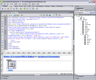
I then used Dreamweaver8 to generate a new XSL fragment file, which calls the aforementioned URL as its source. This gives you a display of the XML schema in the bindings panel. You can then drag and drop elements and attributes (relatively) painlessly onto your XSL document:

The nuts and bolts of my stylesheet are as follows:

<xsl:stylesheet version="1.0" xmlns:xsl="http://www.w3.org/1999/XSL/Transform">
<xsl:output method="html" encoding="utf-8"/>
<xsl:template match="/">
<h3>
<a href="http://www.flickr.com/photos/{rsp/photoset/@owner}/sets/
{rsp/photoset/@id}">Pictures of d.construct2006 in Brighton</a>
by <a href="http://www.flickr.com/people/{rsp/photoset/@owner}"><xsl:value-of select='rsp/photoset/@ownername'/></a>
</h3>
<ul class="thumbnails">
<xsl:for-each select="rsp/photoset/photo">
<li><a href="http://static.flickr.com/{@server}/{@id}_{@secret}_o.jpg" title="{@title}" >
<img src="http://static.flickr.com/{@server}/{@id}_{@secret}_s.jpg" alt="{@title}" name="{@id}" width="75" height="75" id="{@id}" />
<br /><xsl:value-of select="@title"/></a></li>
</xsl:for-each>
</ul>
</xsl:template>
</xsl:stylesheet>
The Photo Source URLs page was extremely useful in telling me what paths I needed to construct for the image thumbnails and originals. Even so, I spent a frustrating half hour getting the syntax right. I learned the hard way that copy/paste in the code view doesn't always get you the right path - but if you drag an attribute from the bindings panel onto the design view of the file (not the code view), the path is sorted out for you!

Basically, I was mistakenly adding:
{rsp/photoset/photo/@attribute}
instead of just {@attribute}, in the loop, and nothing showed up. But the overall title bit worked fine - because this was outside the loop, and did require the rest of the path to parse correctly. Argh!

With a bit of CSS styling, the photoset is displayed nicely in Playpen #7. Clicking the title or thumbnail then brings up the LightboxJS function to display the original image from Flickr, with it's title and prev/next links to the other pictures in the set.

RSS - Consumer Indegestion

As well as problems generating my own RSS feeds, I've been banging my head against the Adobe brick wall as far as consuming RSS is concerned.

Dreamweaver8 is my weapon of choice for development (so shoot me), and I tried a few months ago to get the BBC's Rugby Union RSS feed added to my rugbypix.com page. Adobe have a tutorial which explains a lot. Trouble was, I did everything they said, and on my localhost test environment, I kept getting an error message:

MM_XSLTransform error:
"http://newsrss.bbc.co.uk/rss/sportonline_uk_edition/rugby_union/rss.xml" is not a valid XML document.
The underlying connection was closed: Unable to connect to the remote server.
The claim that it wasn't a valid XML document was obviously rubbish, since the BBC's feed works in all the feed readers I've tried! Googling for the error didn't produce anything sensible, so I shelved the project and put it on the back burner for a while.

Returning to it this afternoon, I tried uploading the XSL fragment (which does the data repeat for the feed) and the page in which the transformation is called, onto my live server. I got a different message - the MM_XSLTransform.cs file was missing - progress! I knew that on my previous attempts, the only transform I could find available was the MM_XSLTransform.vb file, which was the wrong server model for my site.

Another quick google for the C# transform got me to this page. And, voilà! a link to download the missing MM_XSLTransform.cs. Bung it in the includes/MM_XSLTransform/ folder and upload it to the site, and Bob's your uncle... BBC Sport Rugby Union feed at rugbypix.com

Great, another niggling problem ticked off my list!

Monday, November 20, 2006

20x2 v6.5 - Where Am I?

I had fun at last night's 20x2 event, which was well attended by those keen to see the first event held outside Texas. The speakers were:

  1. allison pickett (artist)
  2. steve day (comedian)
  3. jaye joseph (designer)
  4. jon roobottom (designer)
  5. ann mcmeekin (designer/photographer)
  6. steve marshall (developer/designer)
  7. bobby pathak (journalist)
  8. frances berriman (designer)
  9. diego brown & the good fairy (band)
  10. james edwards (developer/designer) - no-show :-(
  11. david frew (acerbia)
  12. john bergaman (artist)
  13. jen dixon (writer, photographer, web geek)
  14. andy galletly (producer/cinematographer)
  15. gavin strange (designer)
  16. leisa reichelt (user experience consultant)
  17. gia milinovich (blogger/tv presenter)
  18. sam sethi (entrepreneur, techcrunch uk)
  19. buswell (band)
  20. foundry (artist)
As you can see, a varied bunch, and certainly a varied interpretation of the question, where am i?

And here are a few photos from the evening:

[my name is roobottom...]

[frances berriman... cue hysteria!]

[foundary whizzes up some art in 2 minutes]

You can see a few more photos from the event at my flickr account.

Saturday, November 18, 2006

Playpen #6 - sIFR Headlines

I've been meaning to experiment with sIFR headline styling ever since hearing Dave Shea's Fine Typography On The Web piece during the @media 2006 conference. I've finally got a demo going at playpen #6.

What does sIFR mean?
sIFR stands for Scalable Inline Flash Replacement, and is an unobtrusive JavaScript/Flash solution for providing lovely fonts on your site (eg for headlines) whilst still remaining accessible, and not relying on that font being installed on a user's machine. Read more about the techniqute by visitng the official sIFR Wiki/Documentation site. H1 and H2 headings are best restyled using sIFR, rather than large bodies of text. If a browser does not have JavaScript enabled, the headlines will just be styled by the regular CSS definitions, so it degrades gracefully.

Why Bother?
There are several techniques for image replacement. The Gilder/Levin method is one such (see Dave Shea's article which explains some of the others too). Gilder/Levin is recognised as one of the best from an accessibility standpoint. But the down side, is that you have to manually generate each graphic used to replace your text, plus add a specific CSS rule for each in your stylesheet. That's all very well if you have a smallish, static site, and not many headings to replace. But what about database-driven sites and blogs, where you don't know in advance what the text will be which needs replacing? The only practical way to go is sIFR under these circumstances.

Where Can I Get It?
More information and a download for the code can be found at Mike Davidson's sIFR page.

Where Is It Used?
Keep an eye out for any sites which use unusual typography for headings or recurrent elements. If this is a database-driven site (such as ecommerce or blog), the chances are, sIFR will be the method that's used. Two likely candidates off the top of my head are:

Friday, November 17, 2006

Playpen #5 - Well Fed

Generating RSS
I've been meaning to get some rss feeds sorted out for my photographic sites for some time. There were some technicalities which I was wracking my brains to overcome, and for a while, I couldn't make up my mind which format to support. But in the end, it only took a couple of dollars to pull my finger out - I found a great tutorial at CommunityMX about blog authoring, which gave me the final push.

I also found the rss2.0 specification and feed validator for Atom and RSS invaluable in getting a valid feed sorted out.

Where Are My Feeds?

Feed Reader Interpretations
One thing I'd not really taken much notice of, as a consumer of other people's feeds, was how various feed readers actually present the information. But once I started authoring feeds, it's become a bit more obvious how each aggregator parses the xml file to display the feed. Some will only show 20 posts (no matter how many are actually in the feed), others keep a cached copy and don't seem to want to update the feed if the order of posts hasn't changed but the layout and content has. All rather frustrating if you're trying to author a feed and test it!

Some Anomalies
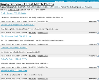
First off, Bloglines keeps a cache of the feed, and so it's only showing an early version of the rugbypix feed (without thumbnails) in this screenshot:

Also, if a feed has 40 items (I sometimes post a large batch of images so didn't want to limit the feed to the last dozen or so), it only shows 20 - the oldest 20. So when other feed readers show the last two matches (40 images = 2 games, 20 images each), Bloglines will only display the last but one game's pictures, not the latest 20. [Add: between composing this and actually posting it, Bloglines has now caught up and refreshed the feed - but it did take about 48 hours!]

The cazphoto feed looks a little better (I'd got the hang of formatting by now):

Next we see what it looks like in YahooMail Beta feed reader:

Quite a nice presentation, but it doesn't show the date up very well.

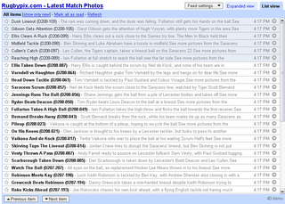
Google's feed reader makes a nice job of things in expanded view:

Plus it offers a cutdown list view if you so wish:

I also tried the Sage plugin for Firefox, which gives yet another take on the display, showing a 3-pane affair, feeds at top left, item summary of feed in bottom left and a rather more snazzily-laid out view of each item in the right pane:


So there we have it - a small sampling of feed readers. What's your favourite feed reader, and how well does it render your chosen feeds? One final (surprising) thing I found out during my investigations was that the standard Flickr Photo Feeds don't validate! Oops!

Publicising Your Feed
It's no good having a feed and no-one knows it's there. Adding a suitable link (often showing the Feed icon icon) to your website can help. Also, add a link in the head of your page to tell feed readers your feed is available. This takes the format:
<link rel="alternate" type="application/rss+xml" title="My Feed " href="http://www.mysite.com/rss/">
Third Party services such as pingomatic can also help raise the profile of your feed. Happy pinging.

Tuesday, November 14, 2006

World Usability Day


Did you know that today was World Usability Day? No? Neither did I until an email landed in my inbox from Userfocus, a UK-based usability/accessibility consultancy.

There's a one-day event held in Nottingham today, with lots of interesting speakers. But I'm particularly gutted to be missing the talk entitled:

“What Farmer Buckley's exploding trousers can tell us about web usability”, by Dave Travis of Userfocus Ltd, (211 Piccadilly London W1J 9HF)
What, indeed?

I'd love to hear from anyone who attended, and might be able to shed some light on Farmer Buckley's mishap!

Saturday, November 11, 2006

Making The Most of Yourself

As an aspiring freelancer, soon to be cast adrift from corporate life, I've obviously been taking all opportunities to get advice on promoting my services and attracting clients. Three great posts have come to light in the past couple of weeks:

  • First up, Andy Budd lists 7 Habits of a Highly Successful Freelance Web Designer - some great tips, and ones I shall be keeping in mind for my own career development.
  • Andy also raises some interesting questions in his Blogging For Business and Pleasure article. One way to raise your profile in the web sphere is to blog regularly, and whilst it might not attract huge numbers of clients beating down your door (depending on their tech-savvy research), it can certainly pay dividends in terms of securing freelance work with other design companies, for instance. Andy employs freelancers on a regular basis, and says:
    By building your reputation as an expert, people will be happy using your services and recommending you to others. Blogging is a particularly good way of doing this and is something I highly recommend. When looking for a new freelancer I’ll get a much better sense of their interests and abilities though their blog than I’d ever get from reading a resume.
  • One of Andy's recommendations is to get a killer portfolio. On this theme, Jeff Veen gives us Five Steps to a Better Design Portfolio. Again, lots of good advice from people that have been there and done it (and done it very well).
Back to the networking theme...
I've just attened a two-day workshop, run by Penna, which helps people with their career transitions - what a nice way of saying "redundancy", LOL. One statistic to come out of that was the fact that only 10-20% of new appointments are actually filled via advertised recruitment - the rest come from personal recommendations or individuals targeting the right people with their resumes. I was really surprised by how low that figure was, but our course leader pointed out that most people will spend their energies concentrating on this 20% and completely ignore the other 80% of, albeit hidden, opportunities.

Networking in a formal, business sort of environment has always struck me as particularly dull, but I've had a great time at recent geek events, chatting over a beer, and getting to know people. Now that sort of networking, I could really get to enjoy!

And of course, it's not a case of bounding up to people and saying "gizza job!" - oh, no. The seeds might be planted now, but the rewards might not be reaped for months or even years. It's a long term bet, but one in which it's well worth investing.

Friday, November 10, 2006

Patronage And Other Musings

You may have noticed the "i'm patronising" badge on the side of this blog. What's it all about? Well, Joe Clark has a big plan and he needs small donations towards keeping him fed, while he spends four months trying to raise $7 million (canadian) to undertake the research he wants to carry out. He's targeting four major strands of accessibility, and has set up the Open & Closed Project in order to do so. By donating a modest sum, folks like you and me can make a small contribution, which in turn will allow Joe to make a big one. Good luck Joe!

Two more recent posts concerning accessibility have caught my eye:

Tuesday, November 07, 2006

London 2.0 RC9

That sounds like a mouthful, but was actually a fun evening at the Old Bank of England, a wonderfully atmospheric pub in Fleet Street.

It's the first time Sheila and I had been to a "London 2.0" event, and we got there quite early due to being able to skive off our regular commitments in plenty of time.

Before long, we were joined by other new faces and old timers. It was great to catch up with some people I'd not seen for a while and make other new friends, including:

  • Liam Clancy - sporting a new haircut, but we still recongnised him!
  • Mike Butcher of Techcrunch, who kindly bought a round and promptly wandered off before we could have a proper chat.
  • Richard Livsey a newbie to the London developers scene, who had rather bravely cycled to the venue - hope your bike was still chained where you left it, Richard!
  • Simon Whatley who was happy to chat with us, drink beer and blether on about the rugby for most of the evening.
Looking forward to the next London 2.0 do, I'll certainly hope to speak to some more of the regulars next time.

Tuesday, October 31, 2006

Wonky Feeds

Apologies for anyone reading my posts via feedreaders, rather than directly on the blog, who may have been wondering why some of my oldest posts are suddenly appearing.

In addition to the new design, I've also been making use of the blogger beta's "label" feature (aka tagging) and updating old posts with suitable tags. Unlike the old version of blogger, which never seemed to care if you went back and updated a post, the beta version makes updated posts float up to the top of your site feed. Hence some older stuff appearing on the list!

Hopefully, it won't happen again on the same scale, since I'll be tagging each post as I write it. Sorry for any confusion!

Monday, October 30, 2006

I've Had A Facelift!

A virtual one, not a real nip & tuck.

After weeks of dithering, I've finally upgraded my blogs to the blogger beta account (there was no going back, so I wanted to be sure before I jumped!). And while I was at it, I thought I would take the opportunity to choose a new template, more in keeping with the colour scheme of my website, carolinemockett.com

It's taken me a while to get my head round the new blogger template widgets, and when I've had more of a play, there may well be a few more tweaks to the Emperor's New Clothes (or should that be Empress?)

Sunday, October 29, 2006

Browser Wars or Spoiled For Choice?

Two new browsers have launched in the same week. As Olly says, it's a bit like London Buses. First a drought, and then they all come at once.

Firefox 2 - first impressions

As a regular user of FF1.5, I was keen to get the 2.0 release and like the slightly "shinier" look of the browser - someone's polished the chrome!

I found an excellent article on tweaking Firefox, and have done a little customisation to make myself happy with it. One thing I was having trouble with - the new version put an "X" on every tab to close it, whereas 1.5 just had the one at the righ hand end of the tab bar.

Fiddling with the browser.tabs.closeButtons parameter, and setting it to "0" just gives you the close button on the active tab. Much better!

The browser.tabs.tabMinWidth default is 100[px]. If you have many tabs open at once, you end up with scroll arrows in the tab bar, and only get about 7 tabs across by default before this happens. Changing this parameter to 75 gives you about 10 tabs before they start scrolling.

I like the "Recently closed tabs" in the History menu too - how many times have you closed a tab, only to think, "damn, I wanted that one"? Restore it quickly via this menu, and voilà!

Setting browser.urlbar.hideGoButton to "true" (default false) will get rid of the annoying green arrow next to the address bar. Personally, I never use it, I'm in the habit of bashing "return" once I've typed in a URL.

There are other new features, but I've yet to fully explore them.

IE7 - first impressions

I've been waiting in trepidation for Microsoft's latest browser to be released. Yet ANOTHER browser us poor web developers will have to take into account when testing our sites. Yesterday, I bit the bullet.

No troubles in downloading the update, or installing it (thankfully!). Similarly, I went and trawled the evolt.org browser archive for a standalone version of IE6. I've heard some people have had problems with these standalone versions, but thankfully, no aggro as yet. So I've now got IE6, IE5.5 and IE5.01 on my PC too. Along with Opera, that has most of the major PC browsers covered.

Looks like none of my sites have major issues in IE7 - thank heavens! But I would have been surprised if they did - most were designed with standards in mind (IE7 is just catching up with the standards used by Firefox for years), and I haven't got loads of IE-specific hacks lurking in my code.

Two things about IE7 I do like, and don't think Firefox2 has (let me know if I've missed these options buried in FF somewhere):

  1. Page thumbnails
  2. Whole-page zoom
Page Thumbnails

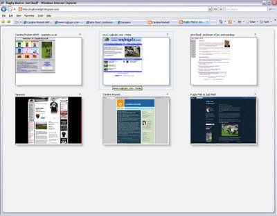
If you click the thumbnails tab at the LHS of the tab bar (outlined in red) -
the browser gives you a large thumbnail of what each tab's page looks like. A bit trivial if you have lots of different sites open, perhaps, but useful if you quickly want to tell the difference between several pages from the same site. The thumbnail display looks like this:


Whole-Page Zoom


And secondly, with accessibility in mind, IE7 will actually zoom the whole page, rather than just text. So if your standard page looks like this:

Once the page is zoomed, even up to 400%, it makes a pretty decent job of rendering text in graphics at this larger size (click the image below to see an actual-pixels version):


I'm sure there will be little niggles and glitches which become apparent as the web community gets used to these new browsers. For the moment, although I see IE7 as a massive improvement over the crusty old IE6, I don't think it's quite persuded me to swich from Firefox as my default browser. And that's largely to do with the developer extensions and addons I use. Perhaps for a regular surfer, it would be enough.

Finally, A Night At The Opera

Lastly, I've just downloaded the upgrade for Opera, now version 9. The Opera website details what's new in Opera9. Haven't really had a chance to look at this in depth, but it's always good to have another browser option to test.

Tuesday, October 24, 2006

Playpen #4 - Microformats/Too Many Tails?

Enthused by the WSG meeting on Microformats last Thursday, I thought I would update my website to include some hCard information, so put together an About Me section.

I thought I would include links to "me" elsewhere on the web, too - such as Flickr and Upcoming. The hCard spec allows for these sort of additional URLs, as long as you mark them up with class="url", which I duely did.

However, when the Tails extension for Firefox scrapes the page for Microformat info, if you have marked up multiple links with class="url" - it just takes the last one in the vCard element as the one which is displayed in the popup. I removed the class from the last link in the list, and Tails took the next one up. So, it seems Tails doesn't parse mutlitple URLs and list them too, it just uses "last man wins" as the URL to display - a shame :-( It would be nice if it took the one associated with the name or organisation element as primary. Perhaps there is a way to say which one is primary, and I'm missing the point?

In order that I don't mess up my about me page, I've taken these extra classes off it, but in order to show you what I mean, I've replicated the problem in the playpen4 page.

If anyone has any thoughts or comments, I'd be interested to hear them.

31st October - add:

Further to Trovster's comments, here are two screenshots for my version of Tails (0.3.4):

[click for a bigger version] - Tails displays my Contact details with just one URL: the link surrounding "Freelance Web Design & Photography" is the only anchor marked up with class="url" on this page.

However, the playpen4 page looks like this with Tails:

[click for a bigger version] Tails still displays just one URL, but this time it's the last one in the hCard list marked up with class="url", this time the link for my dConstruct Backnetwork profile.

Monday, October 23, 2006

Advanced Driving Techniques

I had to take a drive down to the main sorting office earlier on, to collect a parcel. It had a customs charge of £3.68 - fair enough - and a £4.00 "Royal Mail Administration Fee" on top.

<rant> HOW MUCH ?!?!?! </rant>

Anyway, that wasn't the point of this post...

My route home from the PO takes me past the County Police HQ, and just outside it, a vehicle cut me up by pulling in front and proceeded to do 15mph (in a 30 limit) until the next junction, where it turned left without indicating! Sadly, I was going the same way, and the car (still doing 15mph) then pulled up outside the County Court, giving 1 second's worth of indication and "parking" half in and half out of the layby.

It was a display truely worthy of someone out on their first driving lesson. But the reason I was so shocked? It was a marked patrol car!

Sunday, October 22, 2006

Microformats Extension for Dreamweaver8

Having downloaded Brian Suda's Microformat Cheat Sheet, I had been methodically adding XFN and hCard info to previous blog posts by messing under the hood in split/code view. All very tedious. As I added similar stuff for the nth time, I was just thinking, "wouldn't it be nice if some clever type had written a DW extension to do this..."

No sooner thought, than found - more or less by accident, I've just discovered the Microformats Extension for Dreamweaver8 at the WaSP website. Now it really is a no-brainer to add Microformats to any page.

After installing the extension, you get the Microformats tab appear at the end of the Insert Bar:

Microformats Insert bar for Dreamweaver 8
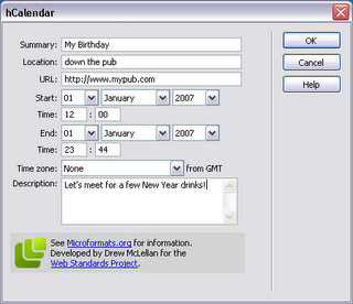
The first icon gives you the hCal dialogue box:

hCal dialogueFill it in, and lo! and behold, you get the relevent hCal code in your page:

<div class="vevent">
<a class="url" href="http://www.mypub.com">
<abbr
class="dtstart" title="20070101T1200"> January 01, 2007 - 12:00 </abbr> - <abbr class="dtend" title="20070101T2344"> 23:44 </abbr> - <span class="summary"> My Birthday </span> - at <span lass="location"> down the pub </span> </a>
<div class="description"> Let's meet for a few New Year drinks! </div>
</div>

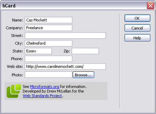
Next up is the icon for hCard, and pushing the button gives us:

hCard dialogueWhich produces:
<div class="vcard"> <a class="url fn" href="http://www.carolinemockett.com/">Caz Mockett</a>
<div class="org">Freelance</div>
<div class="adr"> <span class="locality">Chelmsford</span>, <span class="region">Essex</span> </div>
</div>

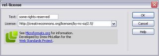
The third icon is for the rel-licence attribute:

rel-licence dialoguegiving the very simple
<a href="http://creativecommons.org/licenses/by-nc-sa/2.5/" rel="license">some rights reserved</a>
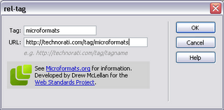
The little "luggage tag" icon gives us the rel-tag dialogue (of course):

rel-tag dialoguewhich gives us
<span class="technoratitag">
<a href="http://technorati.com/tag/microformats" rel="tag">microformats</a> </span>
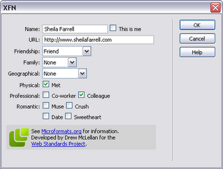
Finally, the dizzy-looking heads icon is for the XFN widget, which really is very neat indeed:

XFN dialogue
giving us this little code snippet:
<a href="http://www.sheilafarrell.com" rel="met colleague friend">Sheila Farrell</a>
Fab. All of a sudden, my life has become easier. Drew, you're a genius!


Saturday, October 21, 2006

Geek Dinner With Molly Holzschlag

Great evening at the Geek Dinner last night, with guest Molly Holzschlag. I've only been to one other, where Chris Anderson gave us a talk about The Long Tail, so I was a bit surprised that Molly didn't give a presentation as such, but we all enjoyed her company and she was pleased to chat with anyone about anything.

It was nice to catch up with existing friends; Sheila Farrell, Robert Lee-Cann, Ross Bruniges, Ian Forrester and Chris Heilmann, plus make some new ones! I had interesting chats with:

So there we are, a good group of names I can now put faces to - see you at the next one folks!

Oh, and fresh from the recent Microformats WSG-meet, I've marked this up with a load of hCard info :-)

Friday, October 20, 2006

WSG London #2 - Microformats

The second London WSG meeting was all about Microformats, something I've been meaning to get to grips with for a while. What are they, and what are they good for? We had three Microformats "Ghosts" to help us understand more about them:

The Ghost of Microformats Past - Mark Norman Francis Esq of Ye Olde Yahoo! Corp. Norman gave us an overview of what Microformats are for, and why they have evolved:
  • They should be there for humans first and machines second
  • They are a way of encoding data
  • Start simply, and re-use building blocks from other standards
  • They are modular and embeddable
  • And most importantly, they should attach extra (explicit) meaning to (implicit) content.

One of the first Microformats to evolve was the XFN standard in 2003. In its simplest form, this adds the "rel" tag to an anchor link (for a person's blog, say), where you can specify your relationship to them. See my other post on XFN for more info.

In 2004, the Creative Commons Licences took off, and the rel="licence" tag was added to the Microformats arsenal, eg: Creative Commons, <a href="http://creativecommons.org/licenses/by-nc-sa/2.5/" rel="licence">some rights reserved</a>

A lot of sites have invisible meta data hidden in their pages, but which might as well be invisible - visitors can't see it, and content authors often forget to update it. Norm's phrase was out of site/sight, out of mind. If a human can't see it, the metadata might as well not be there.

He briefly discussed why using XML namespaces was considered harmful. They are not well supported, even in modern browsers, and are antisocial (giving rise to the namespaces Tower of Babel).

But on 20th June 2005, http://microformats.org was unleashed on the web community. In 15 months, there has been a huge adoption of them, basically because they are simple, sensible and extensible. Most popular have been the hCard and hCal formats, along with the rel-licence, rel-tag and afforementioned XFN.

Out in the wild, heavyweights such as WordPress, Yahoo!, Google, Technorati have adopted microformats. With a very small tweak to one of their PHP templates, Yahoo Local have suddenly made 15m new hCards available on the web!

Next up was The Ghost of Microformats Present, Mr Jeremy Keith of Clearleft

Jeremy started out by reminding us that the (X)HTML specs do not have specific tags for semantic items such as contact details, relationships, events or reviews, and with the addition of a little bit of extra markup (mainly attributes to existing elements), we can explicitly specify these things in existing markup.

  • Elemental Microformats
    • the rel attribute:
      <link href="mystyle.css" rel="stylesheet" type="text/css" />
      In this case, the rel atribute defines the relationship of the linked resource to the current document (something that had never really occurred to me until the blindingly obvious was pointed out!) Similarly, <a rel="help" href="help.html">Help page</a> might explicitly define a help document for the page containing the link.
      <a rel="tag" href="http://en.wikipedia.org/Microformats">Microformats </a>
      tells us that the link is also a tag.
      He also mentioned rel-licence and XFN as above.
    • the rev attribute:
      Less well known and trickier to get your hear round, the rev attribute defines the reverse relationship to "rel". So in the above example, on the help.html page, you might find a link thus: <a rev="help" href="checkout.html">the checkout page</a> which would say, the current page is the help resource for the checkout page.
    • the vote-for/against attribute:
      You might include a link to someone else's blog, which expresses an opion (be it negative or positive) which you agree with. Then use:
      <a rel="vote-for" href="review.html">a damning critique</a>. The rel="vote-against" is of course, the opposite (you disagree with the opinion, whether it is positive or negative)
  • Compound Microformats
    These add more than one attribute - usually classes - to elements. We mustn't forget that classes are for general purpose processing by user agents - NOT just for CSS - and should add extra semantic meaning to a document. He cited the hCard example for contact details on a blog:
    <address class="vcard">
    <a href="http://joebloggs.com/blog" class="url org">
    Joe's Blog</a> is the online home of
    <a href="mailto:me@jobloggs.com" class="email
    fn">Joe Bloggs</a>, a <span class="title">web
    developer</span> living and working in <span class="adr">
    <span class="locality">London</span>,
    <span class="country-name">England</span>
    </span>.
    </address>

Other things we need to consider are tools for creating and viewing Microformats. The hCard-O-Matic will give you a head start on writing an hCard for contact details, as will the hCal-O-Matic for events. Brian Suda's Microformat Cheat Sheet should also be a must if you're needing a quick reference guide.

On the discovery end of things, the Tails extension for Firefox is great for finding microformats on a page. For those folks not running Firefox, John Hicks has written a client-side stylesheet to highlight microformats, and he's updated it already. Tantek's microformats favelets let you copy hCard or hCal information into your address book or calendar. And Technorati have started to index microformats too!

Jeremy has kindly put his slides together as a PDF - but they're never as much fun as seeing them delivered "live" ;-)

Finally, a taste of things to come? The Ghost of Microformats Future, aka Drew McLellan , also of Yahoo! Europe, and a member of WaSP

Drew immediately got everyone's attention by asking, could using Microformats on your current site effectively replace your API? He demonstrated numerous instances where complex calls to APIs could be supplanted with the relevent microformat codes in the page, and pretty much showed us what they could become given enough widespread adoption. You cane see Drew's slides online, as I didn't have time to scribble all the fiddly bits of code he demonstrated.

One site which has no API but is littered with useful microformats is corkd.com. You can extract contact info or reviews at will, if you have the right plugin widgets.

Drew also drew our attention to some useful tools:

Brian Suda's X2V transformer - takes XHTML hCal/hCard and munches them into vCard/iCalendar files. Then there's Drew's new tools.microformatic.com site.

Questions and answers were welcomed by our Three Musketeers. Yahoo! memory sticks were given out as goodies to anyone who asked a question. One interesting question that stuck in my mind was asking if there were any microformats for mobile? Jeremy quipped that they are smaller than that, and there's more information on picoformats at the microformats wiki.

A very long post; wrapping up I'll say we all enjoyed a beer with the other geeks in the pub afterwards! Thanks to Stuart for organising the meet. He's already put up the podcast feed from the event. I'm looking forward to the next one, whenever that comes round.

Tuesday, October 17, 2006

Gone Into Hiding?

You may have wondered if I've gone into hiding as the blog has been very quiet lately. Well, the answer's no, but I have had a week off doing stuff at home and not going near the computer very much. Makes a nice change, every now and then!

Emerging from my exile, I'm blinking in the bright light of day and trying to catch up with a bit of blog reading, writing and other pc-related stuff.

Olly Hodgson has some excellent links, which I've been following up, and then generally getting lost in the blogsphere. I'm also waiting with baited breath to see how The CSS Div almost got himself killed...

Here's a few good posts about accessibility issues:

As an antidote to my recent exile, I'm also being very sociable this week, with the upcoming events in London to attend - WSG London #2 - Microformats and the London Geek Dinner with Molly H. Will report back on them later in the week.

Friday, September 29, 2006

Tips For Business

I was perusing Derek Featherstone's blog the other day (entitled Box of Chocolates, which immediately got my attention!) when I came across two articles of interest about success in business:

Five Business Mistakes I’ve Made
Ten Smart Moves to Improve your Business

Both contain wise words, which are now of particular relevence to me, since I heard yesterday that my current employer has agreed to let me take voluntary redundancy in the New Year. Looks like I'll be working my notice and then free to set up my own freelance design & development company with my payoff! All very exciting, and just a little scary; but I'm looking forward to the challenge immensely.

Wednesday, September 27, 2006

Playpen #3 - Changing Your Stripes

You know what they say about Leopards... well at least you can get a table to change its stripes with a bit of DOM scripting.

It's a fairly trivial problem, but seeing as I'm pretty green when it comes to unobtrusive JavaScript, it's somewhere to start!

The Playpen #3 page shows off the table, which has a new class added on alternate rows, and defines a new background colour in the CSS. OnMouseOver will change the class again, to give another colour. But I'm having real trouble resetting the original class/colour onMouseOut... It's probably because the DOM is changed on the fly, and the original (not moused over) state of the alternate row is never actually "stored" on the page. If anyone has any suggestions, I'd be very interested to hear.

For the record, my stripeTables script looks like this:

function stripeTables() {
if (!document.getElementsByTagName) return false;
var tables = document.getElementsByTagName("table");
for (var i=0; i<tables.length; i++) {
var odd = false;
var rows = tables[i].getElementsByTagName("tr");
for (var j=0; j<rows.length; j++) {
if (odd == true) {
addClass(rows[j],"altrow");
odd = false;
} else {
odd = true;
}
}
}
}

addLoadEvent(stripeTables);

And this is highlightRows:

function highlightRows() {
if(!document.getElementsByTagName) return false;
var rows = document.getElementsByTagName("tr");
for (var i=0; i<rows.length; i++) {
var rowclass = rows[i].getAttribute("class");
rows[i].onmouseover = function() {
addClass(this,"highlight");
}
rows[i].onmouseout = function() {
this.setAttribute("class" , "rowclass[i]");
}
}
}
addLoadEvent(highlightRows);
I thought getting the Class attribute and storing as rowclass would allow me to reset it to what it was before the onMouseOver event, but sadly the table rows become unstripey once they are moused over!

The only other way I can think of doing it is writing some sort of subtractClass script to complement addClass, but seeing as this will almost certainly involve hideous regular expressions, I'm rather shying away from that.

Anyone have any ideas what I'm doing wrong?

Sunday, September 24, 2006

Upcoming Events

I've recently signed up for Upcoming.org so I can keep an eye out on what's in the pipeline in the near future. Two events caught my eye, coincidentally on consecutive evenings (all we need is a third one and they'll be like London Buses...)

Thursday 19th October
Web Standards Group Meeting # 2 where Microformats will be discussed. See Muffinresearch.co.uk for more details.

Friday 20th October
London Geek Dinner, special guest Molly E. Holzschlag. See the Geek Dinner website for more details.

Both events look like a good evening; perhaps I'll see some of you there.

Saturday, September 23, 2006

Playpen #2 - Lightbox JS

The d.Construct Backnewtwork has a neat feature which hooks into the Flickr API and pulls out all suitably-tagged images of the conference. Then when you click an image, it appears in a rather sexy overlay window.

I've been looking for some time, for an unobtrusive javascript method of displaying a photo + caption in a popup, as I have several sites which require this feature, without needing to go for the overhead of dynamic pages or a page per image. Trouble is, most of the methods I've found haven't been friendly if you turn off JavaScript!

The latest issue of .Net magazine (#154) also has a tutorial on Lightboxes (Javascript Image gallery widgets), so I thought I'd give Lightbox JS a try.

It works great straight out of the box, is dead easy to inplement, and will let you customise quite a few features. If users have Javascript disabled, they still get to see the content (the larger image when you click on the thumbnail, albeit in a boring vanilla window), so it's fine from an accessibility standpoint. And I'm pretty sure it's the very same method the backnetwork uses.

I knocked a quick gallery together, which you can see at the Playpen #2 page.

Thursday, September 21, 2006

Beta Blockers?

Blogger has a new beta version out and is inviting bloggers to move over from their existing account. This involves signing in with a Google account - either using an existing one, or signing up for a new account.

Using systems in beta can be a "fun" experience - you might be the person to come across that little-known bug which completely ruins your day! Or you might find that all the new features are worth the little rough patches while everything gets ironed out.

I'll admit I'm dithering over whether I should jump ship and go for the beta release. There are certainly some great new features like the ability to restrict read access and add "labels" (tags to you and me) for searching and categorising your blog posts. OK, these two are features which other publishing systems like WordPress have had for some time (and I know of folks who have defected to WordPress from Blogger in the past due to these deficiencies).

One "hidden" benefit is their new dynamic serving of pages. In the past, you had to "Publish" each new entry or the whole blog when you made changes, to give the static HTML pages which made up your blog. If you forgot to republish, the changes weren't seen until the next time you republished. This was pretty tedious and took quite a while if you had large blog. In the new version, changes are made to the database immediately and each page is served dynamically on the fly at each request. No more waiting for the spinning logo to finish its whirling!

My ideal scenario would be to move just one blog (probably the RugbyMad one) and play with it for a bit to see if I have any problems, before moving this blog too. But it's not clear from the support info if I can do this - effectivley, both blogs are linked from one account, and I think it's the account I'm moving and not the blog specifically.

Anyway, if you're interested in what new features are in the beta release, here are a few links for you to digest:

Wednesday, September 20, 2006

Playpen #1 - Google Maps

Inspired by Jeremy Keith's piece at d.Construct the other week, I've finally dipped my toe in the water of fiddling with APIs - and like many, I decided to go for a Google Map.

It helped that there was a tutorial about that very subject in .Net magazine (issue #153), but when I tried it out, it wasn't working properly. I checked my typing repeatedly for spelling errors, but couldn't find why the map was rendering OK but the overlay bubble was not. Firefox's JavaScript debugger kept coming up with some weird error message about XML mismatches on a line which didn't even exist in the file!

So I turned to my newly acquired tome by Chris Heilemann (see, Chris, after your earlier teasing, I did go out and buy it!): Beginning JavaScript with DOM Scripting and AJAX. Sure enough, in the AJAX-based chapter at the end, I found Chris' take on Google Maps.

Between that, and the Google Maps documentation, I finally figured out how to make a map, add custom marker, and have the info bubble pop up when the marker is clicked. You can see my bit of fun on the Playpen #1 page

Tuesday, September 19, 2006

Further Reading

There was a dangerously-tempting bookstall at d.Construct the other week, and I found myself buying two books which have been on my To Be Read list for a while:

Beginning JavaScript with DOM Scripting and AJAX - Christian Heilmann, Apress
I think it will be an excellent companion for the DOM Scripting book I've already read by Jeremy Keith. Will do a proper review when I've read this in more depth.

Blog Design Solutions - Andy Budd et al, Friends of ED
Great advice for customising your blog. Not just in terms of look and feel, but also advice on hosting your own blog, setting up testing environments, databases etc. I hope to give this blog a "lick of paint" in the near future!

I've also recently finished Dan Cederholm's excellent book:
Bulletproof Web Design - Dan Cederholm, New Riders
This one is a must-read for anybody seriously contemplating standards-based web design. Dan takes common table-based solutions (which can still be seen in the wild), explains why they are not bulletproof, and then reworks the solution in a standards-based way. I was very impressed with the session he did for @media in June, and this takes things even further. A great reference for bulletproof techniques.

Wednesday, September 13, 2006

Podcasts - Usability & Accessibility

Roger Kondrat over at TechWinter has two excellent Podcasts about usability and accessibility - two areas of particular interest to me.

To listen to the podcasts, go directly to Roger's blog:

#1: What is Usability and what does it mean to me? - a discussion with Lisa Halabi, Head of Usability at WebCredible.

#2: What is Accessibility and what does it mean to me? - a discussion with Trenton Moss, Head of Accessibility at WebCredible

They both make excellent points, and give sensible advice for those wishing to convince clients or superiours of the value of good usability and accessible sites.

It amazes me that, with so many positive benefits to using semantic XHTML and CSS, (not least the "freebie" benefit of much better SEO for your site), some company'sdesign mindsets are still rooted in tables and inline code soup.

Tuesday, September 12, 2006

Blogger/Web2.0 Mixer Event #2

Roger Kondrat over at TechWinter organised the second Blogger/Web2.0 Mixer Event last night, and a great success it was. About 40-50 bloggers, startups and web entrepreneurs got together for chat, beer and chips, at All Bar One in Soho.

I met some interesting people, including:
  • Chris Toudic of Jobneters, a new job network which has just gone live.
  • Chris Scollo and Philip Wilkinson of Crowdstorm (good to see you guys again), a new Social Shopping site which launched in public beta last week.
  • Ewan MacLean from SMSTextnews, who was very enthusiastic about all things mobile. He agreed to interviewed for a podcast by Andy White, of Summit Solutions, who was polling people about their Blackberries. Ewan made some very interesting comments about his use of mobile email devices.

Thanks again to Roger for organising the event; keep an eye out on his
blog for future events (I'll almost certainly mention it here too, when
there's more info to pass on).

Friday, September 08, 2006

d.construct debrief

Otherwise known as the dConstruct Party...

But first, I'd like to say what a great time I had at the conference. Some really informed and informative speakers; nice venue (apart from the pokey seats) and plenty of subjects to get the braincells working. And of courese, plently of opportunity to meet like-minded geeks for beer, chat and crazy golf!

Here's some of my pictures taken around the after-party.

[Sunset over the wreckage of the West Pier]

[Bright On Neon. OK, bad pun]

[Ross and his Paps on the crazy golf circuit]

[Who ate all the pies? A conference-goer wishes to remain anonymous]

You can see all my d.Construct/Brighton images at Flickr.

I met some great people, amongst whom were:

The other great thing about the conference was the excellent backnetwork site - no problems if you forgot to get someone's card; just look them up later, or read their aggregated blog posts and view their Flickr pictures, all in one place. Every con' should have one!

Lastly, here's a cheeky little desktop which I spotted during the first session of the day - great to stop the Over The Shoulder Snoopers?

[Stop Looking At My Screen!]

d.construct, Designing The Complete User Experience

A presentation by Jeffrey Veen

[Jeffrey Veen gets excited talking about his old job at wired.com]

Jeff Veen's presentation where to start? He's a very charismatic and engaging speaker, and this was no exception. You can download his presentation slides from his website. But here are a few bulletpoints.

Three criteria you should think about before producing a site:

  • Viability - business case and reasons for building a site
  • Feasability - can it be done?
  • Desirability - do people want it?
[The best products are the most desirable]

Your site's architecture and structure should always be extensible. Even if you start small, plan for expansion! Otherwise...

[What could happen to Amazon by the year 2050...]

Design faces global challenges, but even at a local level, terminology can vary widly. In the US, a survey was conducted to see what people asked for when ordering a fizzy drink. The results were pretty mind-boggling!

[I'd like a can of coke/soda/pop/other (delete as appropriate)]

Terminology can be important when labelling application functions. What happens when internal jargon creeps in - or is it megalomania taking over?

[Create New Country?!?!!]

Understanding Your Visitors is a crucial step in putting together a useful, usable website. Using simple stickie notes to group together functions vs what users are trying to achieve (card sorting) can show up gaps in both directions:

[Mind The Gap mapping]

Top half maps user tasks and bottom half maps website features - the trick is not to have gaps either way. No point wasting resources engineering something that nobody wants, but completely ignoring a facet of the site that is not currently available but users are crying out for.

Finally, Jeff pointed out that it's much more expensive to change your mind (add new features) the closer you get to launch. Proper user research means you are not wasting time, money and resources by going up the wrong garden path.